

The Premium Design of Motto's Queer Lifestyle App
The Story
Tech entrepreneur Joel Simkhai created a monster.
As the founder of Grindr, the category-defining gay hookup app, Simkhai developed undoubtedly the most impactful brand in the history of the LGBTQ+ community.
Grindr is central to the experience of queer people across over 100 countries who use the app for an average of 2 hours per day. In the process, Grindr has grown into a highly-profitable machine with a stranglehold on the gay app market and a recent listing as a public company on the NYSE.
Despite this rosy picture of a thriving business, Grindr is making people miserable. In a study of 200,000 users, Grindr left users feeling more unhappy than any other app in the App Store with 77% feeling regret after logging off. Citing the app’s toxic culture of bullying, high levels of addictiveness, and the sheer amount of time users feel is wasted on the platform, the most iconic brand in the space is also the most hated.
After selling Grindr, Simkhai came to our agency seeking a do-over by launching a competitor to take on the company he once created. The result is an app called Motto that is rapidly growing across the US.
The Approach
Motto is an premium hookup app for queer community focused on cultivating deeply satisfying experiences on its mission to reposition sex positivity as luxurious rather than raunchy.
We engaged in thorough and fascinating research by reviewing consumer studies, leading focus groups, conducting user interviews, and hosting workshops with the Motto team to uncover a unique competitive position in the marketplace as an aspirational, authentic, and positive gay hookup app focused on wasting less time and energy. We recommended various features including requiring profile verifications, prompting users to communicate what type of connection they wanted to make, and suggesting daily matches for users based on their past history on the app.
Motto's brand name is memorable and familiar, representing the app’s call for individuals to share their authentic desires, or their "motto," in order to spark quality connections with others. The brand's voice blends provocative, playful puns with confident, succinct prose through a series of taglines sampled below:
“Less Work. More Gay.”
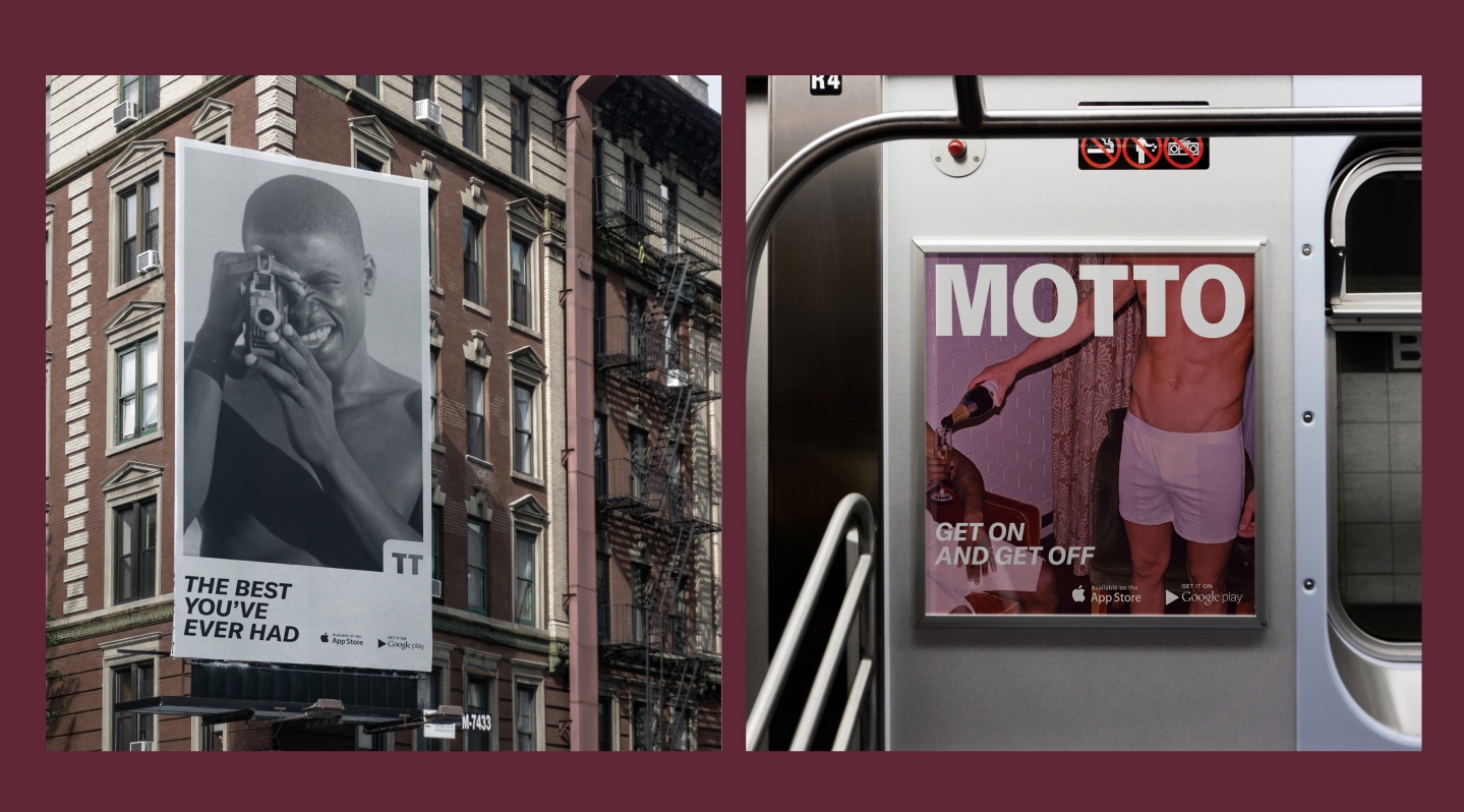
“Get On To Get Off.”
“Less Grind. More Find.”
“All Fun. No Games.”
“We Don’t Mess Around. But You Should.”
The Visual Identity System
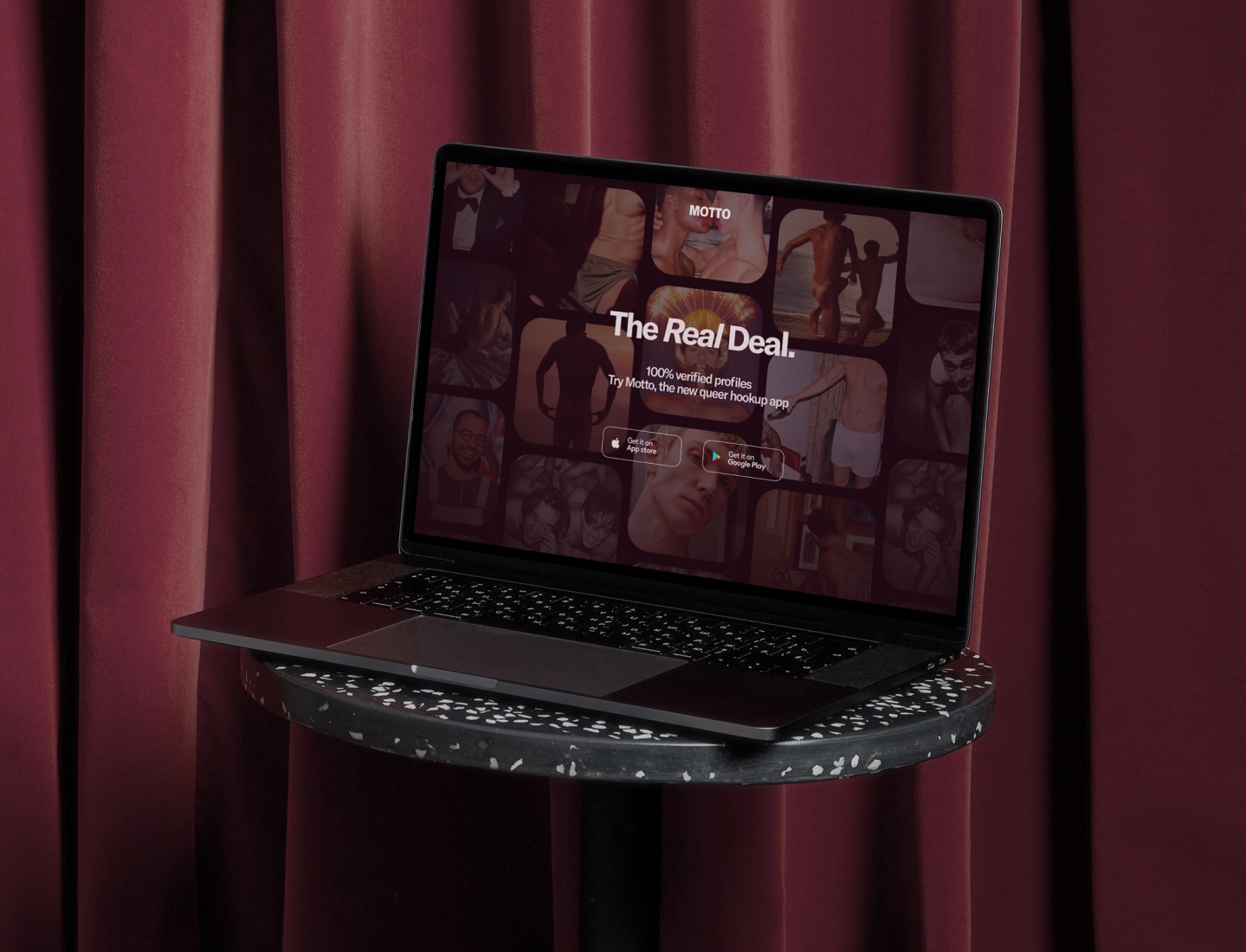
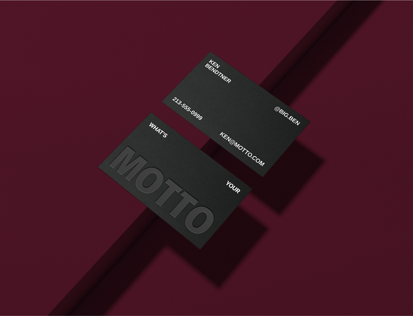
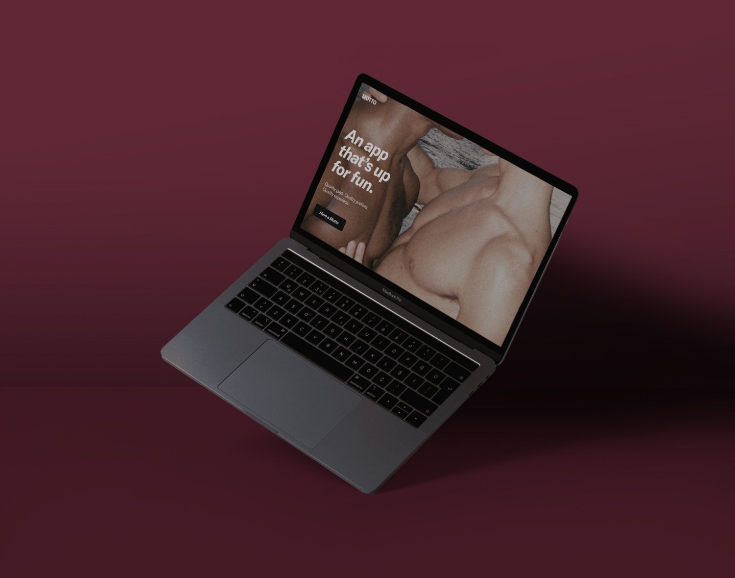
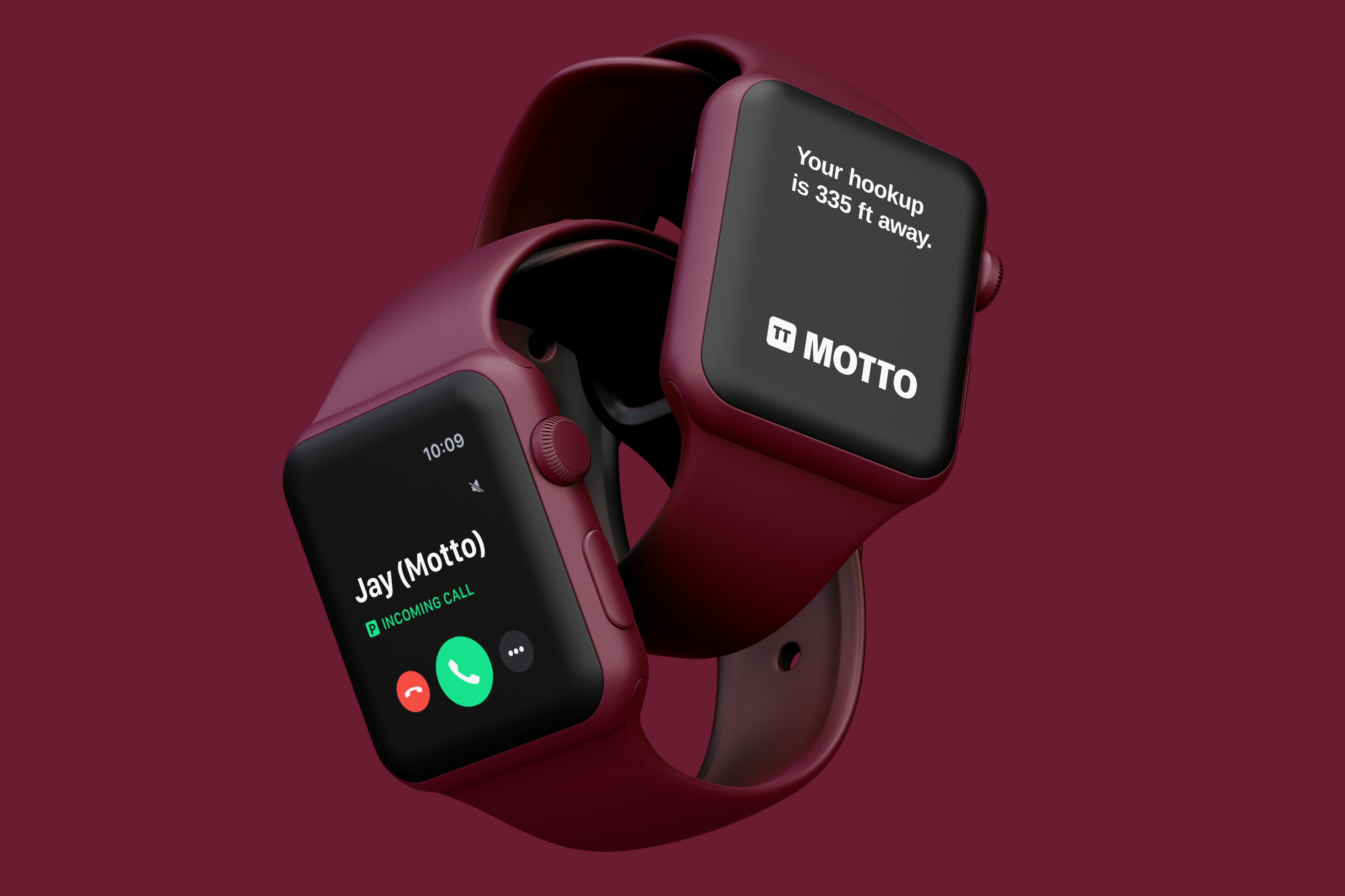
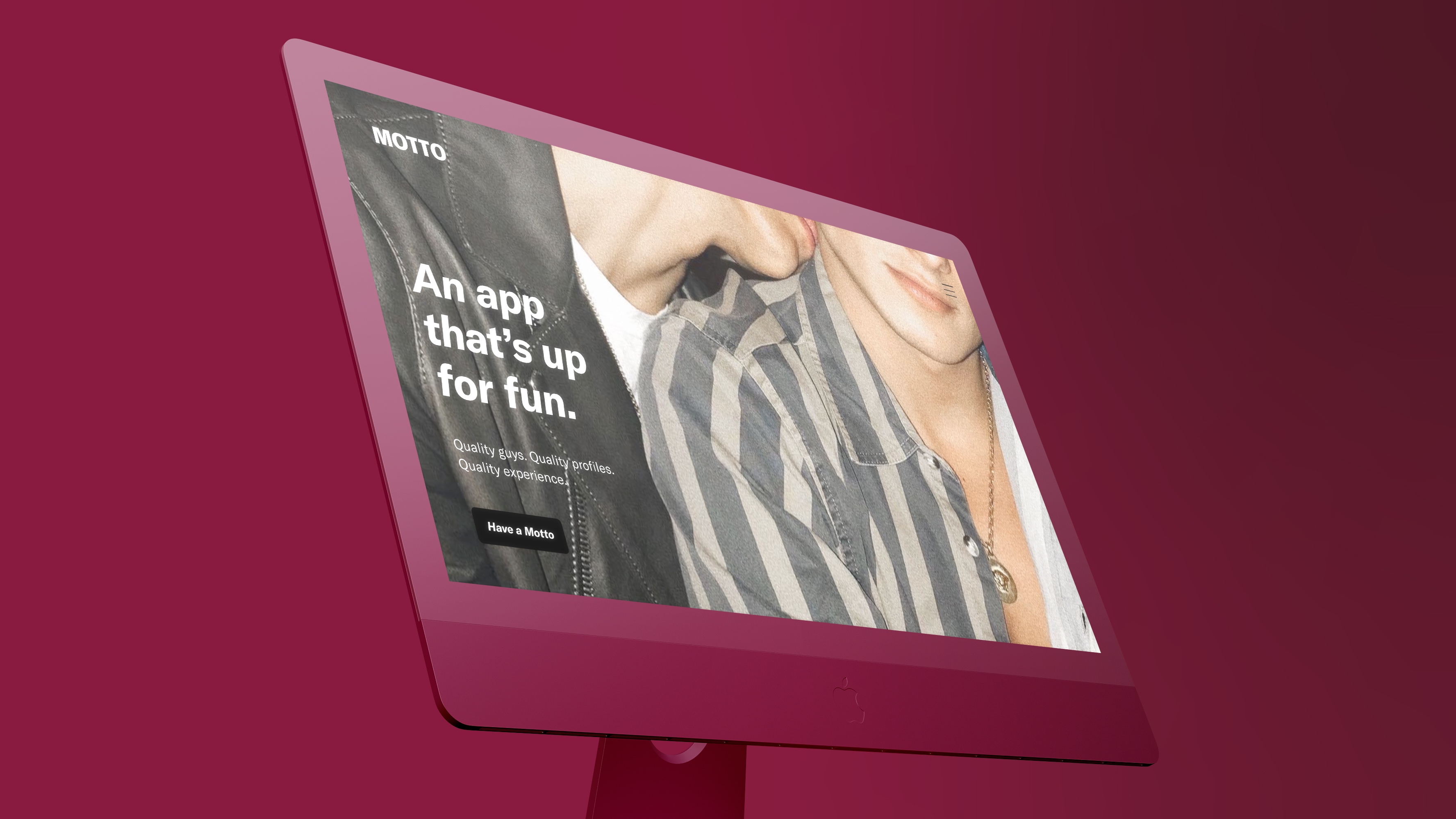
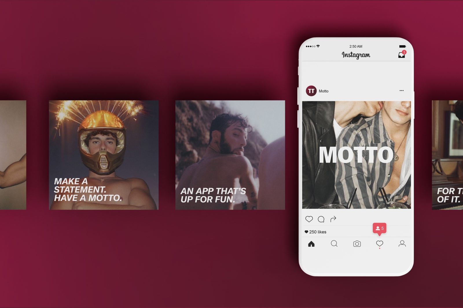
Motto’s visual identity positions the aspirational queer lifestyle brand across a wide range of applications, including its iOS apps, website, social media, event collateral, merchandise, & outdoor ads.
This meant carving out a differentiated design perspective from competitor apps and other mainstream queer-focused brands. For context, competitors like Grindr, Scruff, and Jack'd are branded (as their names imply) to be coarse and hyper-sexualized to an almost cartoonish degree. And most LGBTQ+ brands lean into campy expressions of queer culture.
In contrast, Motto's visual language retains a sense of provocativeness, sexiness, and grit, while balancing elements that communicate the brand’s premium positioning.
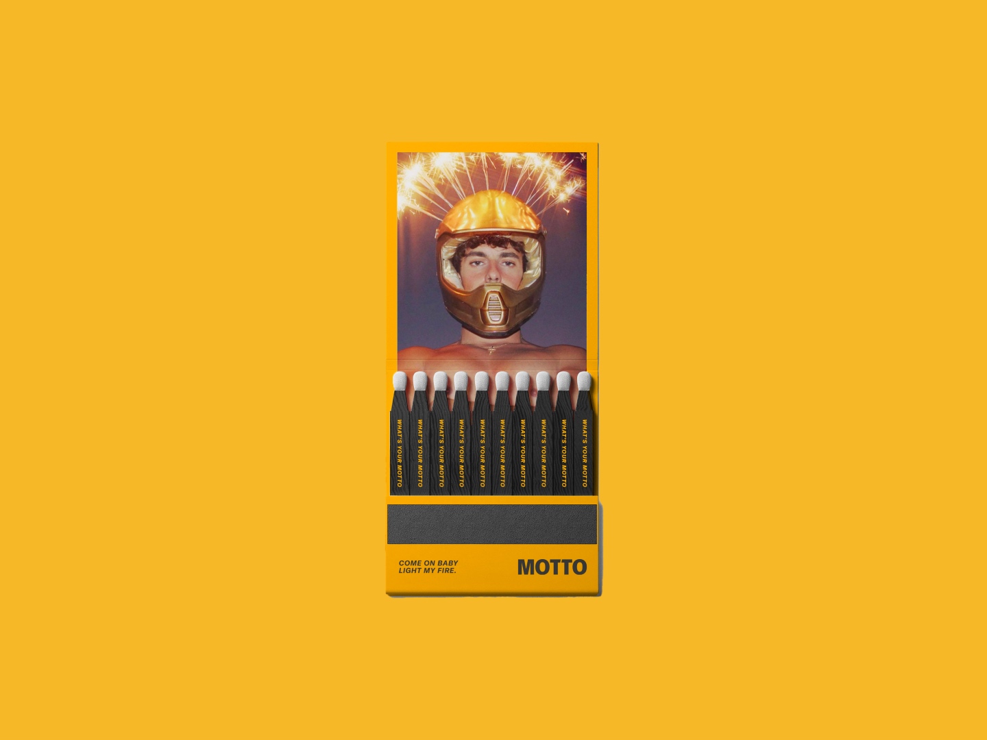
The main source of visual inspiration was a set of vintage matchboxes from underground queer nightclubs in New York City and Berlin in the Sixties and Seventies that we discovered at a flea market. In addition, we drew references from the Hedi Slimane-era of YSL with a youthful, rock-and-roll-tinged allure.
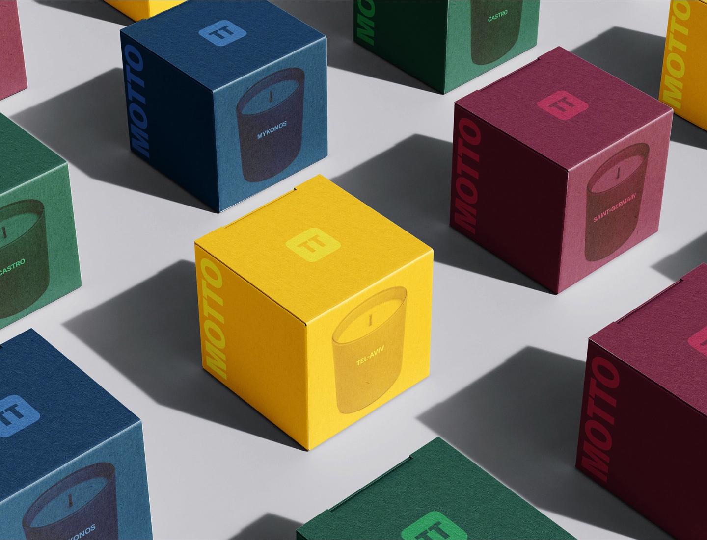
Motto’s bold, serif wordmark includes an intervention in the two T’s. Inspired by the shape of the male symbol, the two T’s represent two men coming together. As a hookup app, the small gap between the letters expresses that these connections are for a good time, not necessarily a long time. The mark creates a variable logo system used with a wide array of photography and colors set inside of the mark. Furthermore, the elevated logo is used as the brand’s app icon, clearly distinguishing the brand from competing services.
In addition, the brand's rich color palette, including a velvety deep purple as the main brand color, provides sophisticated relief from its competitors' bright, in-your-face primary colors. These colors are also employed throughout brand applications and app screens as gradients to communicate the fluid, changing intentions of users. This comes to life in ways that improve the in app experience by helping users more quickly find suitable connections. Users seeking hookups have profiles marked in one color, while users seeking dates have profiles featuring a different color.
The brand's GT America font family is bold, yet minimal in order to function across Motto’s countless digital, UX, and advertising applications. Primary headlines are italicized in order to add a modicum of disruption to this otherwise elevated brand, while clean layout compositions allow carefully crafted copy to shine.
Editorial fashion photography styling is paired with playful, yet sensual moments of fun between couples and aspirational images of desirable individuals. While a dynamic motion graphics system brings vibrance to the brand’s communication with repeating text and disruptions in the brand’s word mark and logo.
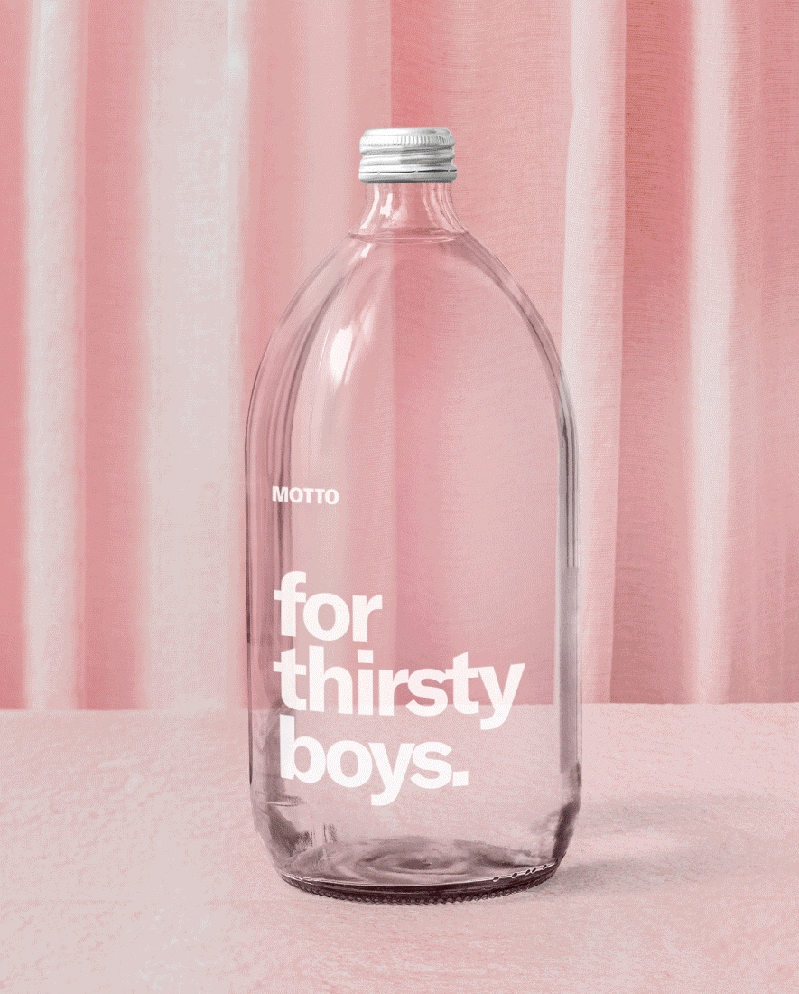
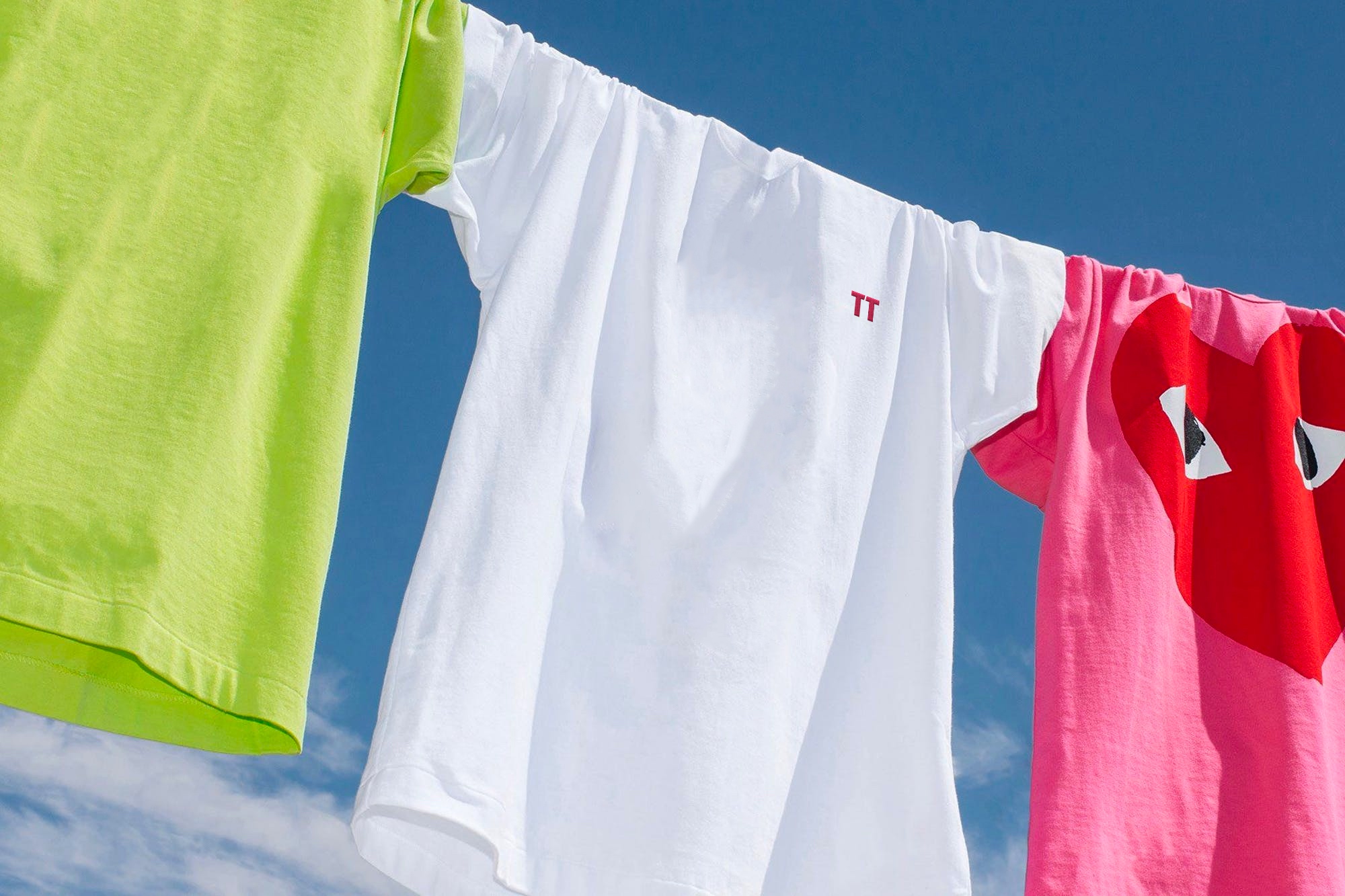
A collection of brand merchandise positions Motto as a gay lifestyle brand that users are proud to be associated with. These include matchsticks paired with candles inspired by iconic gay neighborhoods, water bottles served at events, & apparel. In addition, we created a series of digital and print invitations and tickets to the app’s exclusive events.
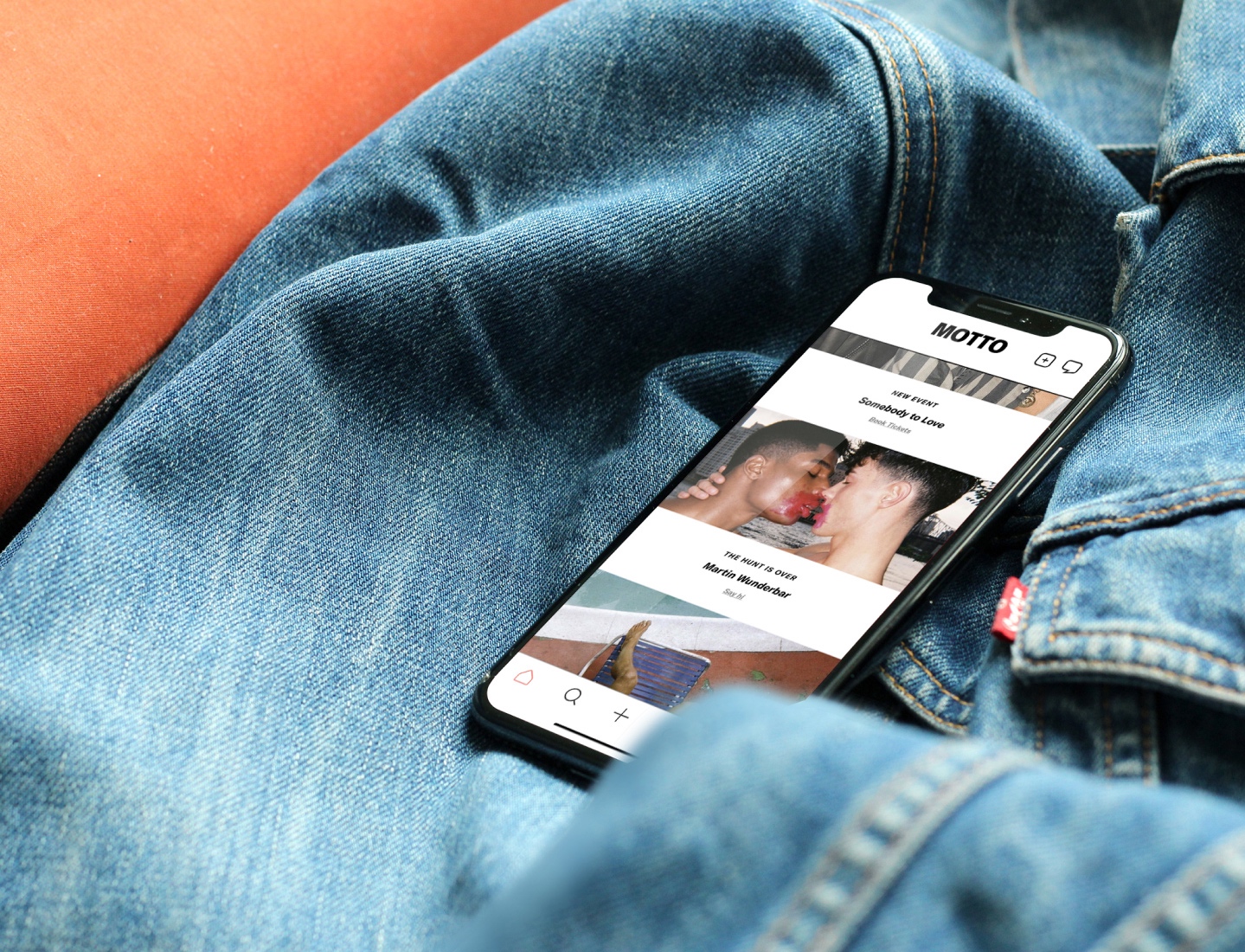
We brought the brand’s visual identity system to life on its iPhone app with a dynamic, modern UX that includes robust user profiles in order to showcase each user in the best light. The brand identity system also shines through a series of outdoor ads. Featured across NYC and Miami neighborhoods, these ads bring together Motto’s typography system, naughty-meets-nice photography, and edgy messaging.
Joel Simkhai created a monster. With Motto, only time will tell if we’ve helped him create slay that monster.
Credit
Name:Truffl
Status:Agency
Location:Los Angeles, United States
Project Status:published
Project Type:Identity
Project Industry:Entertainment
Project Market Region:North America
Project Deliverables:Brand Identity
Keywords:WBDS, Agency, Design, Awards, 2023/24
Additional Credits:
Creative DirectorRaphael Farasat
Brand StrategistRaphael Farasat
CopywriterRaphael Farasat
DesignerMatti Vandersee
More by Truffl
Similar projects