

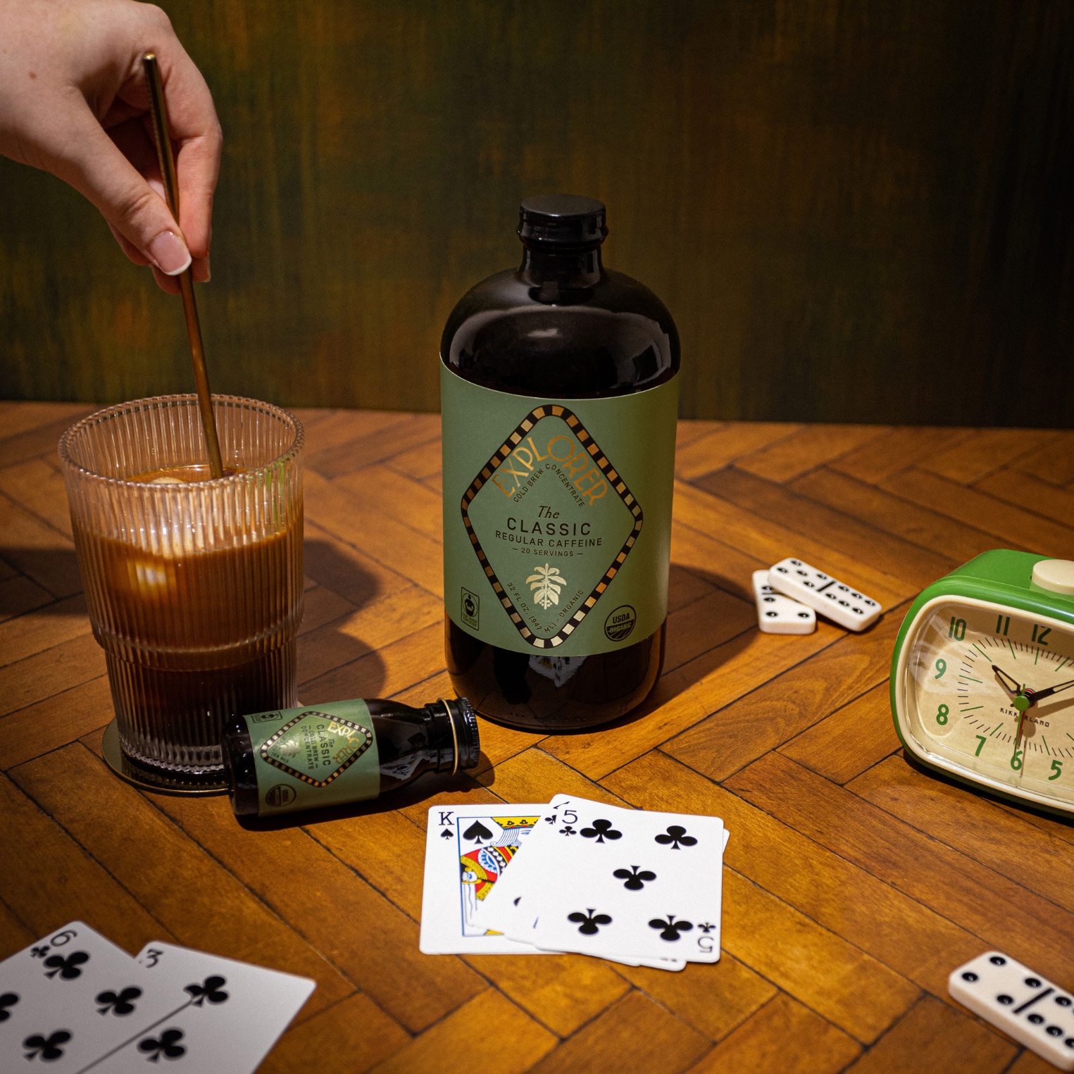
Explorer Cold Brew Packaging Design
The Context
Iced iced, baby. Iced coffee & tea is among the fastest-growing beverage categories, and consumer tastes for these drinks are as broad and varied as they are for their hot alternatives.
Whether it’s an iced vanilla latte on a blazing hot day, a decaf hazelnut iced chai for a cozy night at home, or a black cold brew packed with double the caffeine for one of those Monday mornings when you need that extra oomph, each moment warrants a different drink. However, outside of specialty cafes, no brand is focused on elevating the experience of enjoying and customizing your iced coffee and tea beverages. That’s where Explorer Coffee comes in.
Founded by LGBTQ+ mountaineer, Cason Crane, Explorer makes it effortless to create specialty cafe beverages at home with a curated set of premium iced coffee and tea concentrates and enhancements.
The brand’s product assortment includes a set of 8 cold brew coffee and tea concentrates, ranging from highly caffeinated to decaf, along with premium flavor syrups, wellness drops, and brewing accessories. Combining these products, consumers can discover new beverages and tailor their enjoyment of coffee and tea to suit each and every moment.
Explorer isn’t just about these functional benefits like product quality, customization, or boosting energy, however. The brand’s positioning is rooted in elevating your day by discovering new beverages, rather than settling for unsatisfying routines. This positioning invites the brand to credibly speak to life and not simply its products. Whether it’s eating and drinking well, taking breaks, finding balance, indulging your senses, or connecting with others, Explorer believes elevating everyday moments helps make life richer and more vibrant.
The Approach
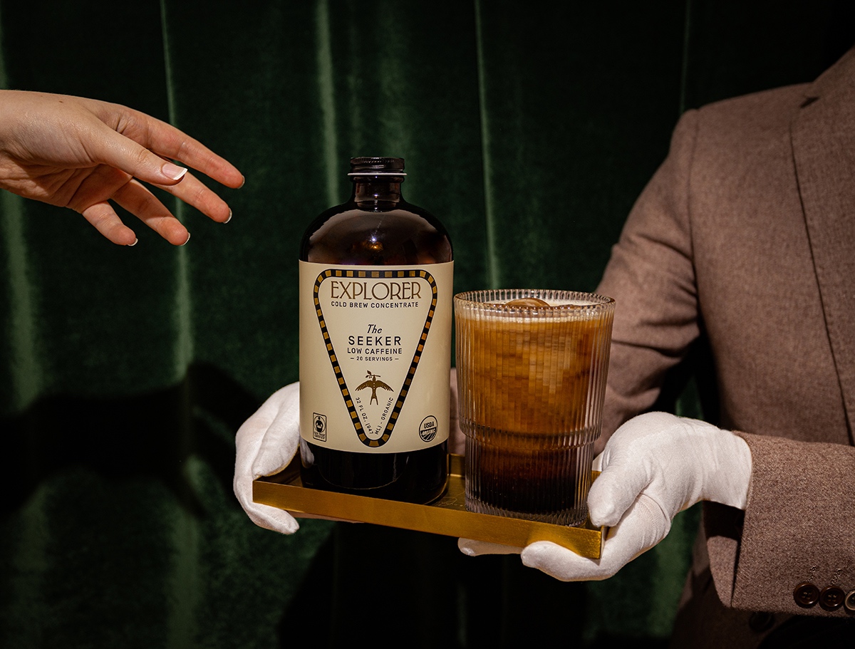
Our design approach eschewed the overly minimal and clean aesthetic employed by coffee brands like Jot and Blue Bottle in favor of a rich language that is both heritage and maximalist. Drawing inspiration from legacy perfumers and candle makers like Cire Trudon and Diptique, Explorer’s visual identity language is composed of detailed illustrations, ornate embellishments, gilded print finishes, high-quality materials, imaginative mixed type treatments, and bespoke shapes in order to impart an Old World and highly-decorative look & feel.
The brand’s wordmark features a character-rich, sharp serif font called EHMCKE HTF. The font is condensed and thin, yet brimming with character based on its sharp serifs. Despite the font’s decorative serifs, it remains clearly legible when applied to countless different layouts across packaging, including smaller formats such as the brand’s mini 2oz bottles. Furthermore, the wordmark functions perfectly in tandem with the brand’s similarly sharp, expressive illustration style.
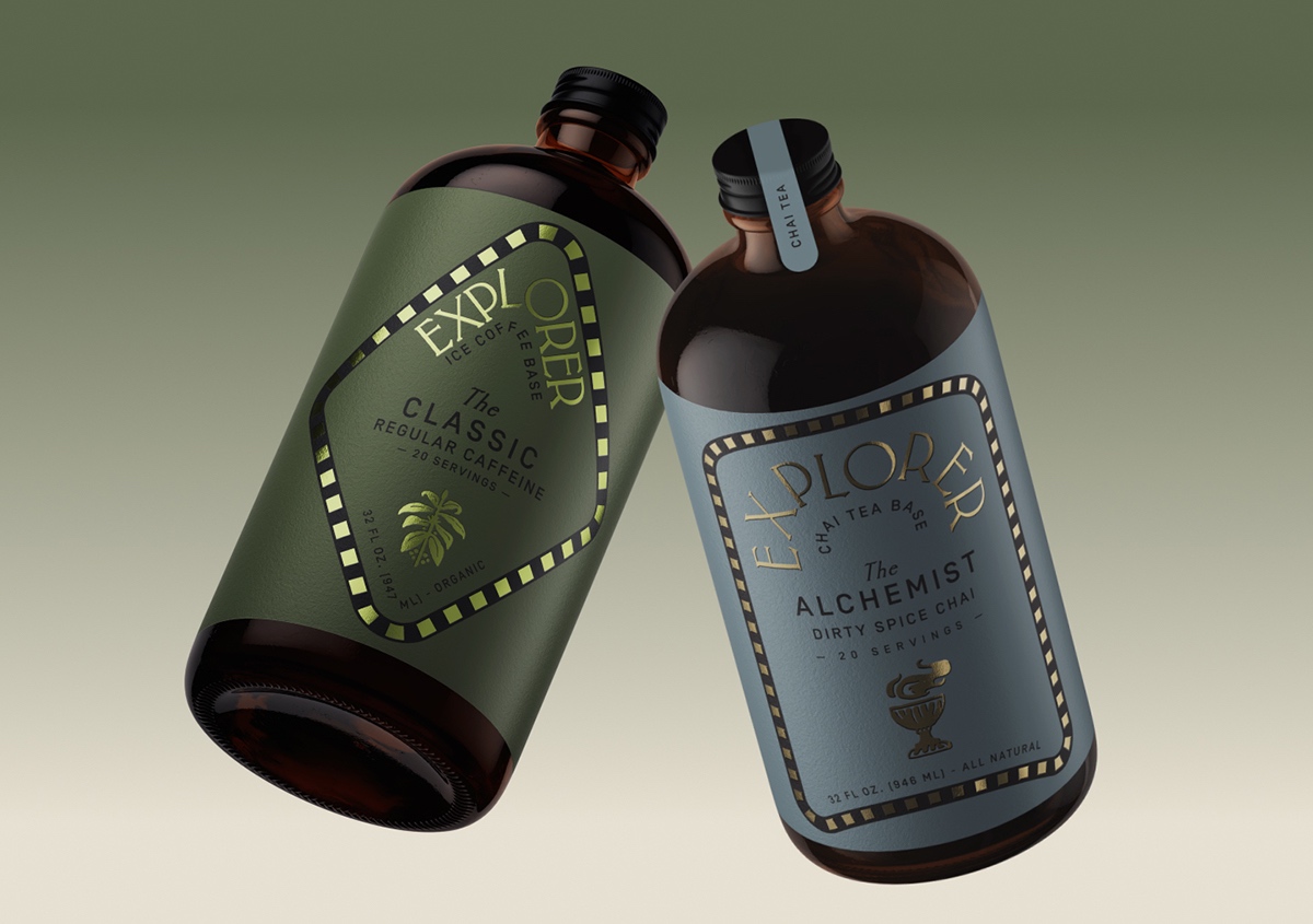
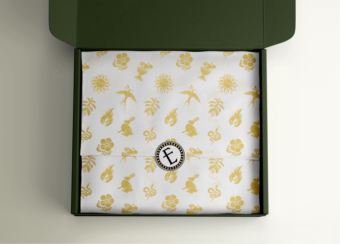
A gold foil and black pattern creates a border used as a primary framing device across the brand’s identity and packaging. A circular shape of this foil border frames the brand’s logo mark, which is created by isolating and intervening the middle stroke of the “E” from the wordmark.
Once our primary font and logo system were developed, we created visual balance with the remainder of the typography system by using two weights of Simplon BP, a sans serif font employed with multiple levels of hierarchy across packaging details as well as longer format s of content in the brand’s print and digital applications.
Explorer’s brand identity truly shines when applied to its packaging. The brand offers a complex mix of over 28 products distinguished by flavor, size, caffeine level, and ingredients that can be used on their own or together.
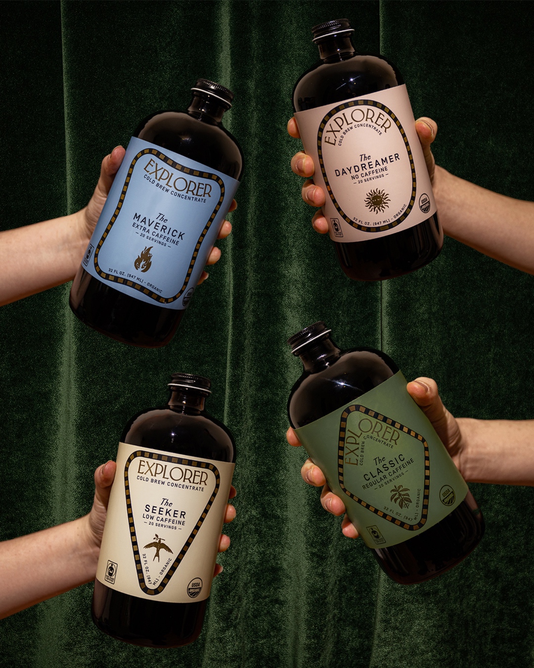
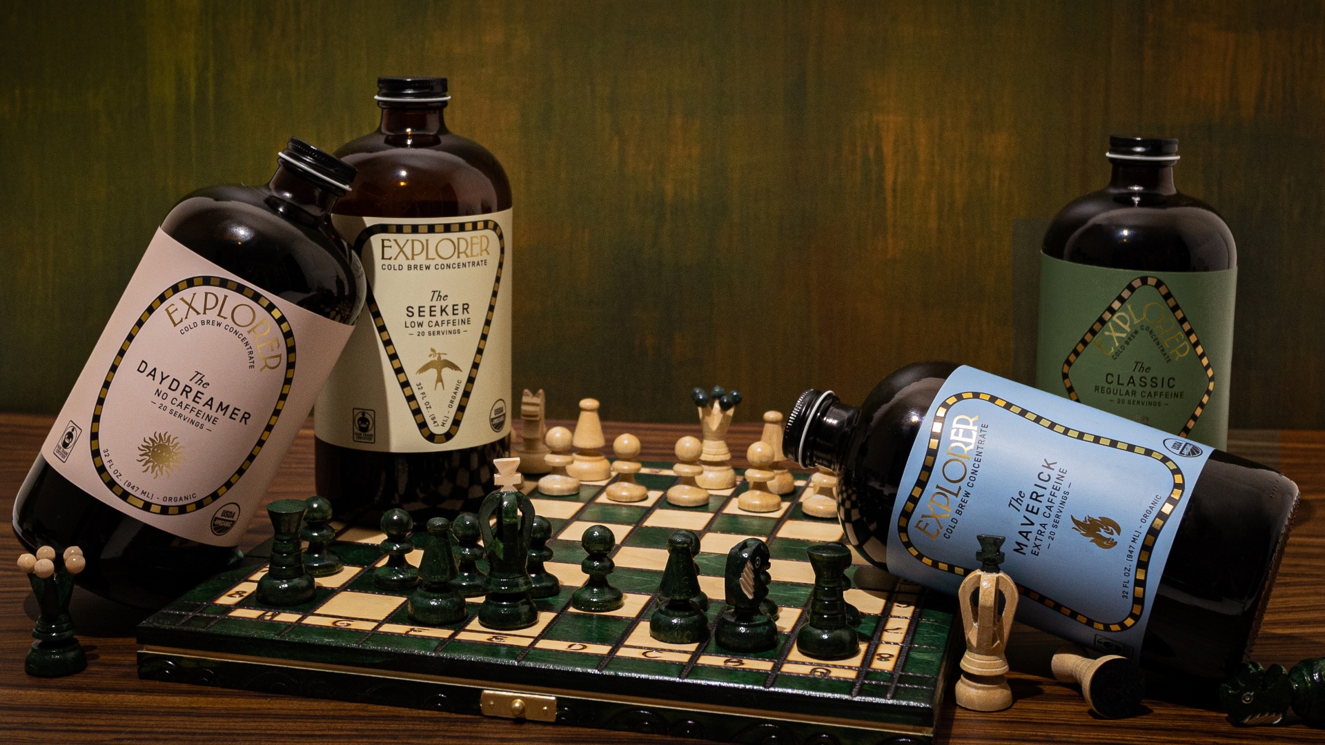
We prioritized cohesiveness and customization with equal weight in order to encourage the celebration of each product as unique while ensuring each product line would be viewed as a set. This meant creating a flexible packaging system that updated every element of packaging design for every product.
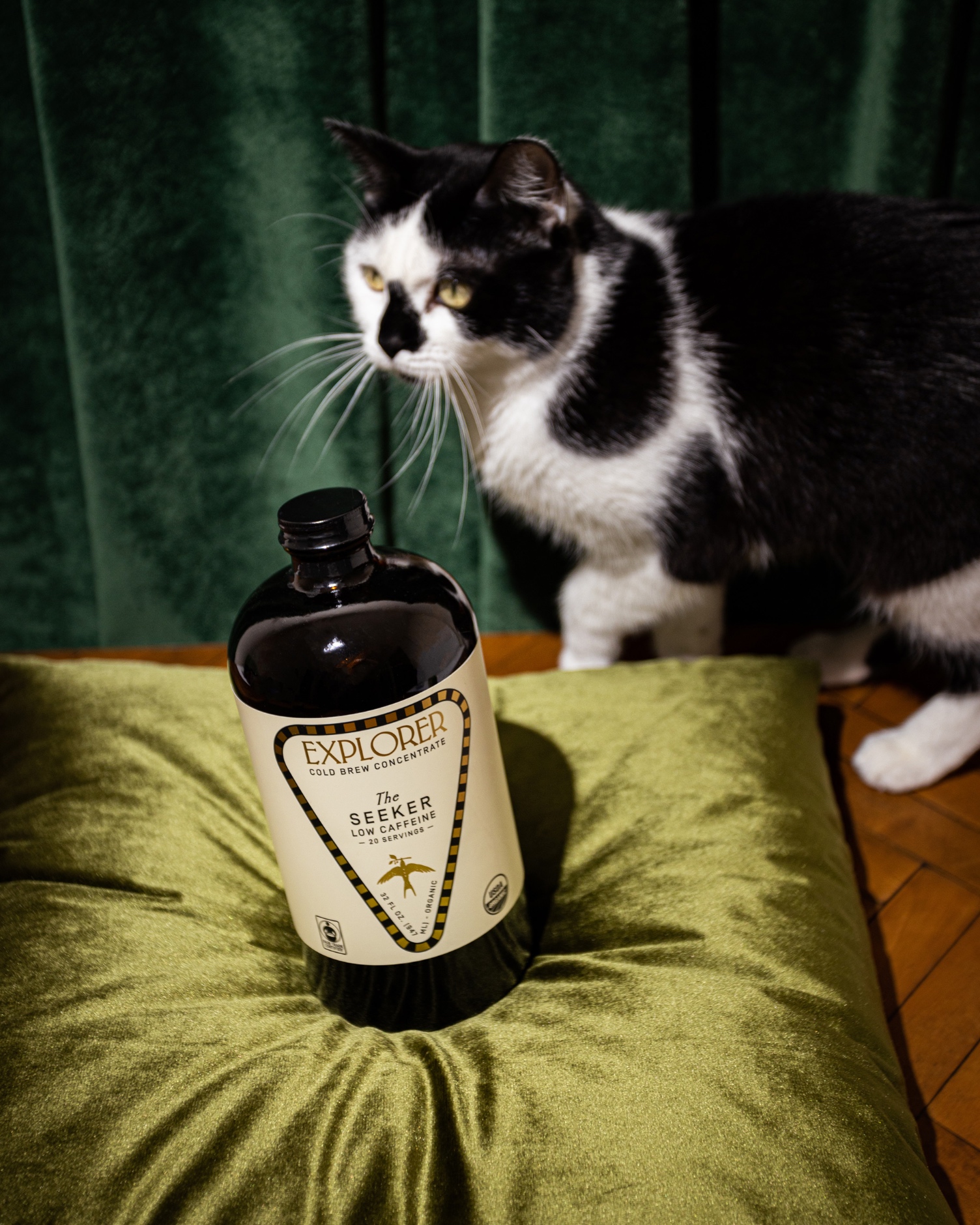
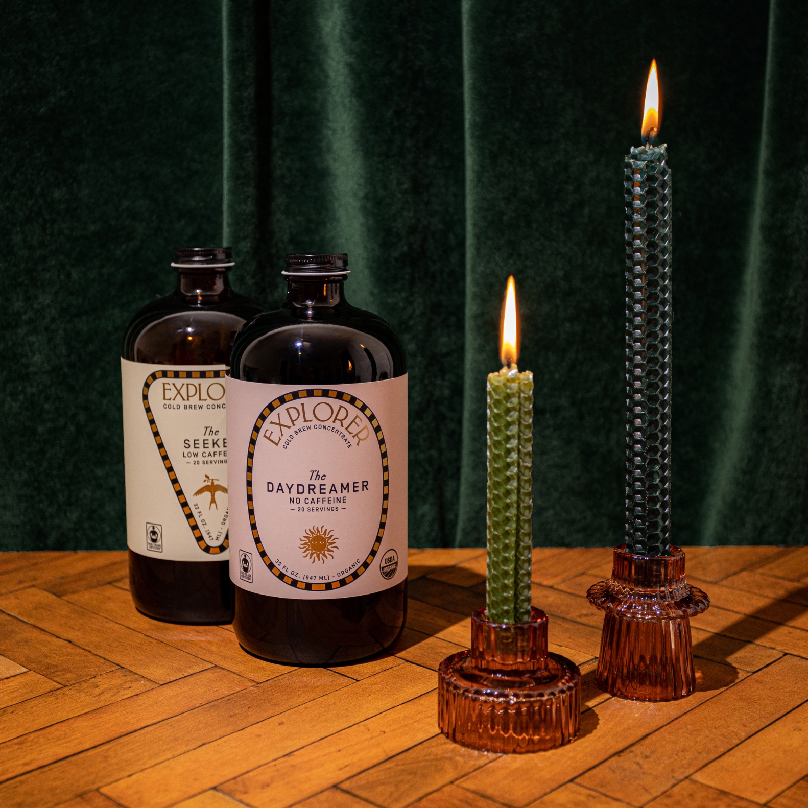
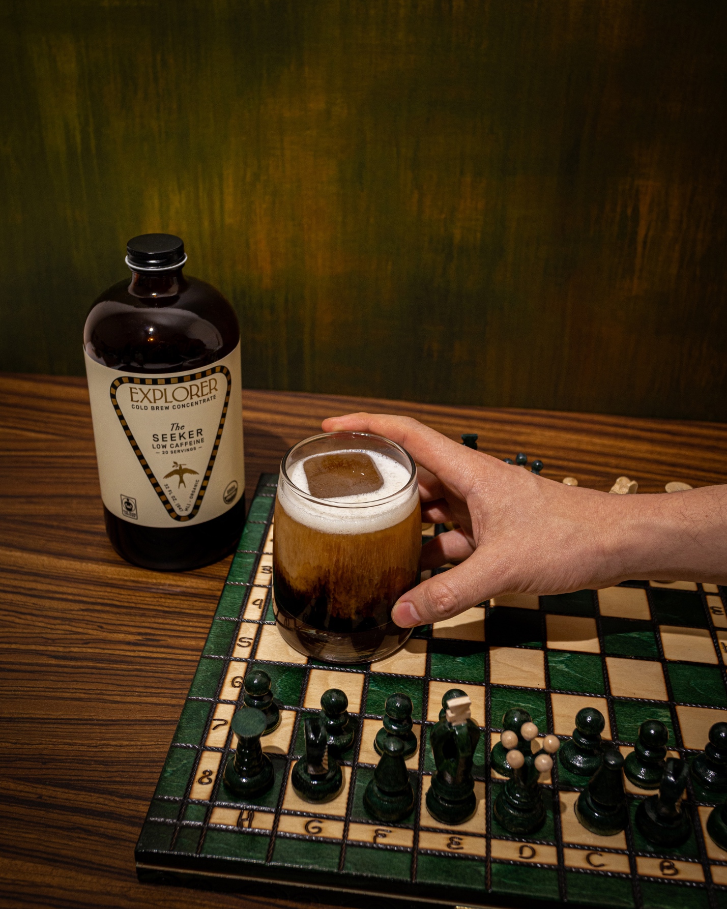
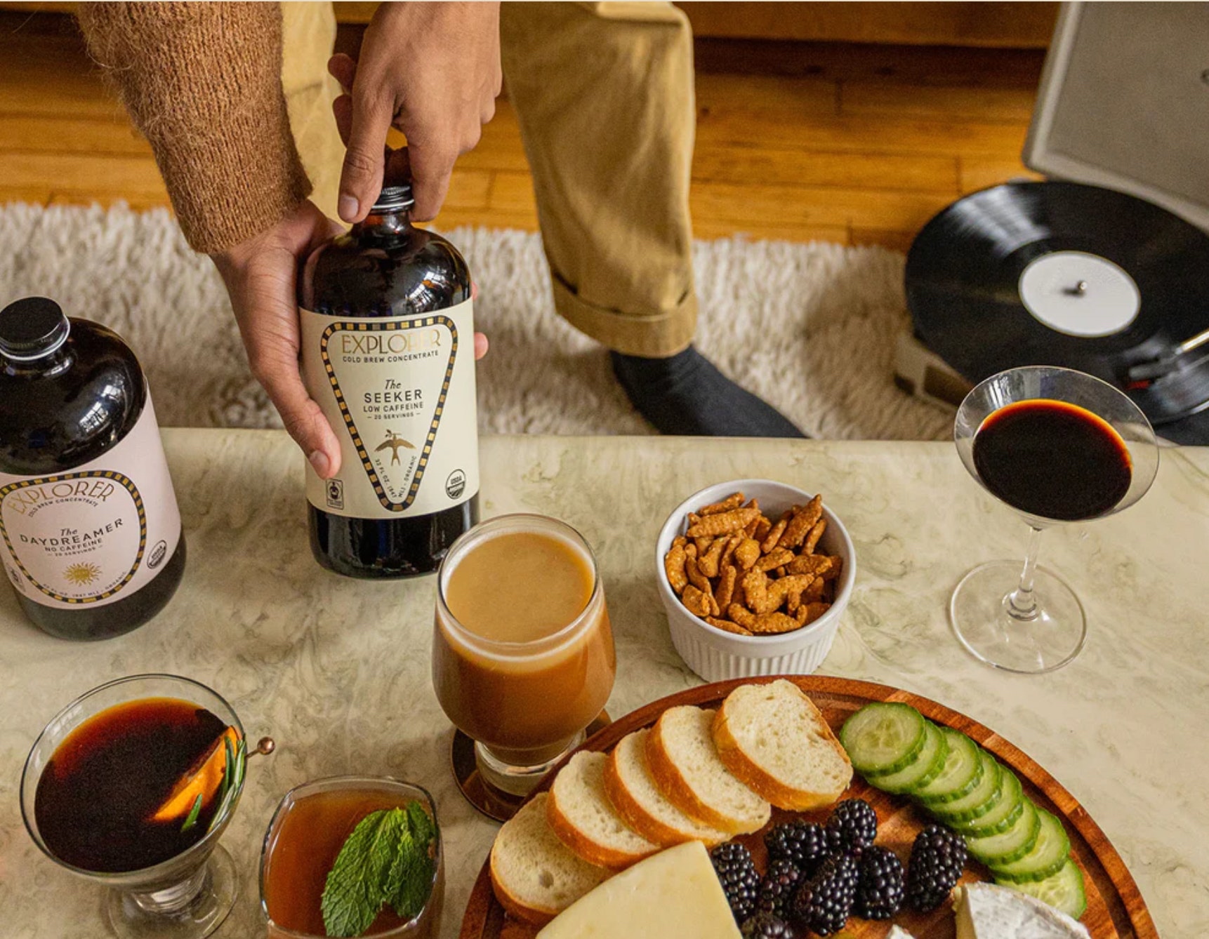
We started by selecting a unique, evocative product name connected to the qualities of each SKU, such as The Alchemist, The Idealist, The Seeker, and The Maverick. Each product name is paired with a corresponding illustrated symbol, like a coffee plant and chalice, that is applied prominently on the front of pack. In addition to their application on packaging, these illustrations are used throughout the brand identity system as patterns and icons.
The brand’s gold foil border is used to frame product information. Originally, each product was designed with a different label shape on the front and back of pack. However, due to production constraints, this design became unfeasible. Our solution, instead, was to create the appearance of different label shapes through the application of a unique, embellished and curved shape for each product using the brand’s foil border.
In addition to this unique shape, each product receives a bespoke layout system complete with a distinct flowing, curvy treatment for the brand’s wordmark and a different composition for all typographic elements.
Inspired by the outdoorsy nature of Explorer’s name, the brand’s primary color is a smart and rich shade of green. From there, we created a color system to distinguish Explorer’s products based on their caffeine level ranging from a soft pink for their decaf SKUs to a rich blue for their highly-caffeinated SKUs.
Finally, Explorer’s products and packaging reflect its value of sustainability. The brand’s core product lines of coffee and tea concentrates are fully plastic-free. In addition, compared with ready-to-drink beverages, concentrates remove 80% of water content from each beverage, dramatically reducing shipping weight and packaging materials.
In Closing
Explorer’s founder, Cason Crane, is no stranger to exploration and discovery. After graduating from college, Cason became the first gay man to climb the world’s 7 Tallest Mountains. While Explorer’s brand is not rooted in exploring the outdoors, it is nevertheless firmly rooted in encouraging inner exploration and discovery of new routines. Through the design of Explorer’s branding and packaging, we hope this spirit of celebrating discovery shines through each and every aspect of this project.
Credit
Name:Truffl
Status:Agency
Location:Los Angeles, United States
Project Status:published
Project Type:Packaging
Project Industry:Food/Beverage
Project Market Region:North America
Project Deliverables:Packaging Design
Keywords:WBDS, Agency, Design, Awards, 2023/24
Additional Credits:
Creative DirectorRaphael Farasat
Brand StrategistRaphael Farasat
CopywriterRaphael Farasat
Art CoordinatorXimena Cervantes
DesignerRodrigo Tovar
PhotographerDylan Skinner
Motion Graphics DesignerMartina Salvaterra
More by Truffl