

Fat Miilk's Audacious Photography, from Packaging Details to the Energetic Essence of the Brand
Introduction: The First Drip
Fat Miilk remixes Vietnamese Coffee with unmissable authenticity, boldness, and charisma.
Founded by Vietnamese-American, Lan Ho, a daughter of immigrant political refugees, the brand stands as a bold declaration of her journey. Lan's path was initially one of security, fulfilling her family's expectations through a career as a Harvard-educated pharmacist. However, her firing during COVID-19 became a turning point, prompting her to embrace her heritage and enter the world of Vietnamese Coffee.
This venture, initially funded by maxing out credit cards, catapulted her into the limelight with an appearance on celebrity chef Gordon Ramsey's primetime show. Her inspiring story caught the attention of investors and set the stage for Fat Miilk's rise.
Brand Narrative: A Bold Story
Unlike other Vietnamese coffee brands focused on the education of robusta beans or the struggles of coffee producers, Fat Miilk takes a different path, celebrating the energetic kick, robust flavor, and cultural pride intrinsic to its products, and embodying the resilience and swagger of its immigrant roots.
This is coffee for the bold, for those who seek a punch of flavor and energy. It's more than just a beverage; it's a wake-up call embodied in a cup. Fat Miilk, with its unapologetic authenticity and charisma, is a cultural revolution, making Vietnamese coffee accessible and relatable, blending rich heritage with a vibrant, inclusive ethos.
Brand Identity: Defining Fat Miilk
Fat Miilk’s brand identity is built around the concept of rebellious sophistication. The brand adopts a minimalist, dark color palette, complemented by bold typography and disruptive text treatments, echoing the spirit of an aspirational streetwear brand. The logotype is confident and legible, while the fluid, illustrated “FM” logo symbolizes milk swirling into coffee, extending to secondary brand marks and pattern series.
Brand Voice: Unapologetically Confident
The brand voice of Fat Miilk is assertive and bold. Phrases like "coffee that slaps" are not just slogans; they are affirmations of the brand's ethos. This confident tone permeates the packaging, transforming each product from a mere beverage to a symbol of the brand's core values.
The Packaging
Packaging Design: A Canvas of Stories and Boldness
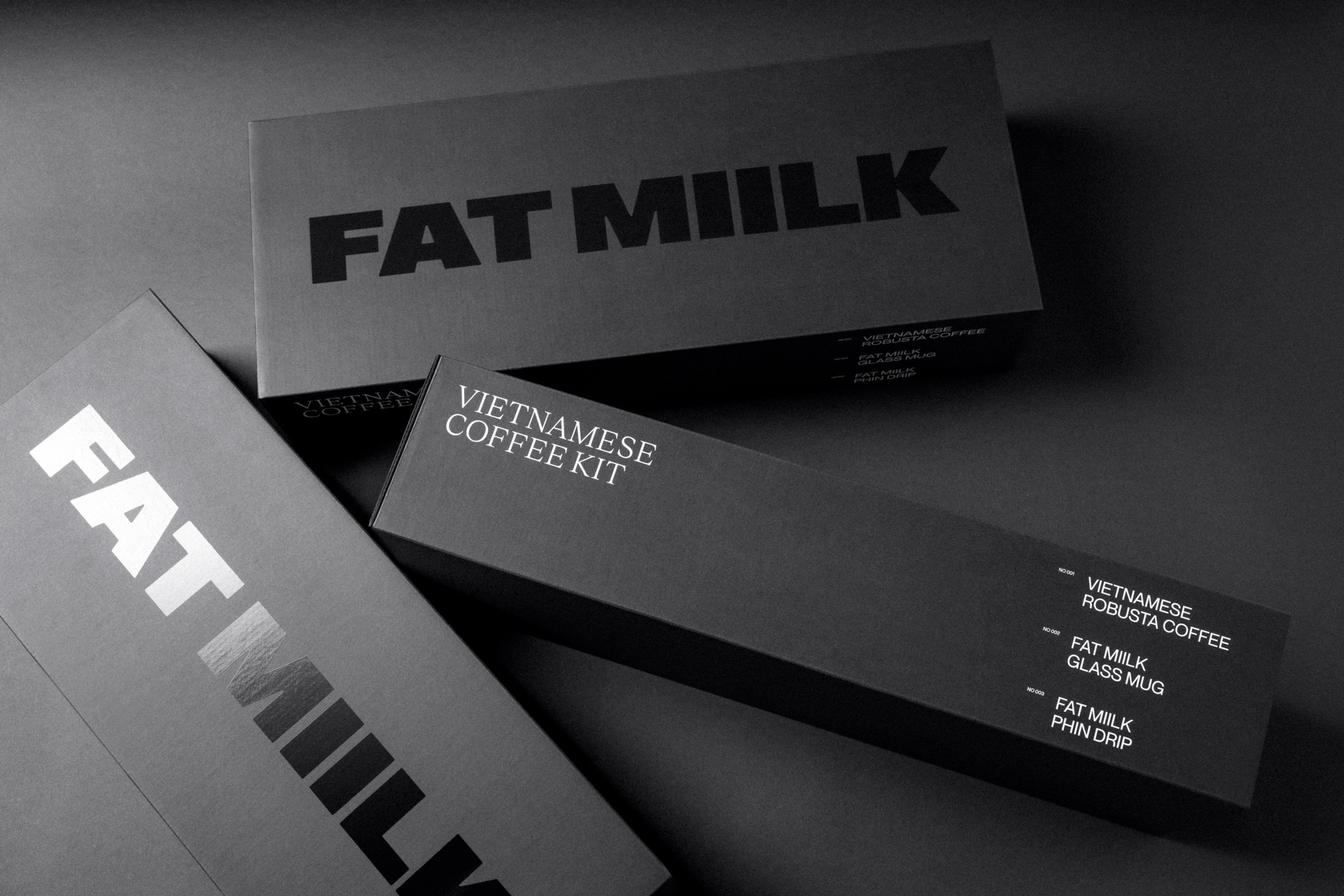
Fat Miilk’s packaging is a delicate balance of minimalism and intricate detailing. The premium card stock, embellished with embossing and spot UV highlights, transforms each unboxing into an immersive and tactile experience. Each package, with its hidden messages and tear strips, tells a story of heritage, strength, and boldness. This design approach is not only visually captivating but also symbolically rich, embodying the brand’s bold, unapologetic, and authentic identity.
Coffee Packaging: A Bold Statement of Clarity and Confidence
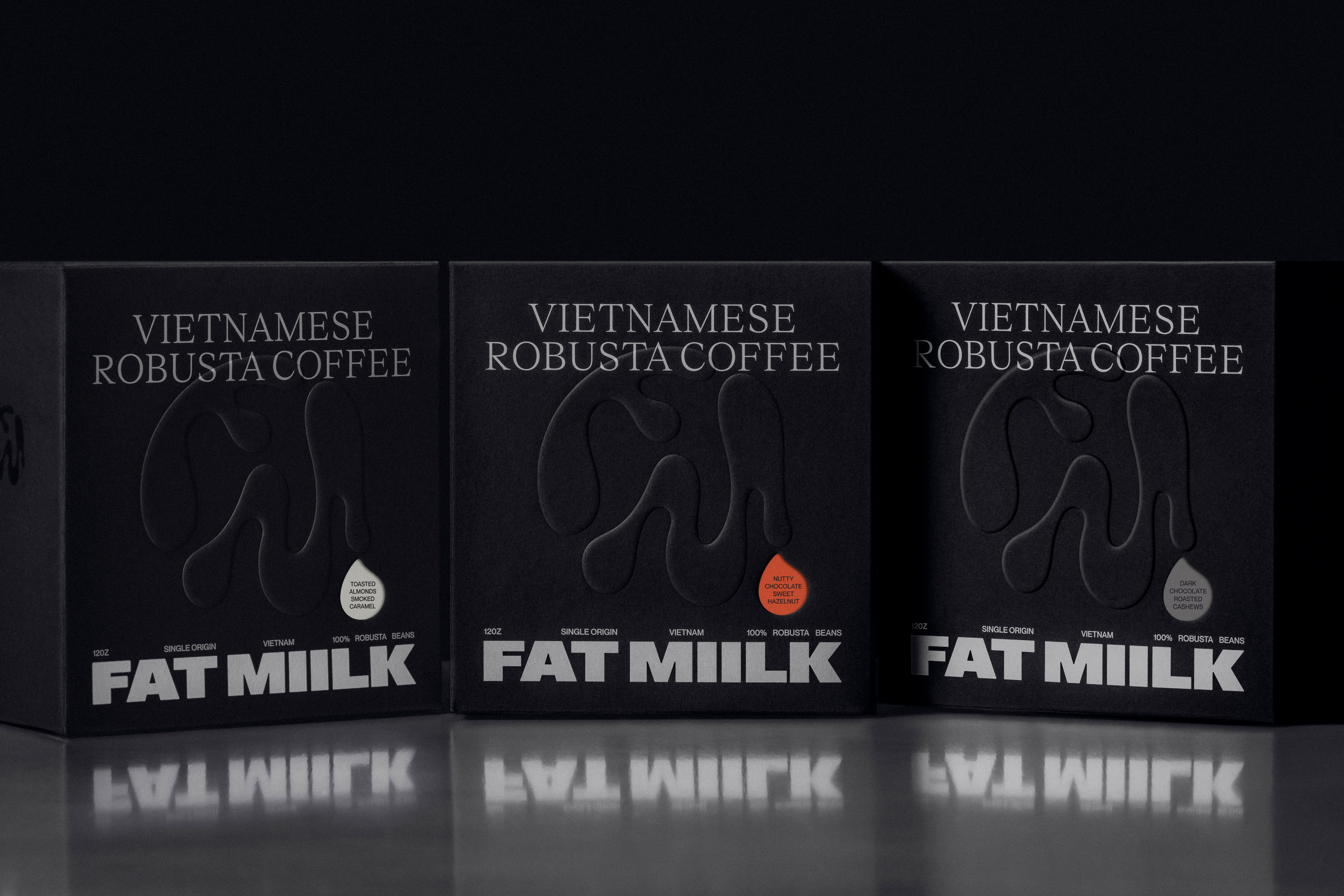
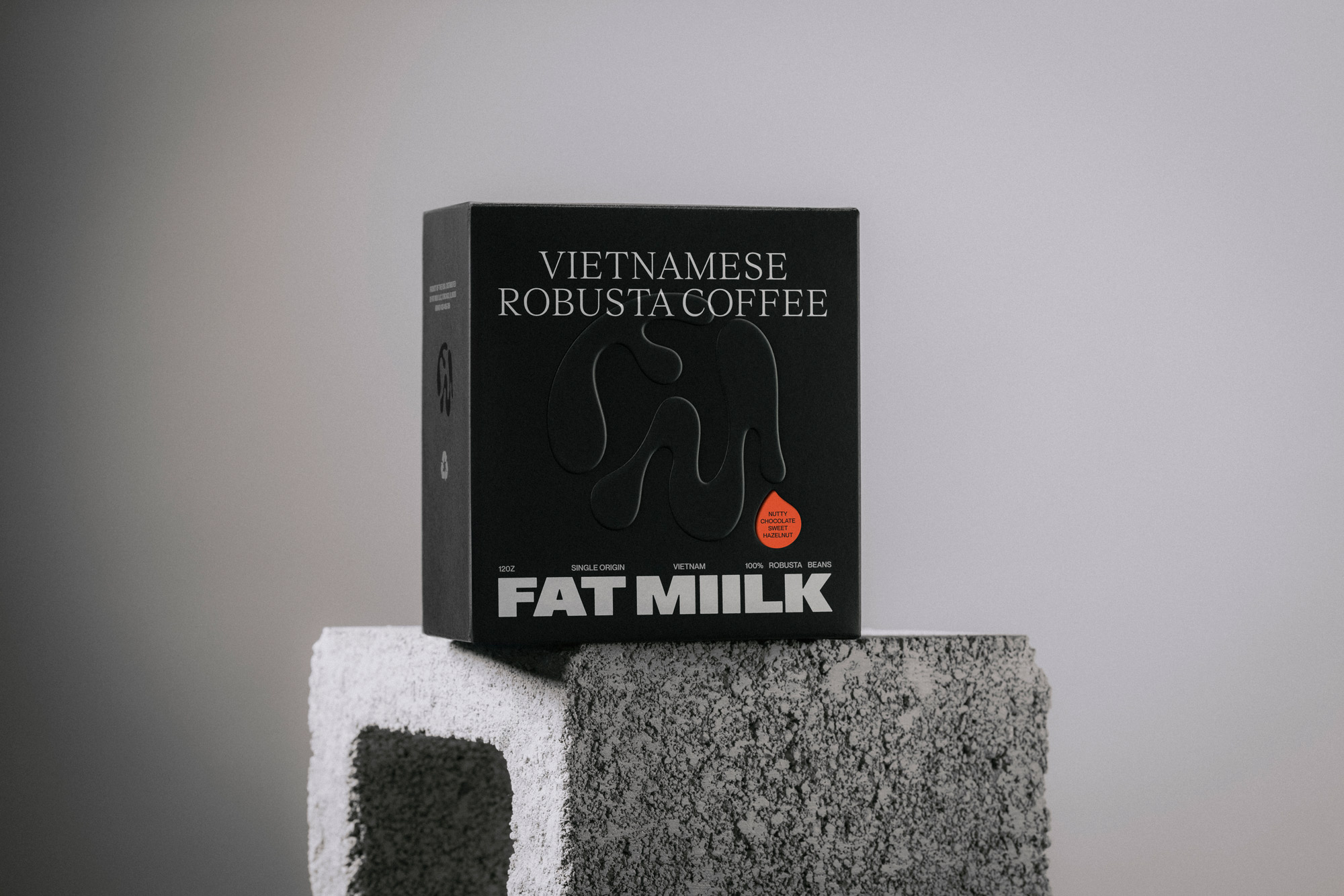
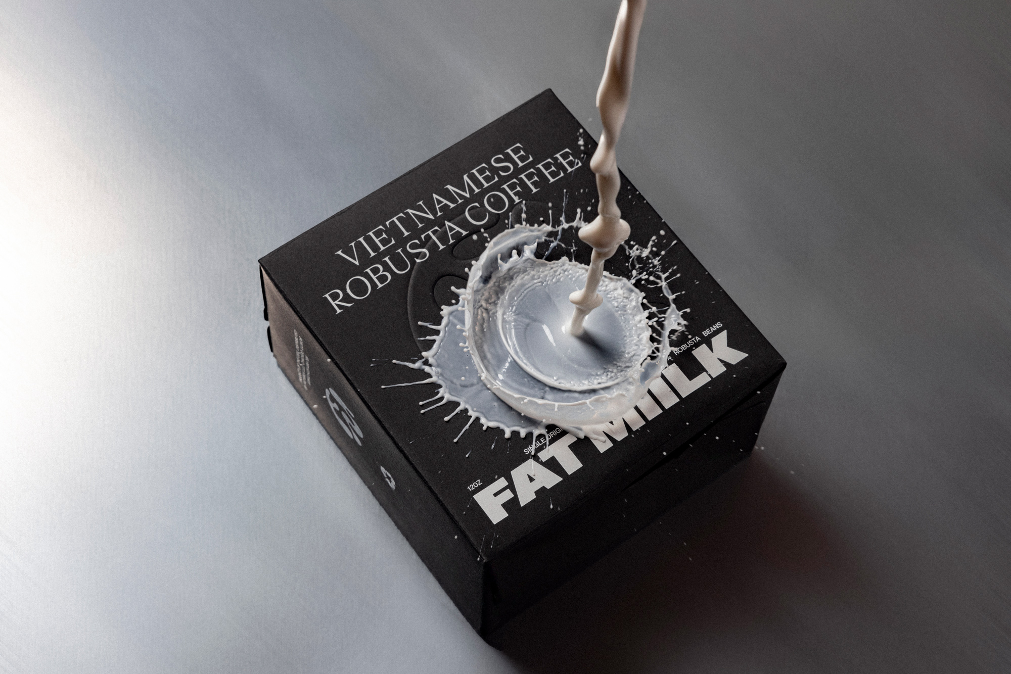
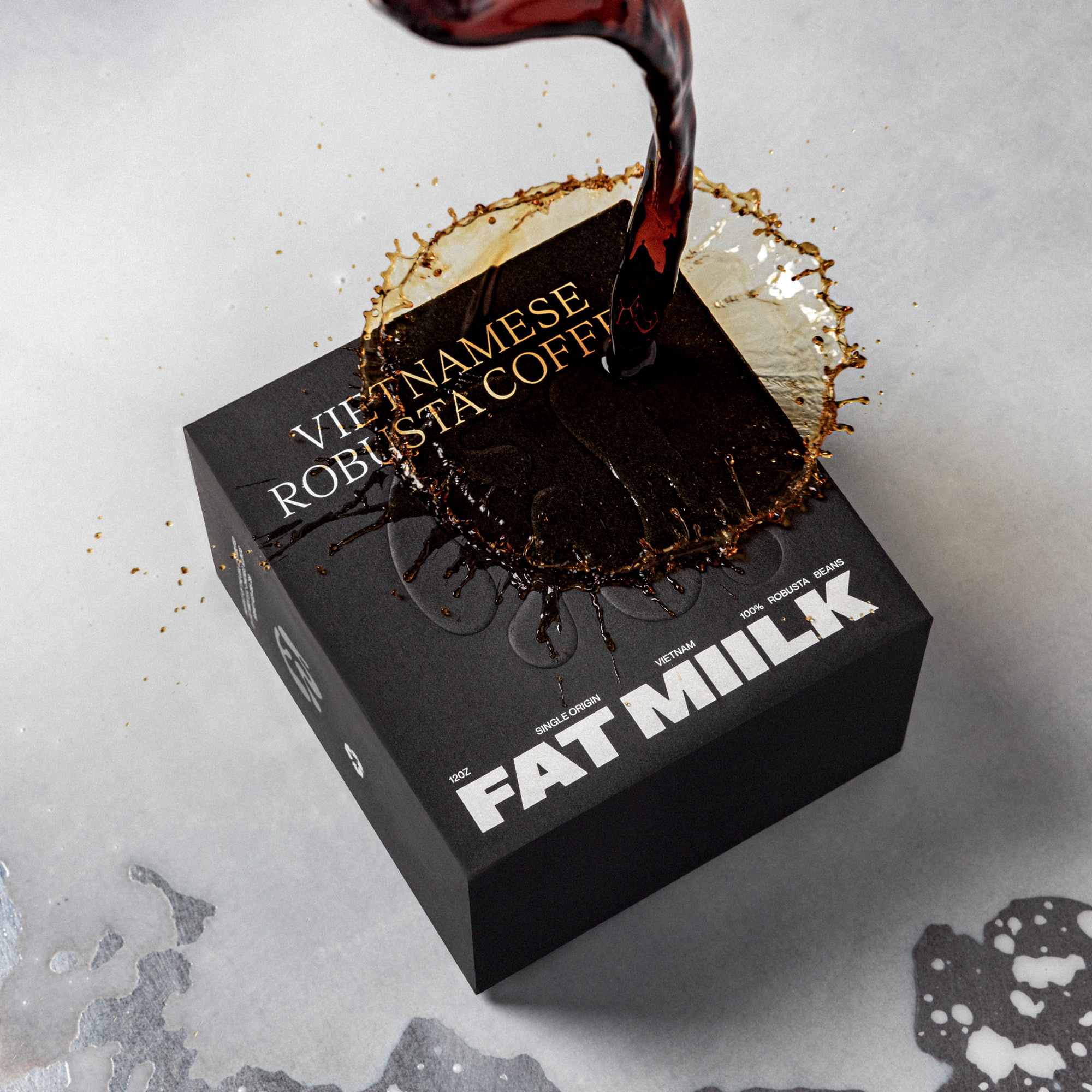
The hero product, Fat Miilk’s coffee beans, is presented in elegantly designed, rigid black boxes. The deep embossed logo, coupled with striking headline typography, makes a bold statement. The brand name, "Fat Miilk," is clarified with prominent "Vietnamese Robusta Coffee" labeling, ensuring consumer understanding given the brand’s name including “Miilk” rather than “coffee.”
The packaging distinguishes each flavor with colorful coffee drop-shaped stickers that appear to drip from the FM logo, adding a playful yet sophisticated touch. The sides of the box feature spot UV finished logos and tasting notes, while the back narrates the brand's inspiring story and mission.
The sides of the box feature small yet significant details. One side includes a spot UV finished logo for a subtle shine, while the other side lists the tasting notes, unique to each coffee varietal, providing an insight into the flavor profile of the coffee inside. The top of the box includes a tear strip with the Fat Miilk logotype emblazoned atop. Tearing the strip reveals the brand’s tagline “Vietnamese Coffee That Slaps.”
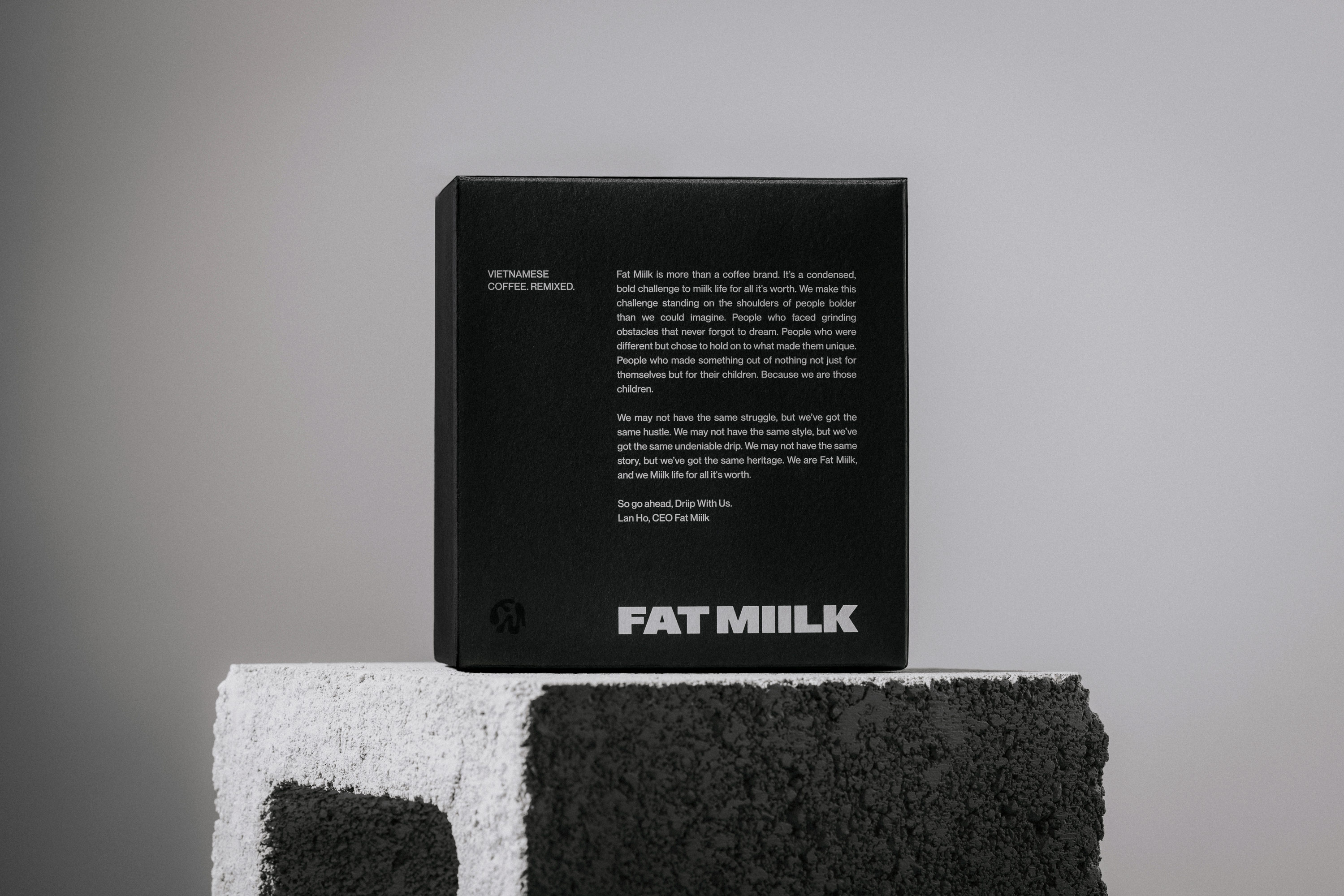
Finally, the back is reserved for the brand's compelling story and mission statement, in order to connect with the brand’s roots and story. It reads:
“Miilk life for all it’s worth.
Fat Miilk is more than a coffee brand. It’s a condensed, bold challenge to miilk life for all its worth. We make this challenge standing on the shoulders of people bolder than we could imagine. People who faced grinding obstacles that never forgot to dream. People who were differ- ent but chose to hold on to what made them special. People who made some- thing out of nothing, not just for them- selves but for their children. Because we are those children.
We may not have the same struggle, but we’ve got the same hustle. We may not have the same style, but we’ve got the same undeniable drip. We may not have the same story, but we’ve got the same heritage. We are Fat Miilk, and we miilk life for all its worth.”
Phin Filter Packaging: Dripping with Boldness
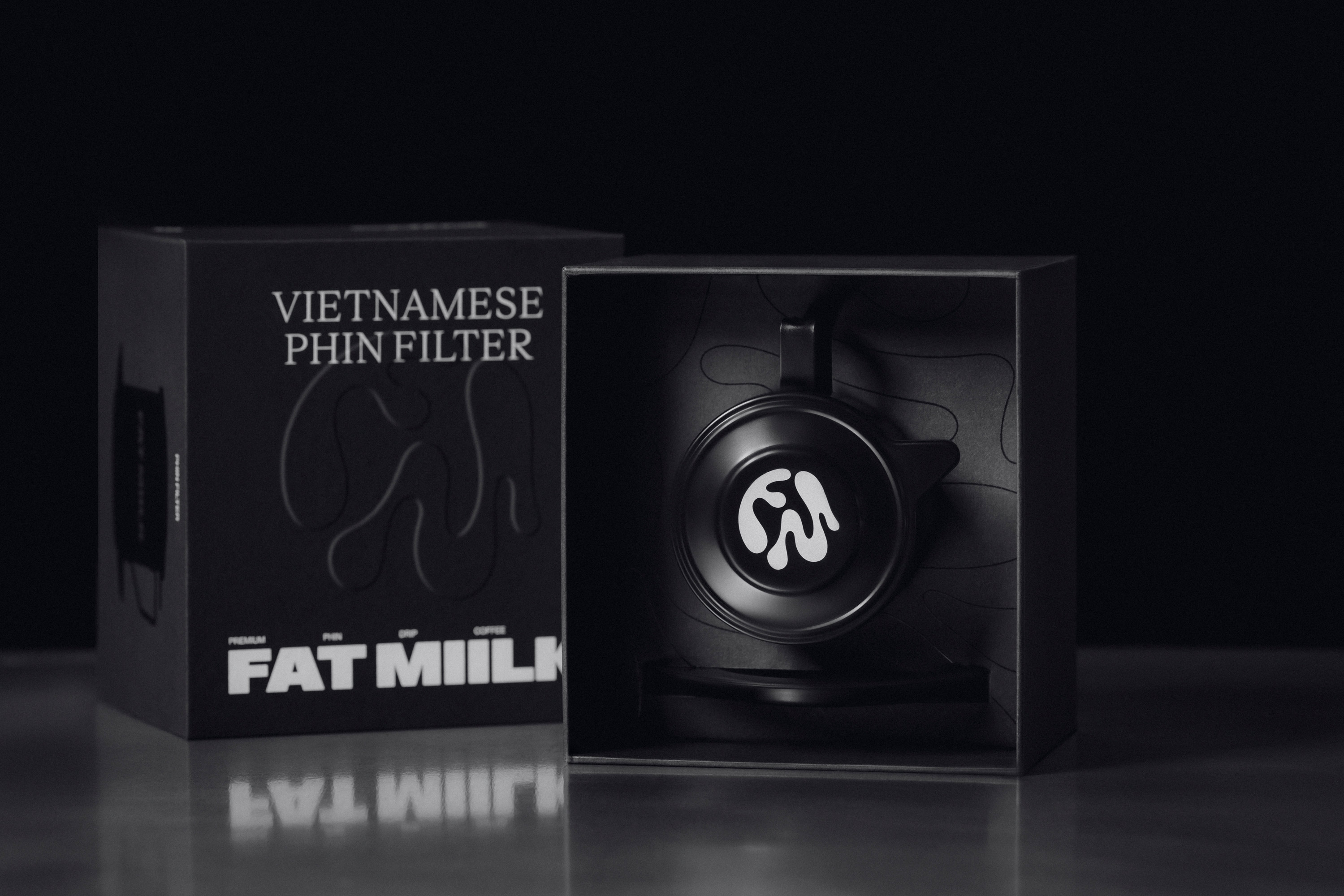
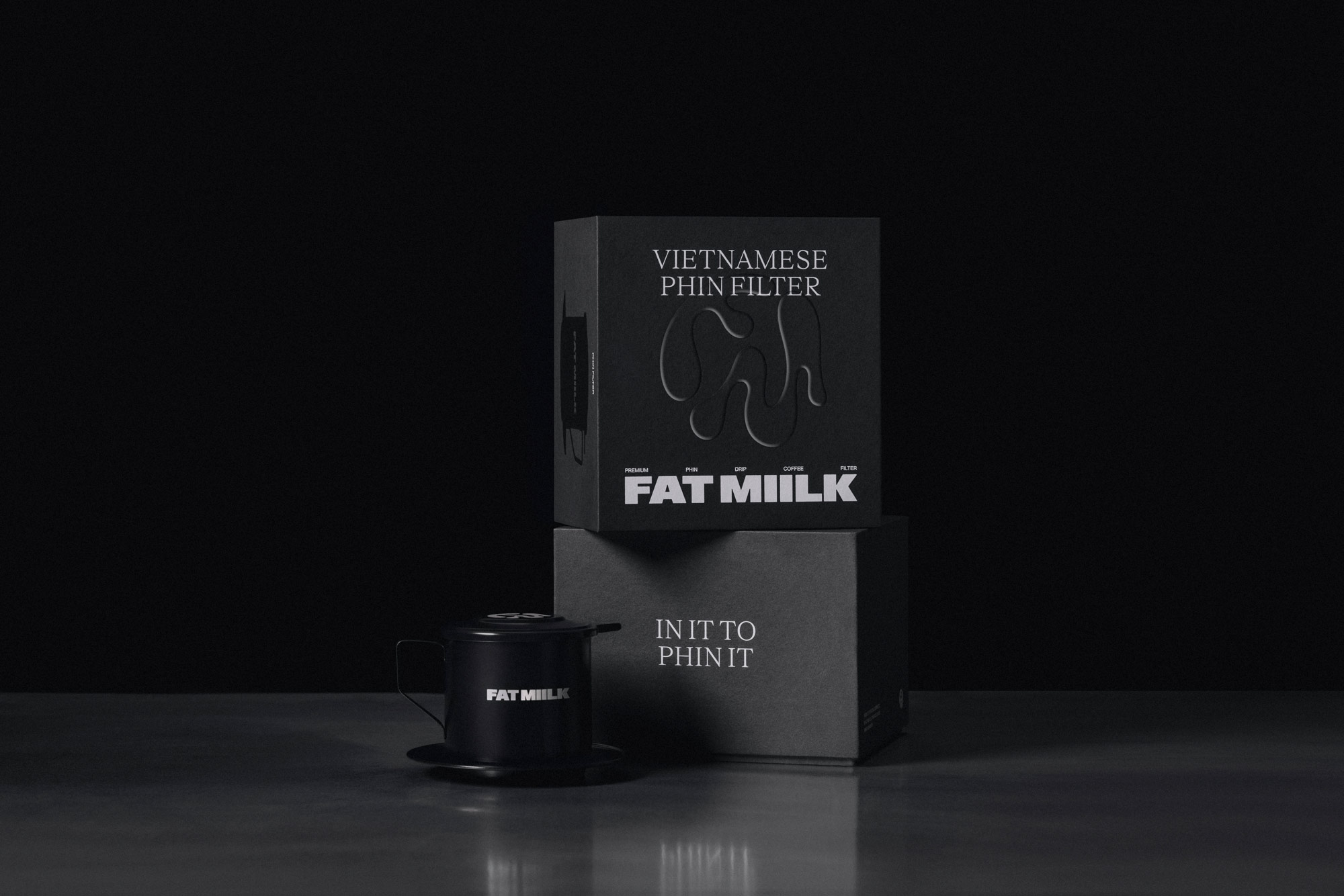
The Phin Filter, crucial for brewing traditional Vietnamese coffee, continues the brand’s design language. The packaging mirrors the coffee bean boxes with its bold typography and striking black color. The sides include a spot UV finished illustration of the filter, along with a brewing guide and brand messaging.
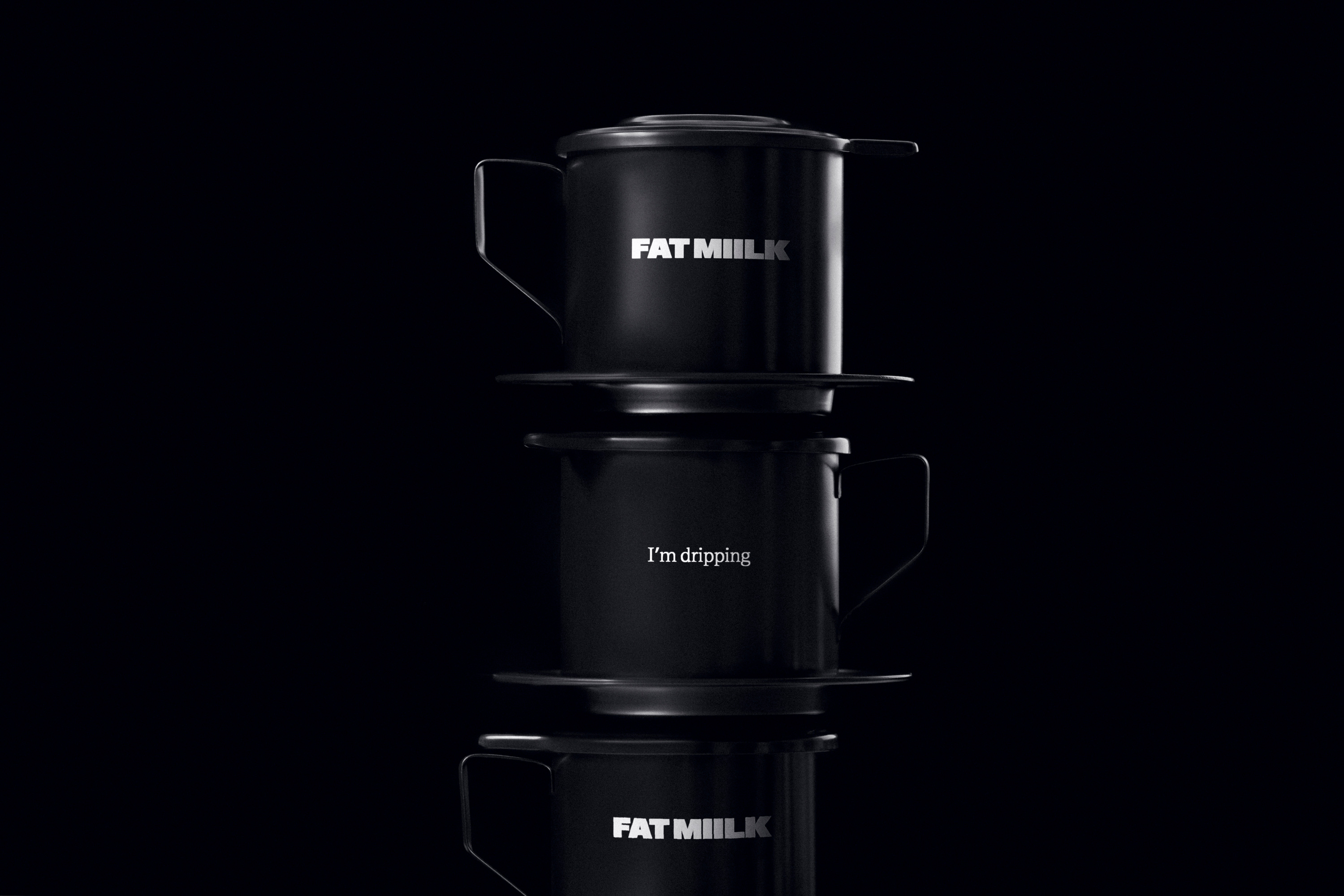
The Phin itself continues the cohesive, sophisticated and minimal design with the logo type on one side and “I’m Driiping” on the reverse side, creating a memorable social media moment while consumers brew their coffee.
Vietnamese Coffee Kit Experience: A Gateway to Vietnamese Coffee Culture
The Vietnamese Coffee Kit, combining coffee, the Phin Filter, and a Fat Miilk mug, is an all-encompassing introduction to Vietnamese Coffee. Presented in a sleek box with a revealing tear strip, the kit offers a complete experience, showcasing the brand's ethos and the richness of Vietnamese coffee culture. Each element, nestled in custom-fit inserts, contributes to a narrative of boldness and quality.
The Photography
Photography: Confidence and Energy
Fat Miilk’s photography is a vibrant portrayal of the brand's bold character and the dynamic impact of its products. The photography strategy is multifaceted, aiming to encapsulate the essence of Fat Miilk in every frame.
The journey begins with ecommerce-style photography, providing a clear, unembellished overview of the packaging. These images meticulously capture the matte varnishing, the subtle yet impactful embossing, and the cheeky messaging that Fat Miilk prides itself on. The focus here is on the fine details that elevate the packaging from mere containers to storytellers, inviting potential customers to take a closer look at what sets Fat Miilk apart.
To truly embody the brand's mantra of "flavor in your face", the photography dives into dynamic shots where Fat Miilk products are seen in action. Images of coffee splashing out of a cup, beans mid-fall, and milk exploding mid-mix, and other imagery capturing the raw, unfiltered essence of the brand. These shots are unafraid to get messy, perfectly mirroring the brand's audacious spirit. They’re not just pictures; they’re statements of the brand’s bold, energetic nature.
The substantial, edgy props and surfaces infuses an effortless cool-factor with a crisp and bold aesthetic. These images create a striking contrast between the calmness of the environment and the vibrant pulse of the brand’s products. This juxtaposition speaks to the brand's ability to stand out, to throw its flavor unapologetically in the face of convention. The aim is to capture moments that not only showcase the product but also the lifestyle and attitude it embodies.
Macro photography focuses on capturing the sensory experience of Fat Miilk's products. Close-up shots that freeze the moment caffeine hits, the rush of exhilaration, and the delectable quality of ingredients. These images aim to evoke a sensory response, making viewers almost taste the robustness of the coffee and feel the smoothness of the milk. It’s about bringing the viewer close enough to experience the product at a nearly tangible level.
In essence, Fat Miilk's photography is as bold and dynamic as the brand itself. Each image is carefully crafted to showcase not just the products but the experience they promise. From detailing the fine elements of the packaging to capturing the explosive energy of the coffee, each photograph is a chapter in the story of Fat Miilk, inviting viewers to step into a world where coffee is not just a beverage, but an experience, a statement, a way of life.
Conclusion
Conclusion: Reshaping the Coffee Landscape
Fat Miilk is more than a brand; it's a narrative changer in the Vietnamese coffee scene. Each cup and package invites consumers to embrace a new perspective on coffee, to celebrate their heritage, and to experience the boldness of Vietnamese culture. Fat Miilk stands as a beacon for those who value authenticity and dare to be different, turning every sip into a bold statement and every product into a piece of art.
Credit
Name:Truffl
Status:Agency
Location:Los Angeles, United States
Project Status:published
Project Type:Packaging
Project Industry:Food/Beverage
Project Market Region:North America
Project Deliverables:Packaging Design, Photography
Keywords:WBDS, Agency, Design, Awards, 2023/24
Additional Credits:
Creative DirectorRaphael Farasat
Brand StrategistRaphael Farasat
CopywriterRaphael Farasat
Art DirectorMatti Vandersee
Art DirectorFrankie Dineen
DesignerSebastian Hofer
PhotographerAudrey Ma
Packaging SupplierPorter Packaging
More by Truffl