

Morillas Create Brand Image and Identity of Two Artisanal Wines
Morillas has already completed fulfilling projects for Ampans – a foundation that supports and collaborates with people with functional diversity by working with them to create extraordinary things. So, we were delighted to embark a project for Vins Urpina, a range of artisanal wines created by the institution's members
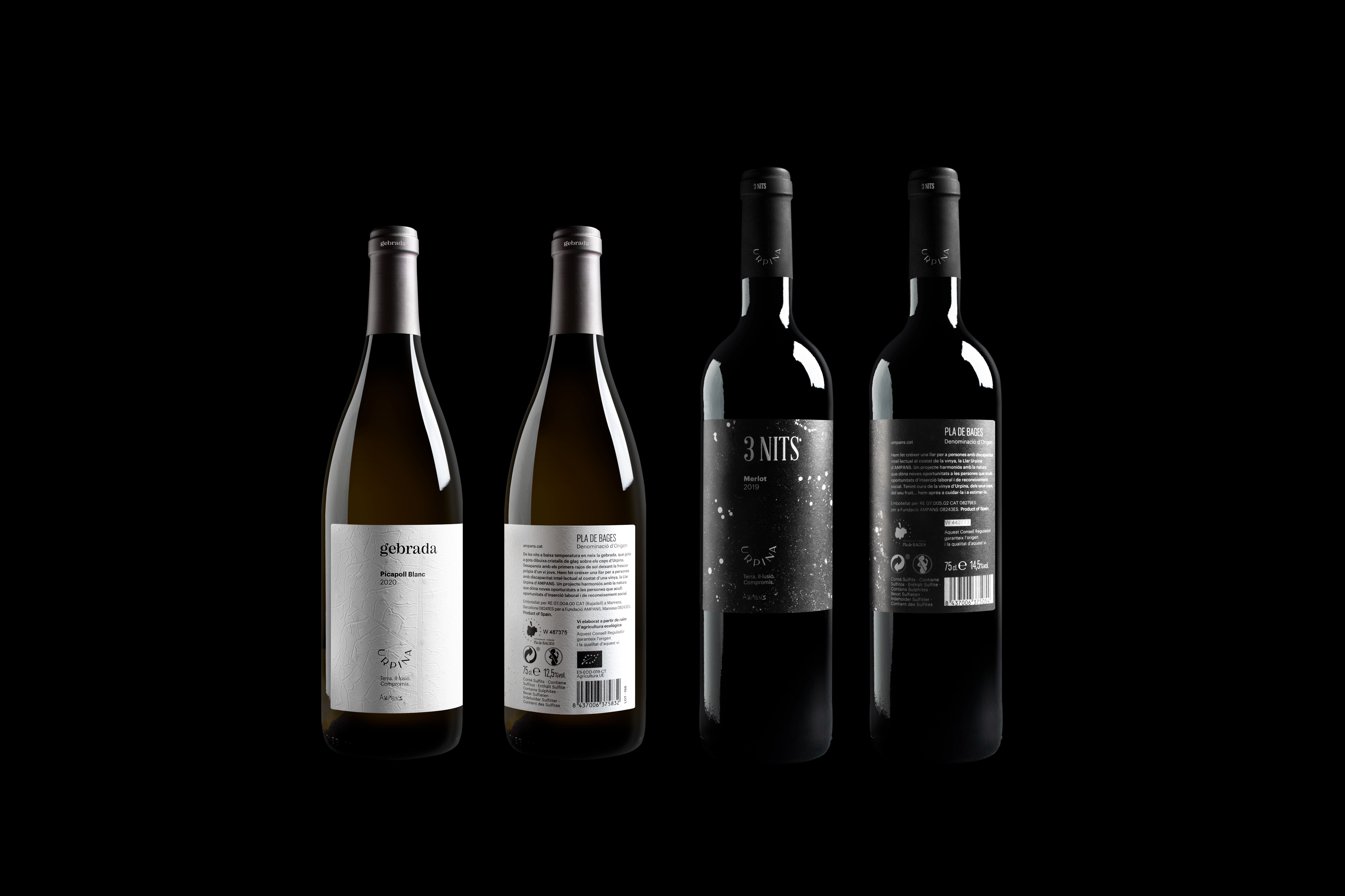
Our challenge was to refresh the brand image and identity of two wines: Gebrada and 3 Nits, by creating a more signature language, linking the brand with its concept, and elevating the wines’ commitment to quality. The first step was to make the logo more authentic, by connecting it with the brand’s promise and warm character. We conjured “the glass of enthusiasm” – an emblematic insignia that represents a wineglass and at the same time embodies Urpina’s elaboration process: the cultivation of joy, the smile of satisfying commitment.
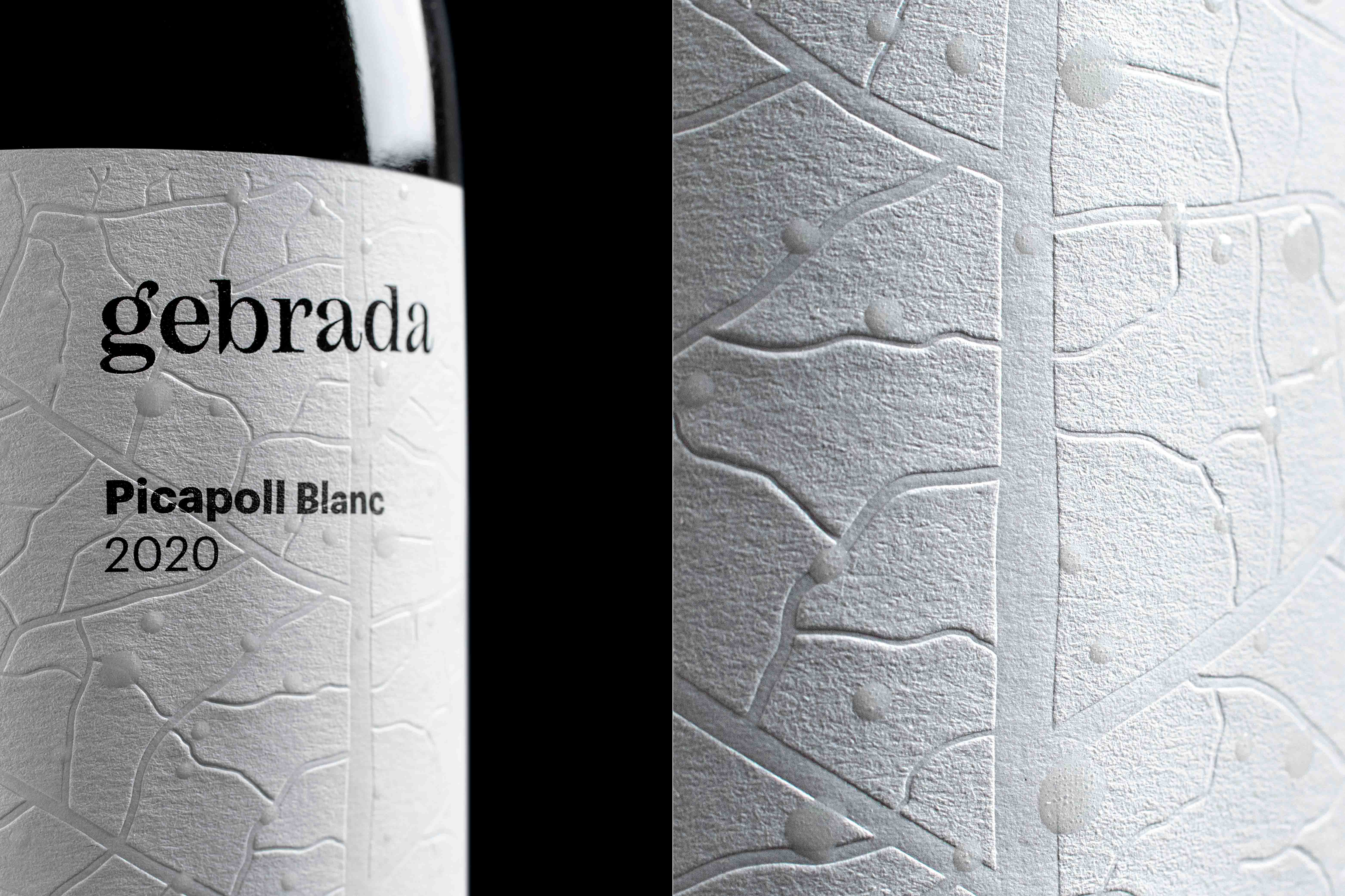
Once the concept was signed and sealed, we turned our hands to the visual identities of Gebrada and 3 Nits, – two of the products of the range. Focusing on Gebrada, we reinforced the naming concept (Gebrada means “frost” in Catalan) by creating a label design that shows the frost drops drying on the vine leaf. In this case, we used white as the main character, adding a layer of varnish and fine dry finishes to simulate the texture and shapes of the dew. The resulting design perfectly elevates the wine to the highest quality and connects it to the core concept.
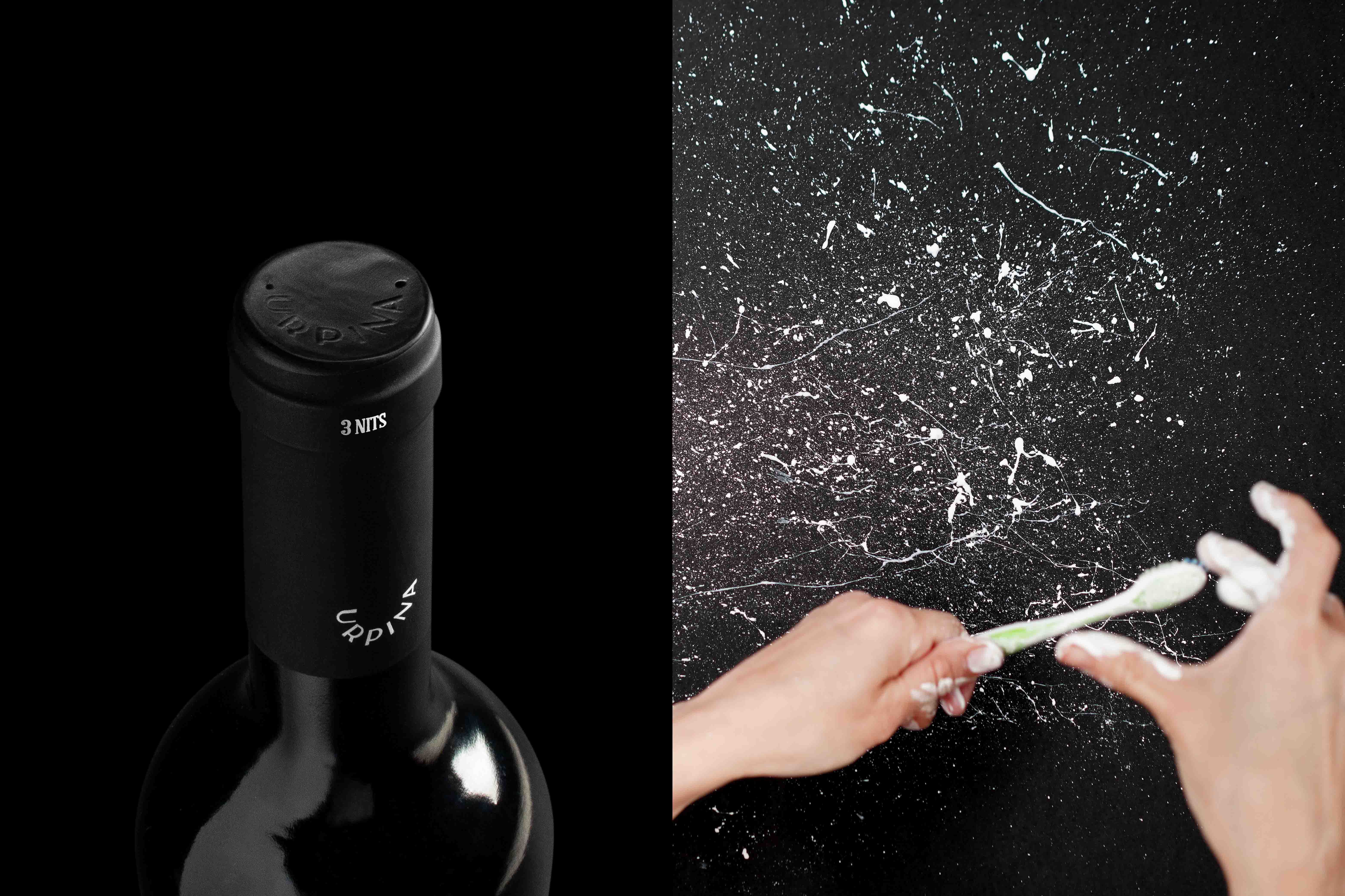
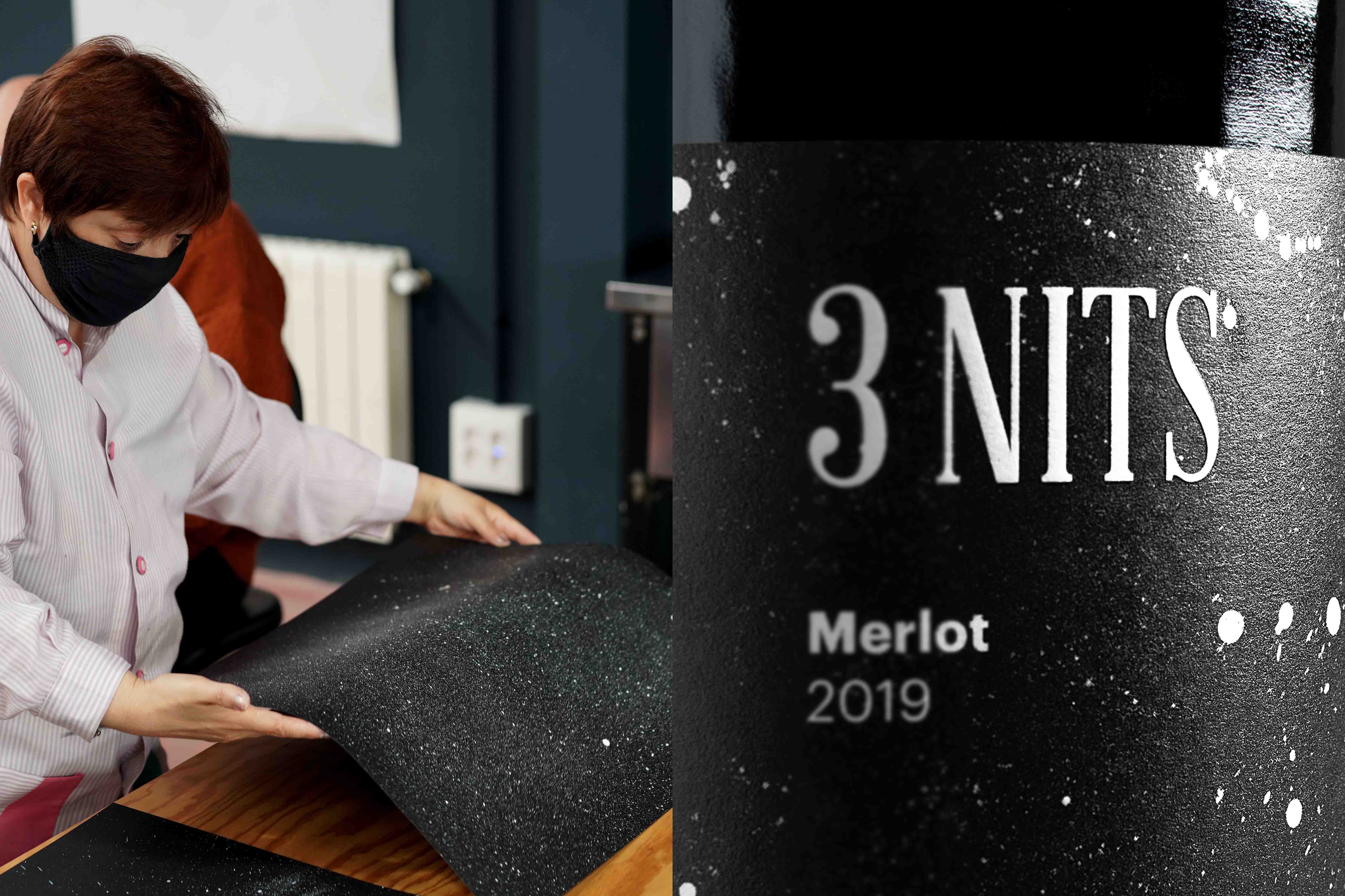
With 3 Nits (3 nights), our objective was to fuse its identity to the brand’s inherent sense of commitment. We organised a workshop with association members to co-create the new visual identity for this product. Toothbrushes, paints, poster boards, and all-hands-on-deck brought continuity to the naming and delivered a visual language symbolises the starry sky through paint splashes, creating a more inclusive cosmos. To round off, in close alignment to Urpina’s essence, we created “Terra. Il·lusió. Compromís” (Land. Joy. Commitment) – an evocative claim with great sonority that encapsulates the heart of the brand’s proposal: cultivating enthusiasm to generate value beyond wine. As part of this special project, we got the opportunity to share a commitment to creating extraordinary things and reveal the character and known-how of people at risk of exclusion.


Credit
Status:Creative
Location:Morillas Brand Design, Spain
Project Status:published
Project Type:Identity
Project Industry:Food/Beverage
Project Market Region:Europe
Project Deliverables:Brand Identity, Branding, Packaging Design
Keywords:, morillas, createsomethingextraordinary, wines, urpina, ampans, brandidentity, packaging, visualidentity, branding, socialinclusion, commitment
More by Morillas Branding Agency
Similar projects