-Profile-Picture.png)
-Profile-Picture.png)
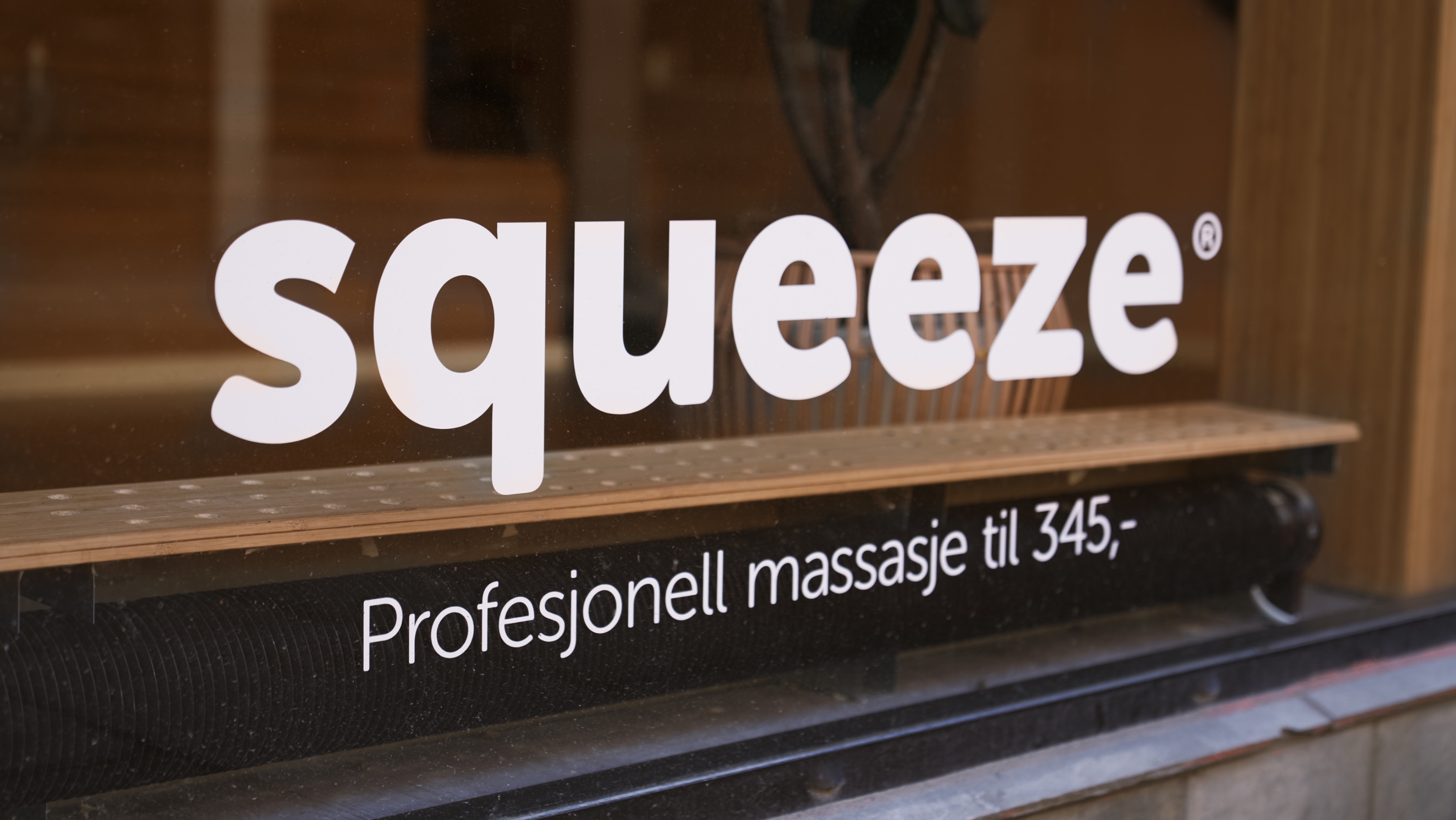
Squeeze Advertising Campaign
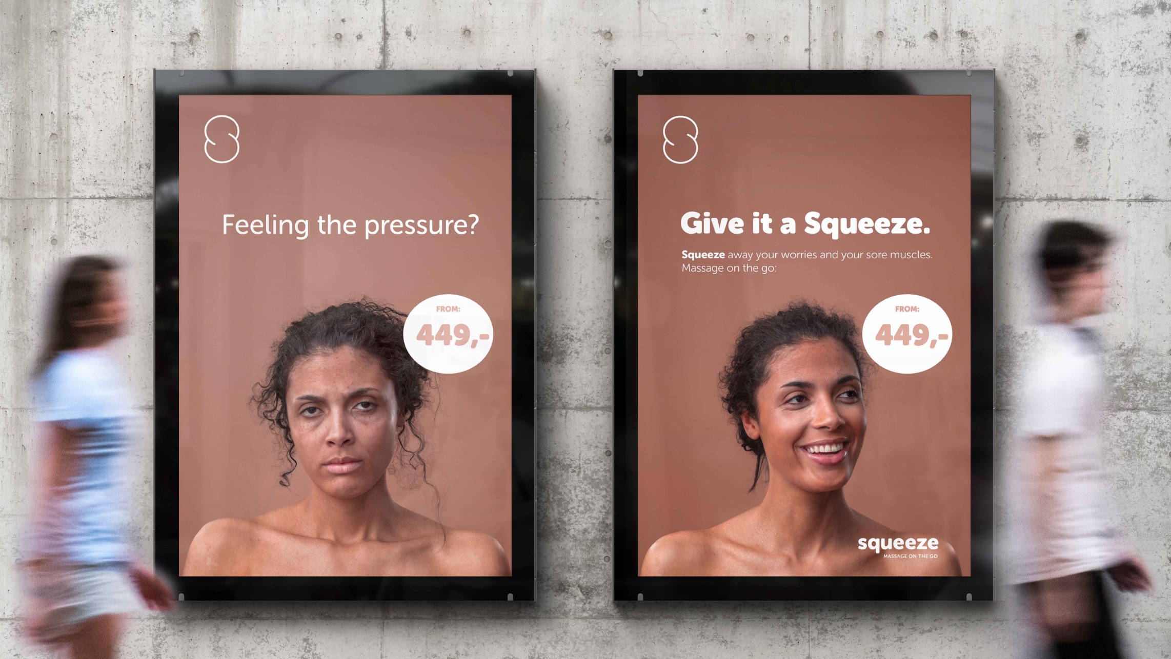
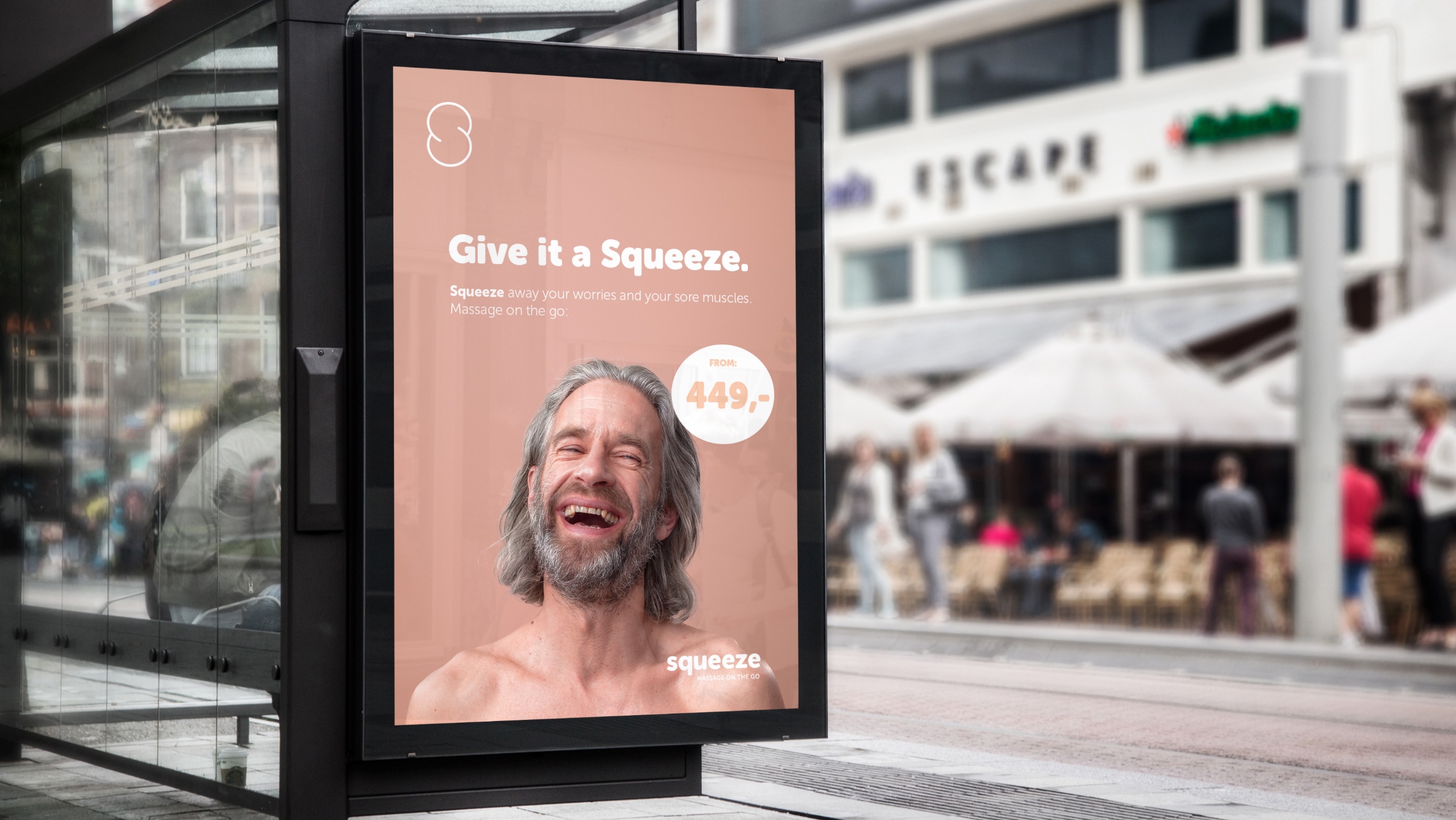
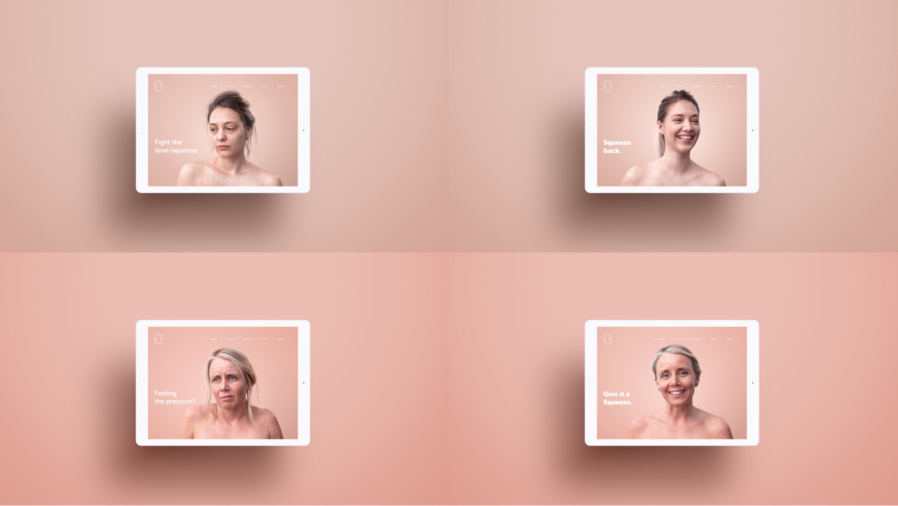
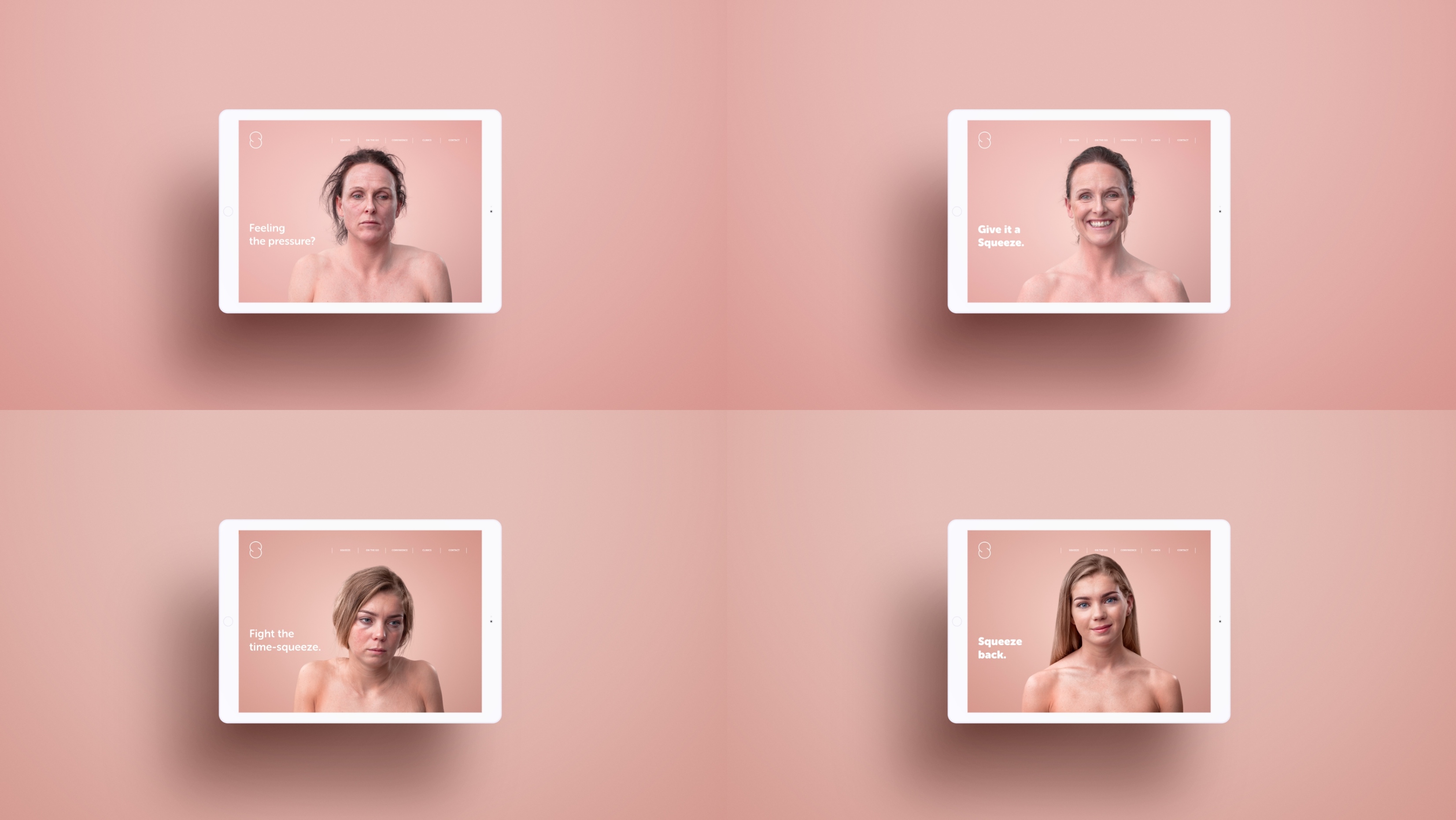
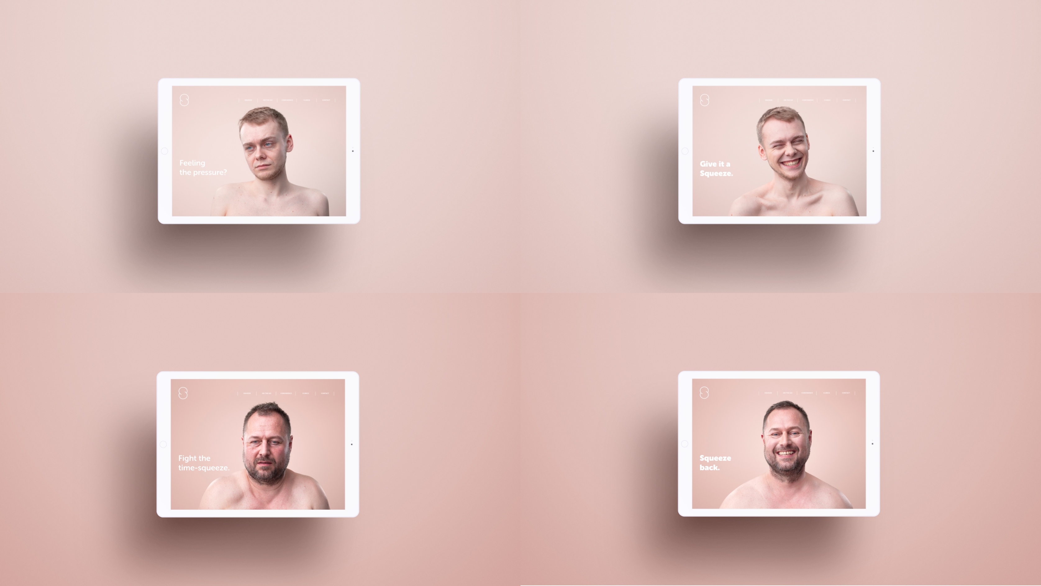
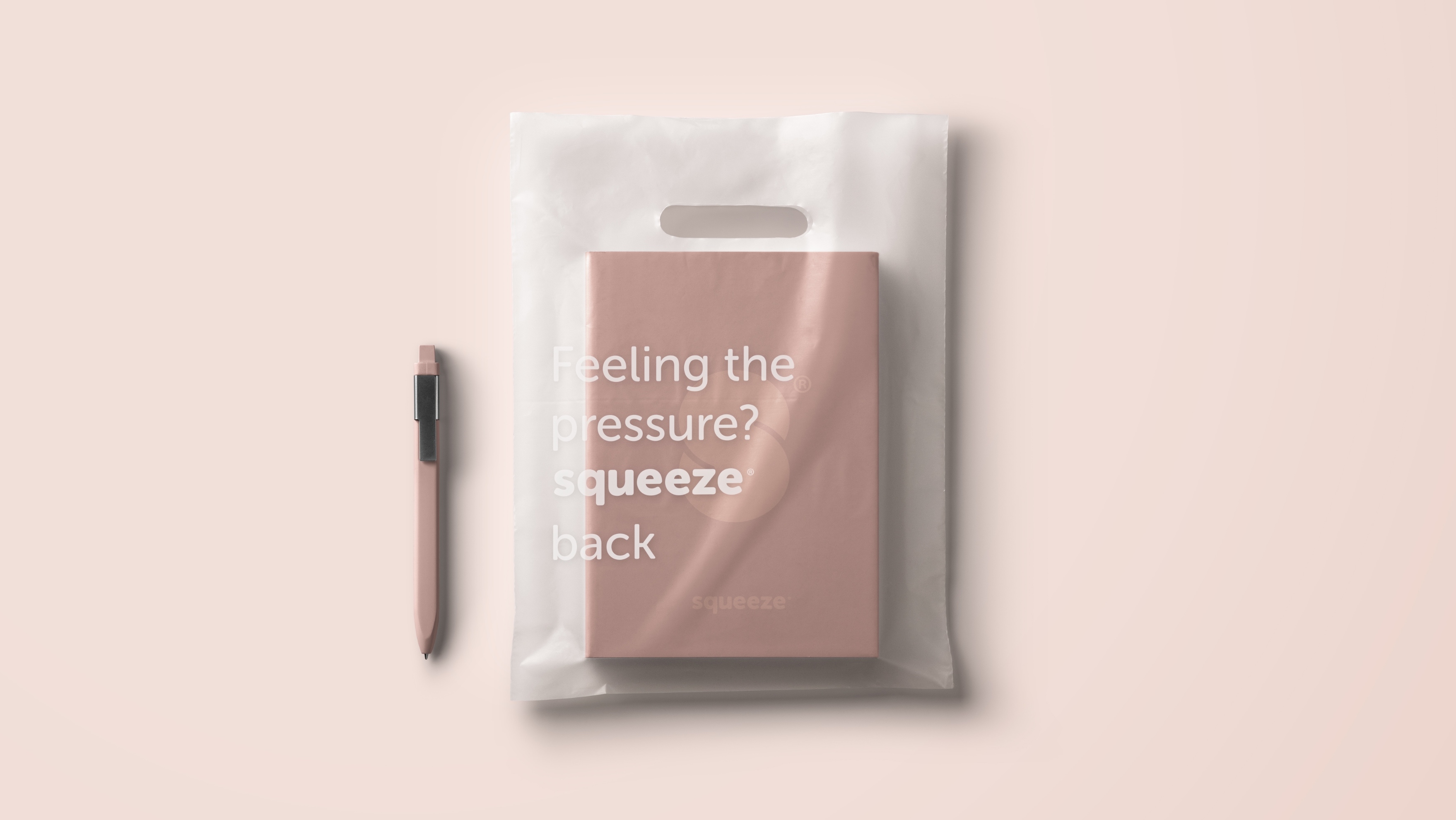
Squeeze, a Norwegian massage chain, has revolutionised the massage industry by focusing on affordable drop-in sessions on the go. The solution is convenient, simple, and effective, providing stress relief at your fingertips. Life is hard, Squeeze is a friendly, comfortable, and soft escape. Feeling the pressure? Give it a squeeze.
Strategic Locations:
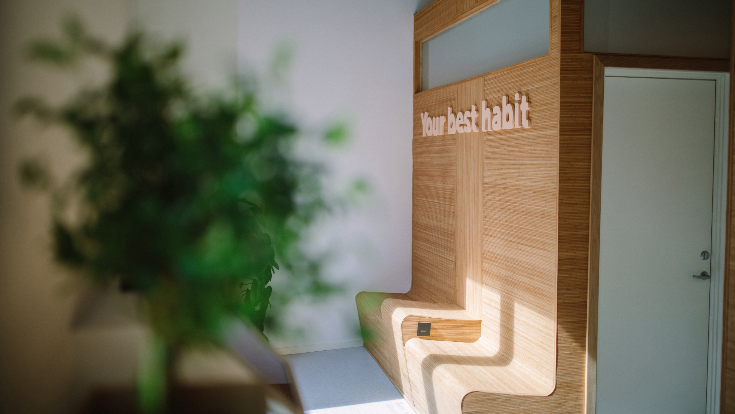
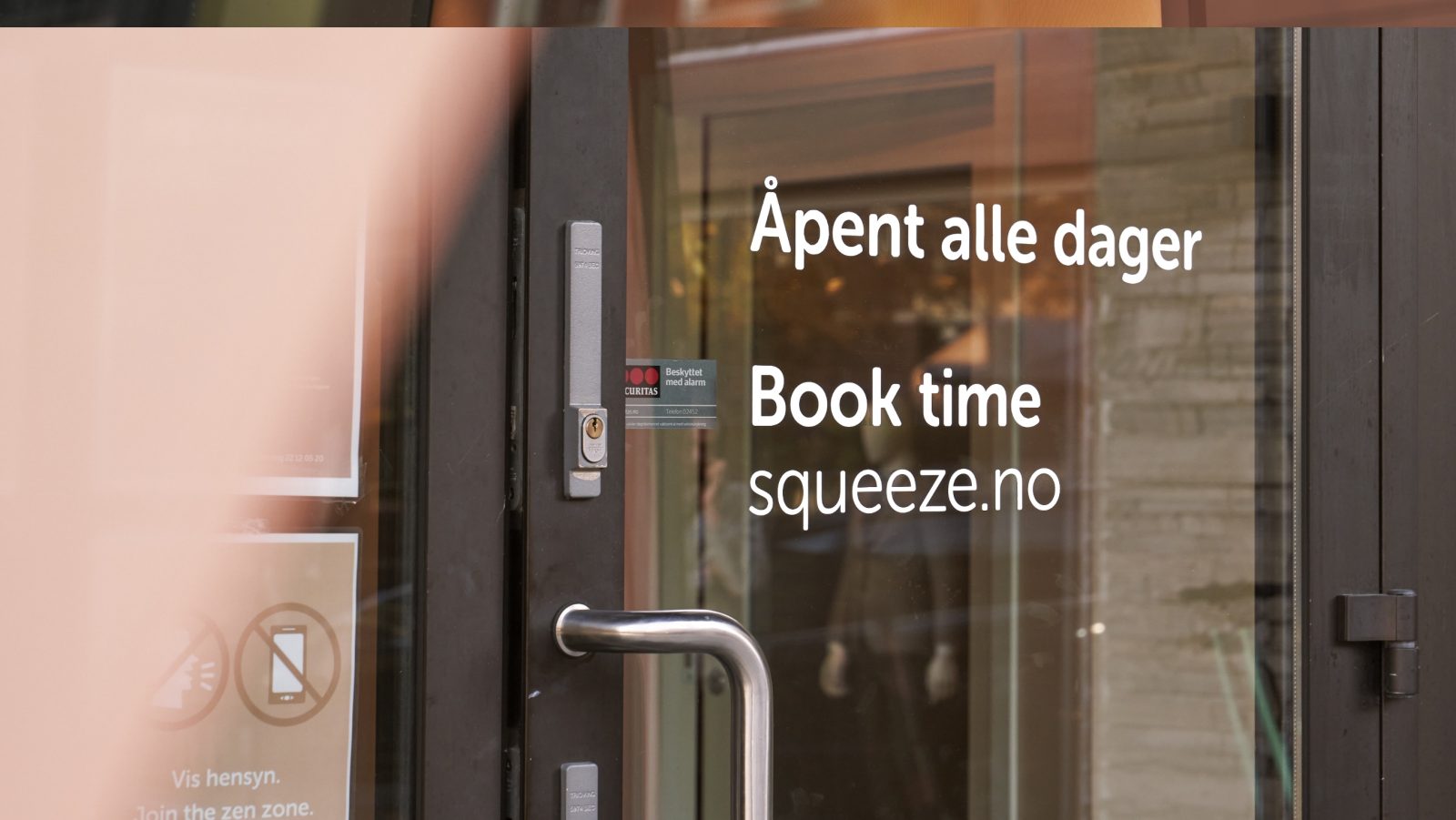
Squeeze strategically positions its massage centres where people need immediate stress release—airports, coworking spaces, and city streets. Modern salons, friendly staff, efficient scheduling at low prices—Squeeze offers a sanctuary to organise your therapy efficiently. With a membership, you can even choose your therapist. Squeeze time, squeeze cost, squeeze your worries away.
Market Positioning:
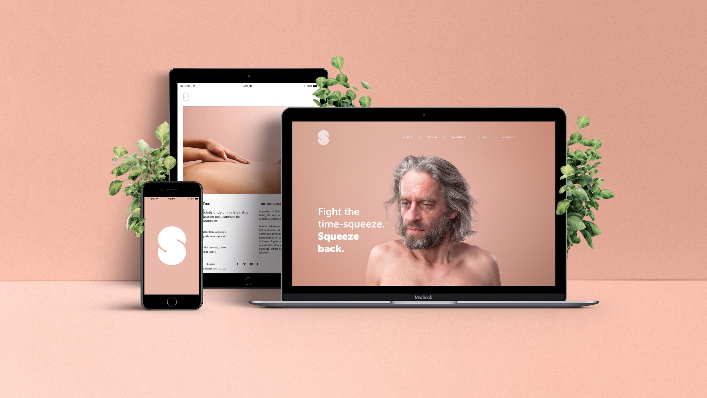
Squeeze bridges the divide by identifying a market gap between expensive luxury clinics and more budget-friendly yet less professional massage parlours. Leveraging digital solutions for quick and efficient bookings, Squeeze has rapidly become a household name in Norway for physical well-being.
Soft Human Touch:
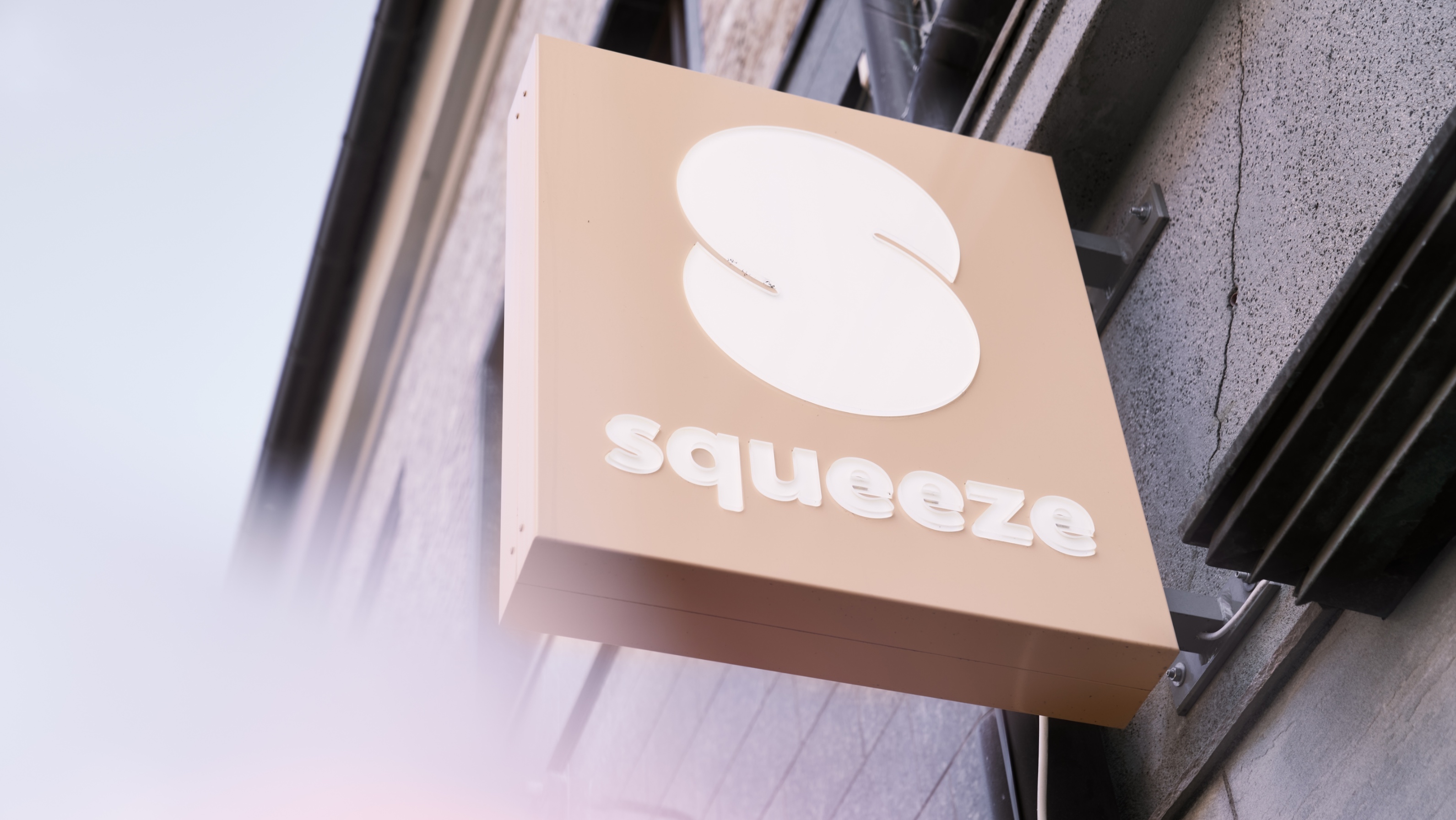
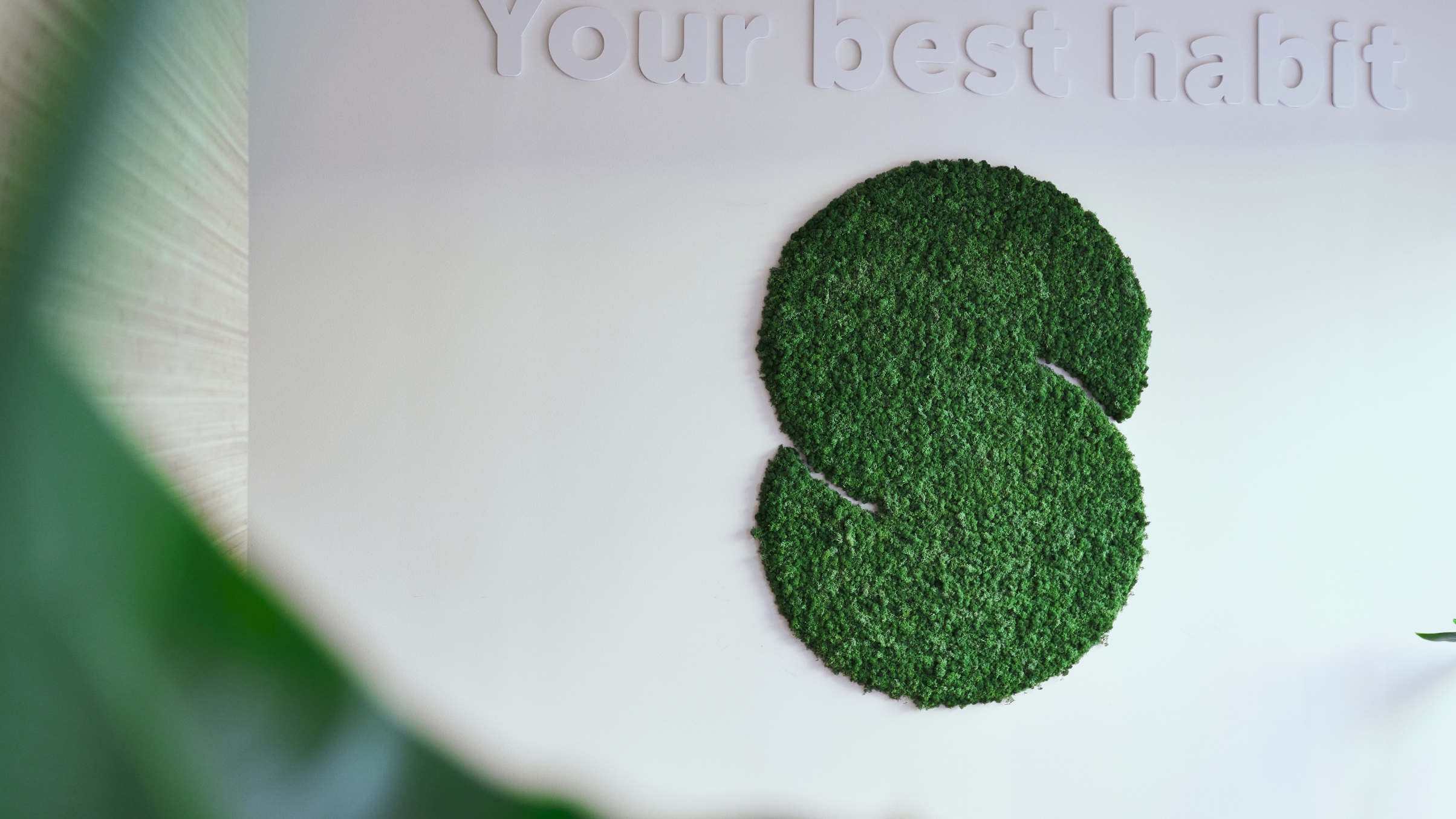
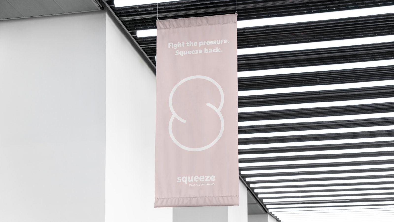
Squeeze’s visual identity draws inspiration from soft, human forms. The ’S’ in the logo is playfully squeezed, reflecting a gentle and friendly touch. Humour and approachability are key elements in communication and imagery, humanising both the clinics and the brand, making them more relatable and approachable.
Friendly and Approachable:
Humour and a lighthearted approach to communication and visual style contribute to the brand’s accessibility. By incorporating these elements, Squeeze has successfully made its clinics and services more down-to-earth, resonating with a broader audience.
Dynamic Palette:
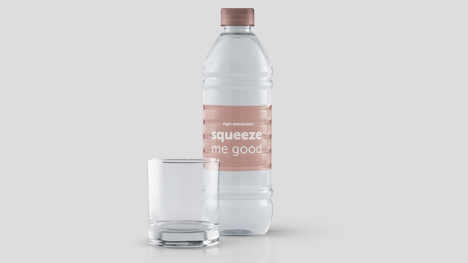
The dynamic colour palette takes cues from skin tones, creating a warm and human-centric identity. The chosen colours evoke a sense of comfort and friendliness, reinforcing the brand’s commitment to providing a welcoming and enjoyable experience.
Typography:
Squeeze employs a rounded grotesque typeface known for its friendly and warm characteristics. This choice in typography aligns with the brand’s identity, conveying a sense of approachability and warmth.
Communication Style:
The brand’s communication is characterised by humour, simplicity, and positivity. Squeeze has crafted a fun narrative, ensuring its messaging resonates positively with the audience. This approach differentiates the brand and establishes a memorable and engaging connection with customers.
Squeeze’s visual branding is a testament to the brand’s commitment to creating an effective but also friendly, comfortable, and soft environment—a true reflection of the brand’s ethos.
Conclusion:
Squeeze is not just a massage; it’s a lifestyle choice. Transforming the perception of massages from a luxury to a necessity, Squeeze stands out as a brand that understands the pulse of modern life—fast-paced, demanding, and in need of an instant escape. The brand journey of Squeeze showcases how simplicity, accessibility, and a touch of comfort can redefine an entire industry.
Credit
Status:Agency
Location:Bergen, Norway
Project Status:published
Project Type:Campaign
Project Industry:Health Care
Project Market Region:Europe
Project Deliverables:Advertising
Keywords:WBDS, Agency, Design, Awards, 2023/24
Additional Credits:
Chief Creative DirectorTom Emil Olsen
Design DirectorKnut Harald Longva
Senior DesignerEmil Olsen
Graphic DesignerMichal Leonchuck
Director of PhotographyChristoffer Meyer
Key Account ManagerBeate Myren Romslo
Strategic Brand DirectorThomas Danielsen
Kristine FlatlandGraphic Designer
More by KIND (Conceptual Branding AS)