

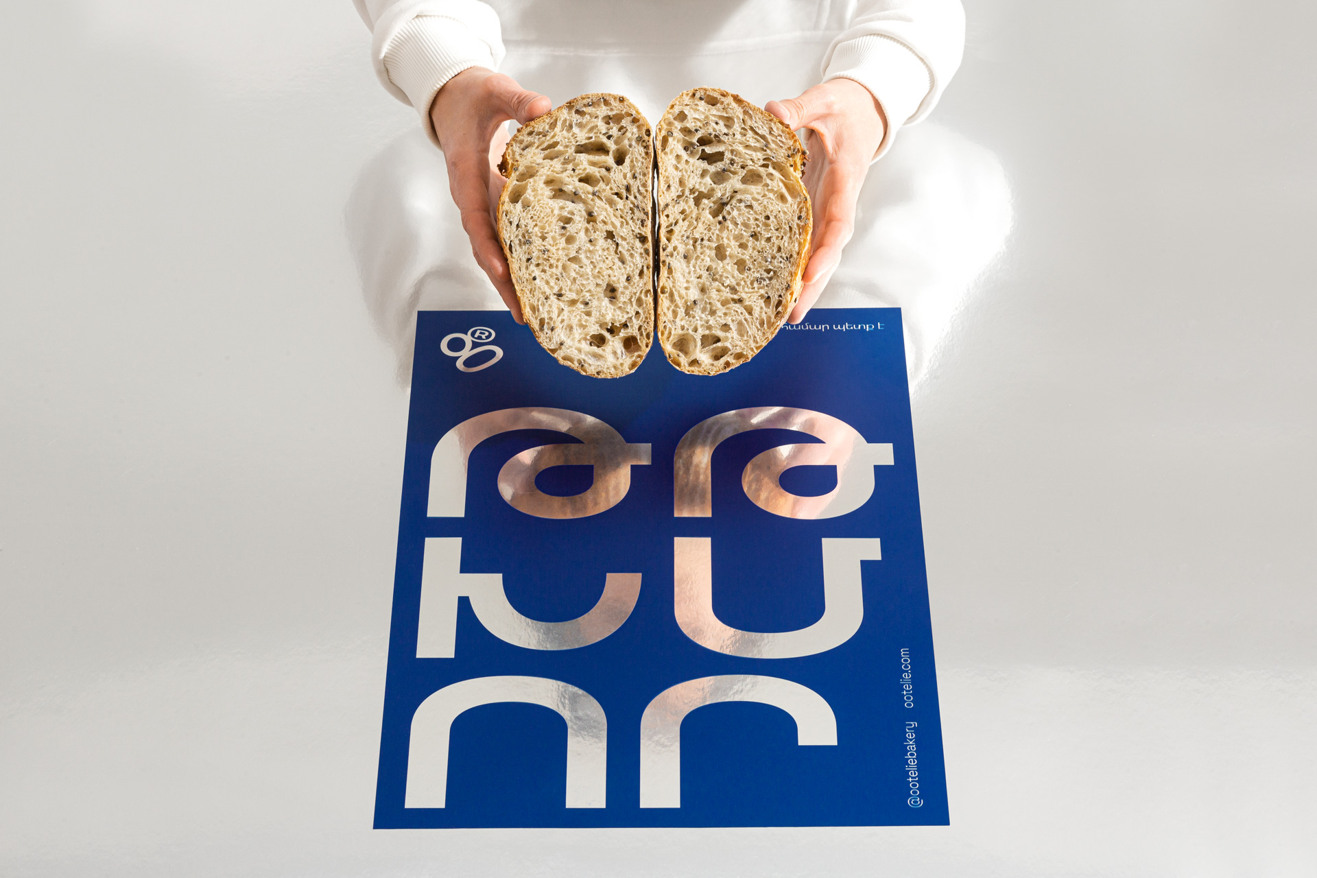
Branding for Ootelie Artisan Sourdough Bakery
Ootelie (translated as “good enough to be eaten” in Armenian) is an artisan sourdough bakery located in the scenic town of Dilijan. The bakery also functions as a food lab, investigating and experimenting with different ingredients.
The bakery's unwavering commitment to crafting exceptional breads has prompted them to delve deeper into the rich history and culture of Armenian bread making.
Through meticulous research, Ootelie has gained invaluable insight into traditional bread baking practices, which they skillfully combine with modern techniques to produce truly unique breads.
Our challenge was to create a look and feel for Ootelie.
We initiated our research by analyzing the fundamental and microscopic nature and visual characteristics of sourdough, its history, and its appearance.
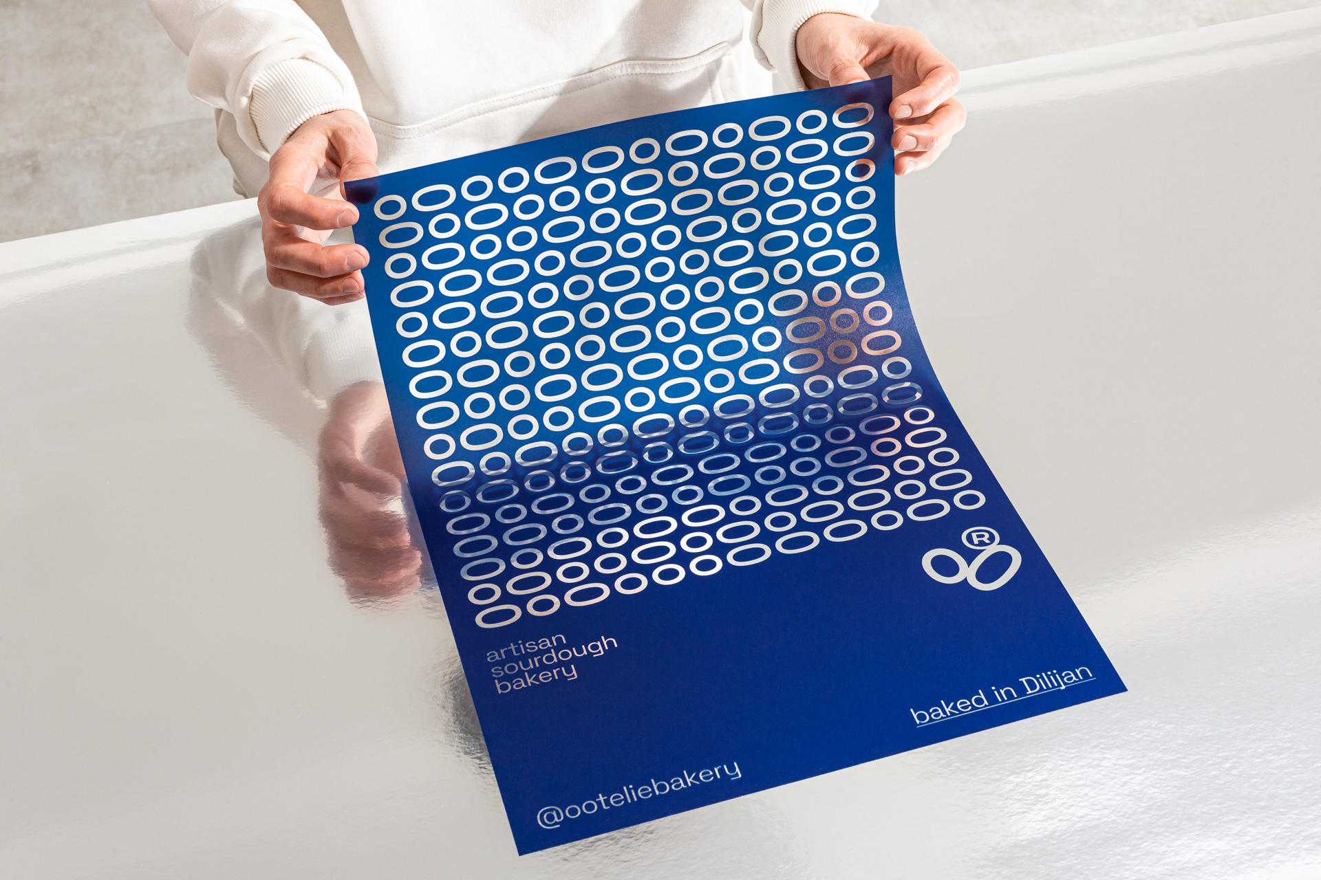
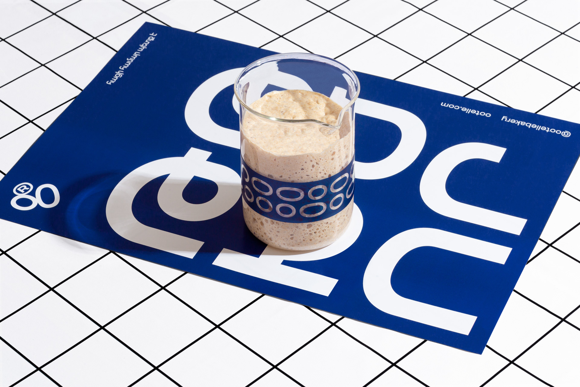
Sourdough bread is a naturally leavened bread made by the fermentation of dough using wild bacteria and yeast. When looking at sourdough under a microscope, the yeast cells typically appear as small oval or spherical shapes, and as living organisms, they constantly exhibit movement and change direction. We took this idea as the basis of the concept and dynamic identity.
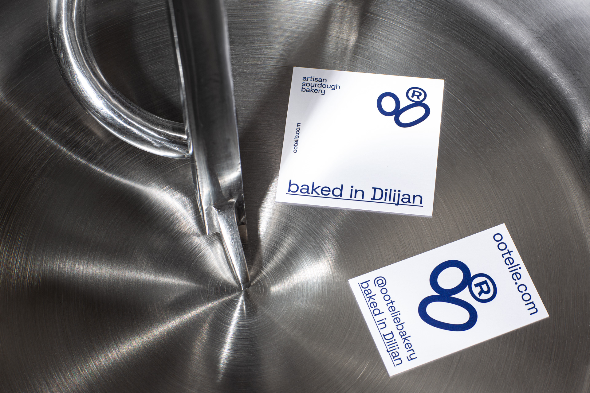
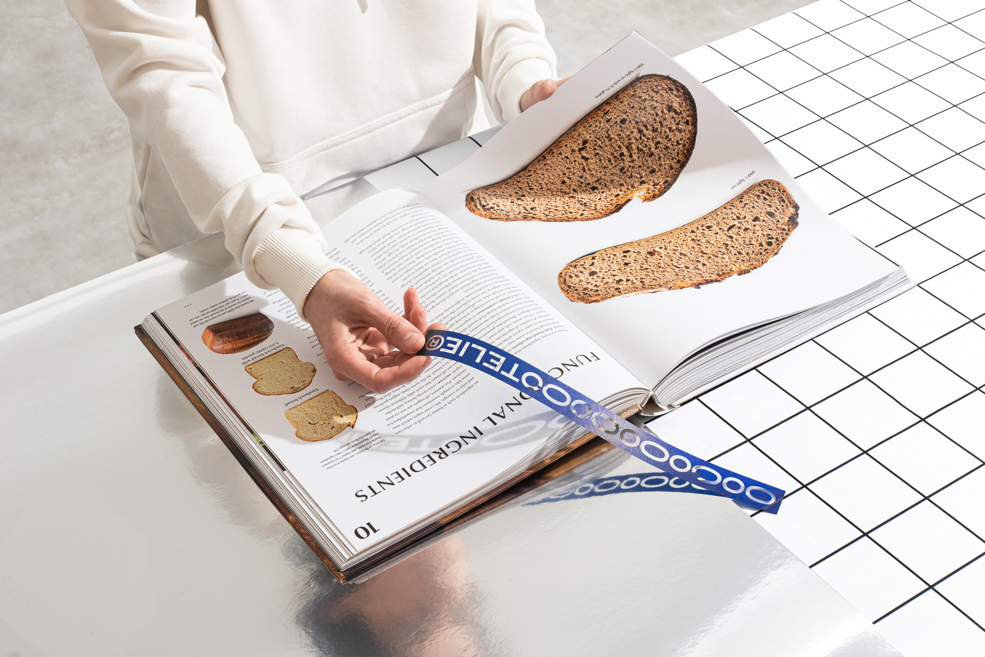
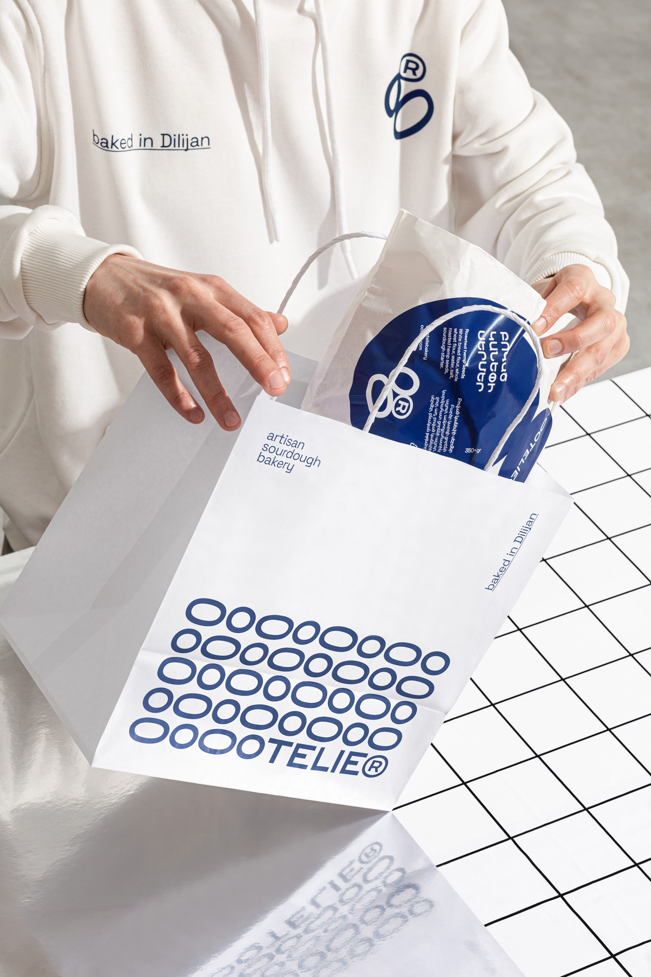
Given that the brand name "ootelie" contains two o's, we opted to design the letters in a manner that resembles the physical appearance of bacteria when observed under a microscope. The two o's have thus been elevated to the foundational element of the entire brand identity.
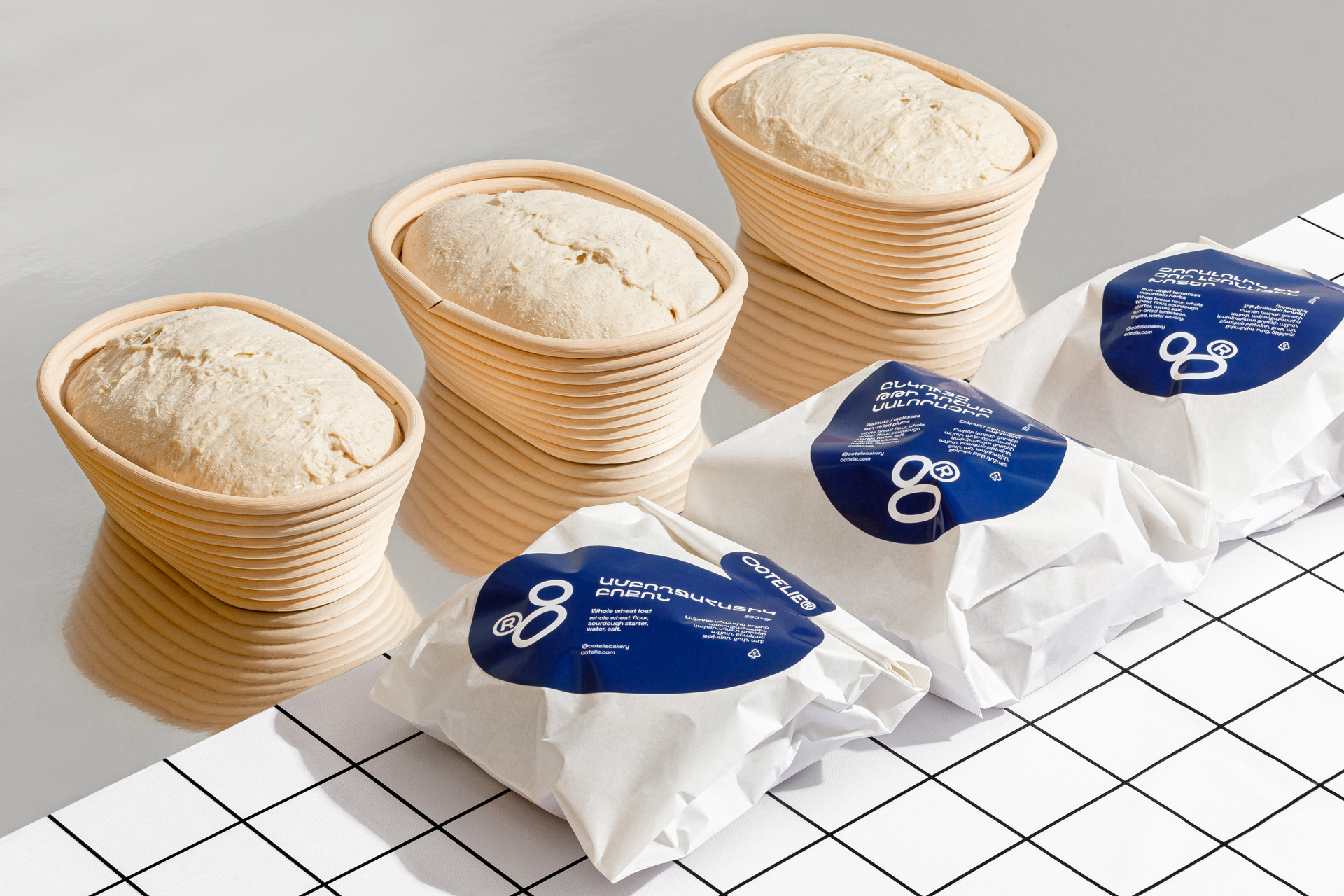
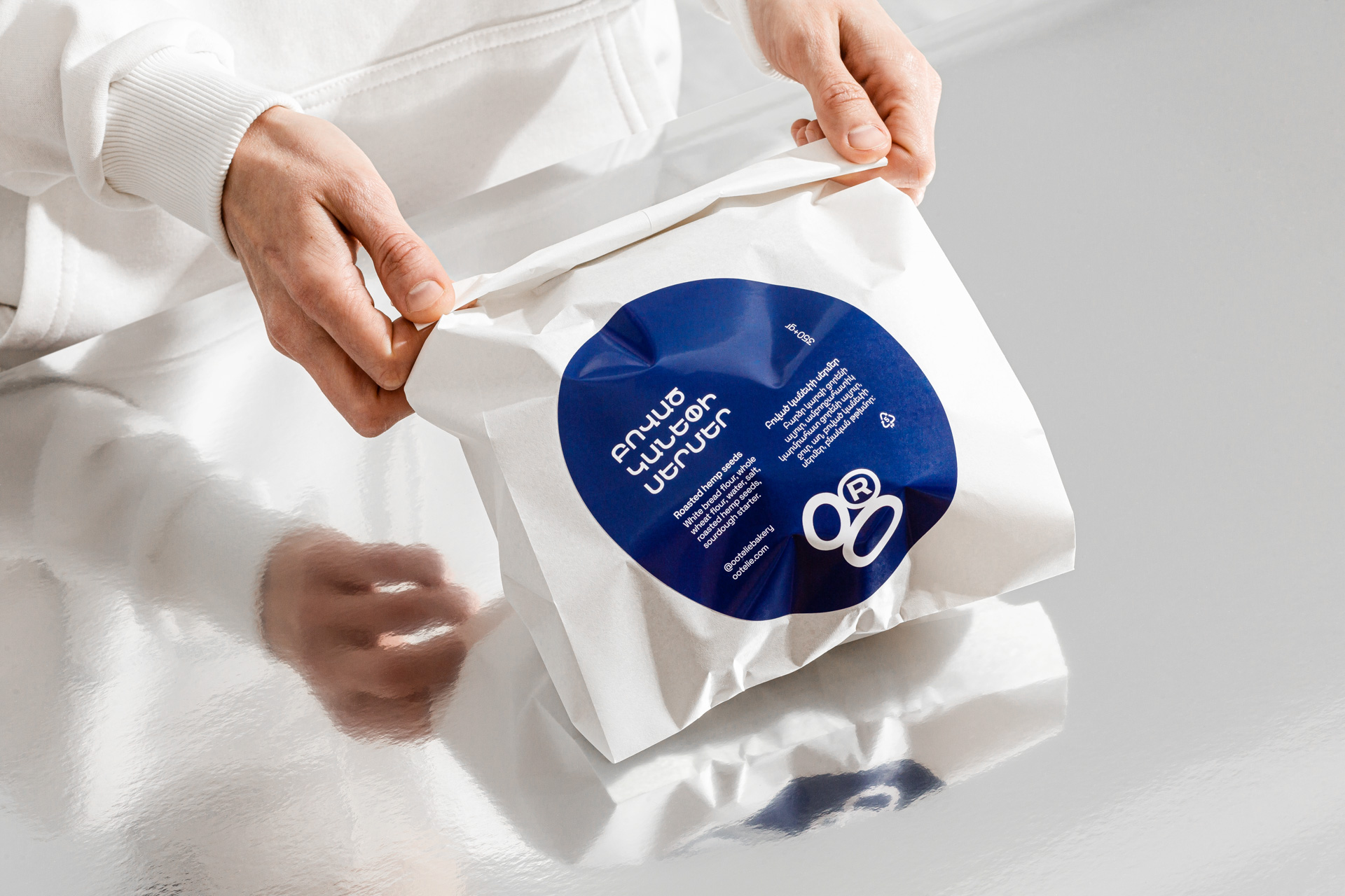
In crafting a dynamic monogram for our brand, we drew inspiration from the two o's and the registered sign. The registered sign was harmoniously incorporated into our concept as the third member of the yeast, owing to its round shape which mirrors that of the o's.
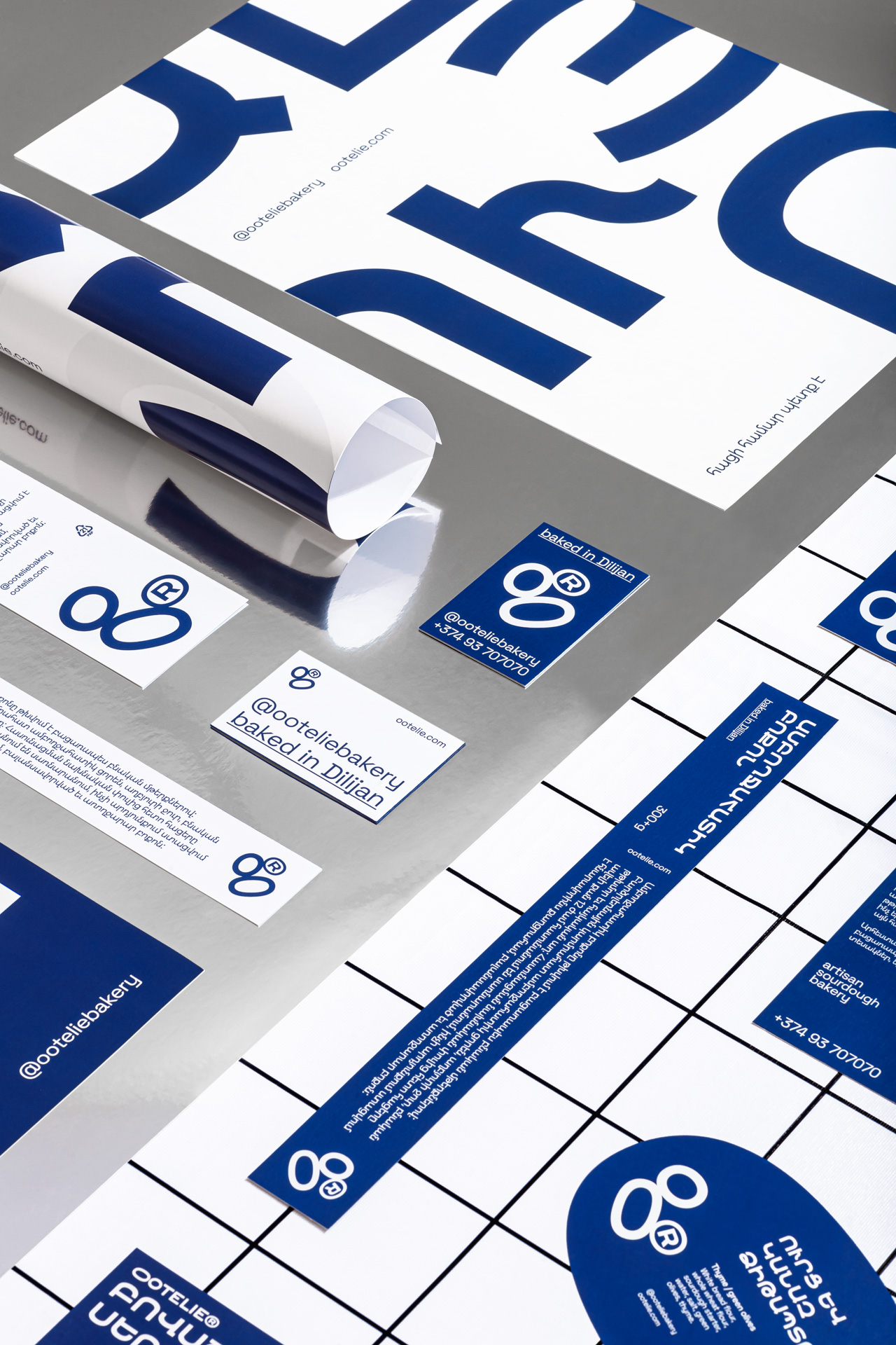
In a bid to underscore the idea that our brand is a living organism, we have ensured that the monogram is strategically placed on all our communication materials. This placement varies from one material to another, serving as a visual cue that the monogram is not static but rather dynamic, much like a living organism that is constantly evolving.
On posters we show the key ingredients that make up the bread-making process. Specifically, we showcase Armenian words that represent the vital components used in crafting this staple food; flour (ալյուր), salt (աղ), sourdough (թթխմոր), water (ջուր).

Credit
Name:Formascope Agency
Status:Agency
Location:Yerevan, Armenia
Project Status:published
Project Type:Identity
Project Industry:Food/Beverage
Project Market Region:Europe
Project Deliverables:Art Direction, Brand Creation, Brand Design, Brand Identity, Brand Tone of Voice, Branding, Design, Identity System, Packaging Design, Photography, Typography
Keywords:bread, bakery, minimalism, forms, shapes, identity, packaging, branding, design, artisan, sourdough
Additional Credits:
Art directorKaren Gevorgyan
Graphic designersMery Sargsyan, Sen Olqinian
CopywritingAni Gevorgyan
PhotographyArnos Martirosyan
More by Formascope Agency
Similar projects