

Ripe for an Uplifting Refresh
Our Leeds team was given a juicy challenge. Cider brand Somersby was already bearing fruit for Carlsberg. The brand had built a strong emotional connection with consumers around the world. But with many new brands entering the market, we wanted to build on Somersby’s success and keep ahead of competition. The opportunity was to elevate the brand and break the traditional cider category tropes and create something more than just a cider. Carlsberg wanted to bring simplicity to its multi-tier brand architecture, as well as flexibility to meet the needs of different market environments. Somersby wanted to ensure that it continued to be distinctive, ownable, recognisable and campaignable. The brand was ripe for a refresh.
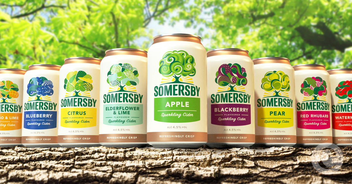
The positioning, ‘Refreshingly Optimistic’ is a rallying cry encouraging consumers to come together, enjoy carefree time and embrace life. Every asset was designed to be a ‘smile in the mind’, to tell the Somersby brand story and to bring its brand values of sharing, being uplifting and embracing optimism to life. Moving away from the literal interpretation of an apple tree, an established category code, our Leeds team developed the idea of a ‘living tree’ – a dynamic symbol with many expressions bringing the various flavours to life. Flowing curves paired with bright colours welcome consumers to a refreshingly optimistic brand, in complete alignment with the new positioning. The fixed iconic shape provides meaningful brand architecture, whilst the flexible canopy brings each of the refreshing flavours to life, capturing the individual tasting notes.
The positioning, ‘Refreshingly Optimistic’ is a rallying cry encouraging consumers to come together, enjoy carefree time and embrace life. Every asset was designed to be a ‘smile in the mind’, to tell the Somersby brand story and to bring its brand values of sharing, being uplifting and embracing optimism to life. Moving away from the literal interpretation of an apple tree, an established category code, our Leeds team developed the idea of a ‘living tree’ – a dynamic symbol with many expressions bringing the various flavours to life. Flowing curves paired with bright colours welcome consumers to a refreshingly optimistic brand, in complete alignment with the new positioning. The fixed iconic shape provides meaningful brand architecture, whilst the flexible canopy brings each of the refreshing flavours to life, capturing the individual tasting notes.
Credit
Name:Elmwood
Status:Creative
Location:Not specified, United Kingdom
Project Status:published
Project Type:Packaging
Project Industry:Not specified
Project Market Region:Global
Project Deliverables:Brand Creation, Brand Experience, Brand Guidelines, Brand Identity, Brand Redesign, Brand Refinement, Brand Rejuvenation, Brand Strategy, Brand World, Branding, Graphic Design, Identity System, Illustration, Packaging Design, Product Architecture, Rebranding, Research
Keywords:Not specified
More by Elmwood