

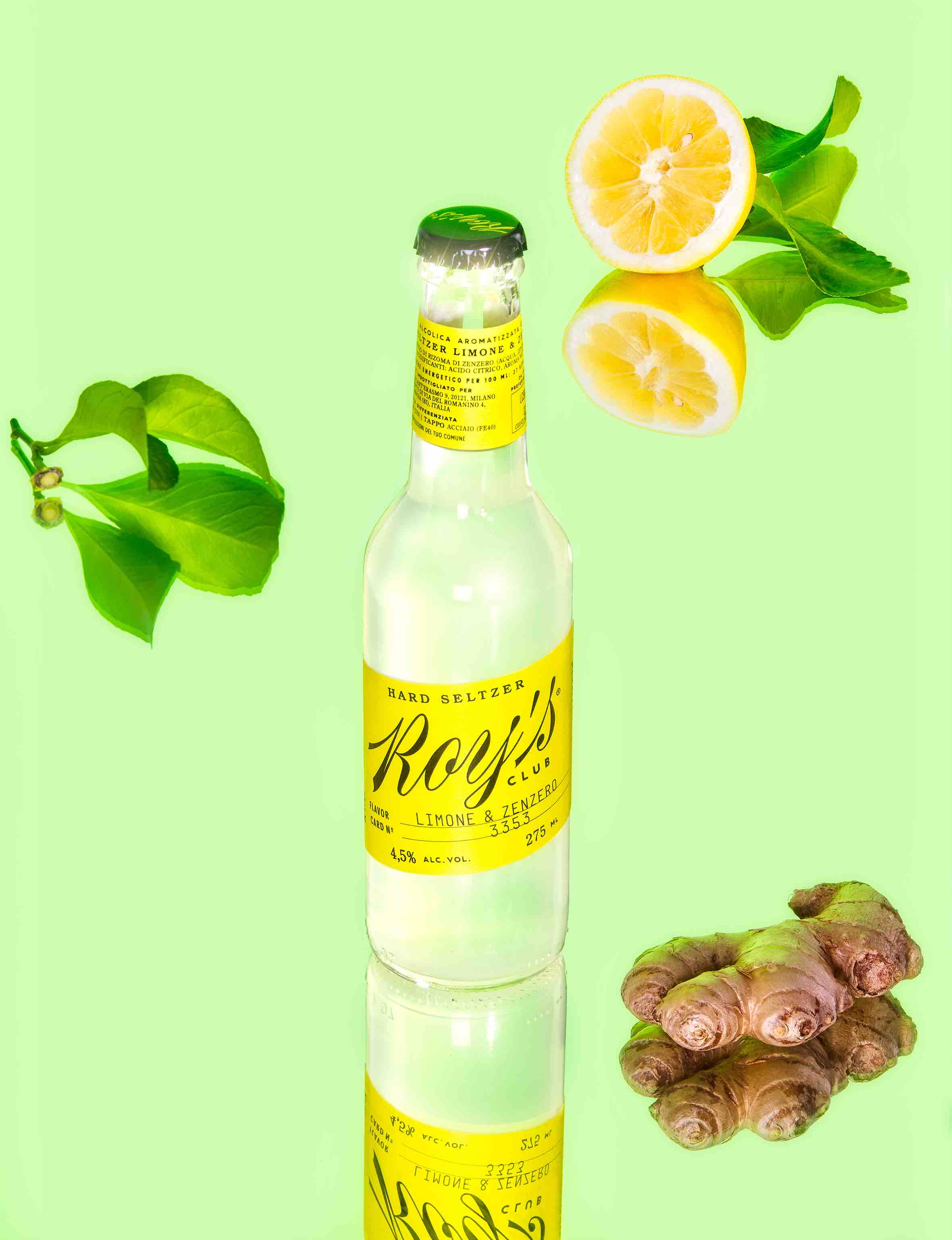
Roy's Club Hard Seltzer Labels Design with Italian Social Club Vibes
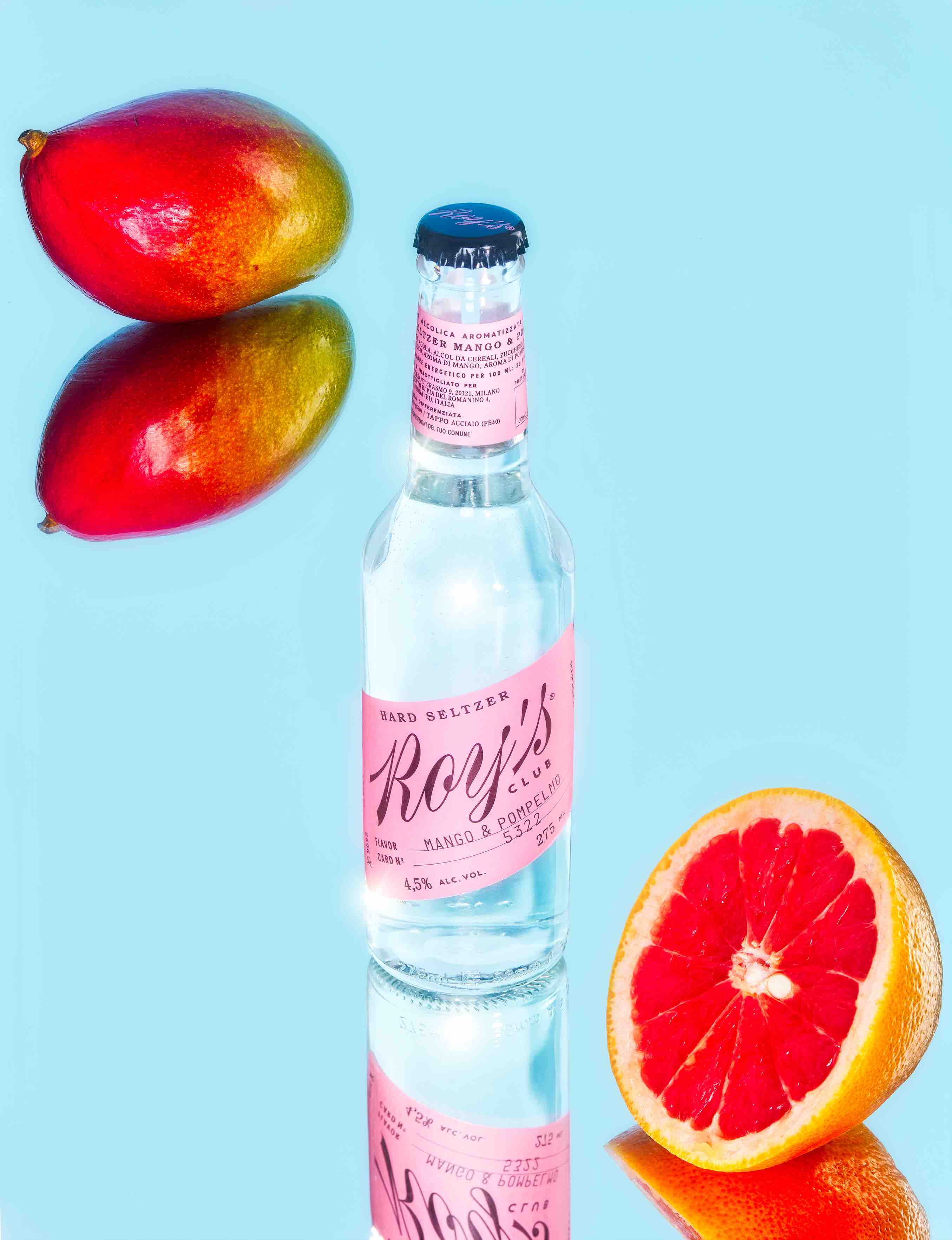
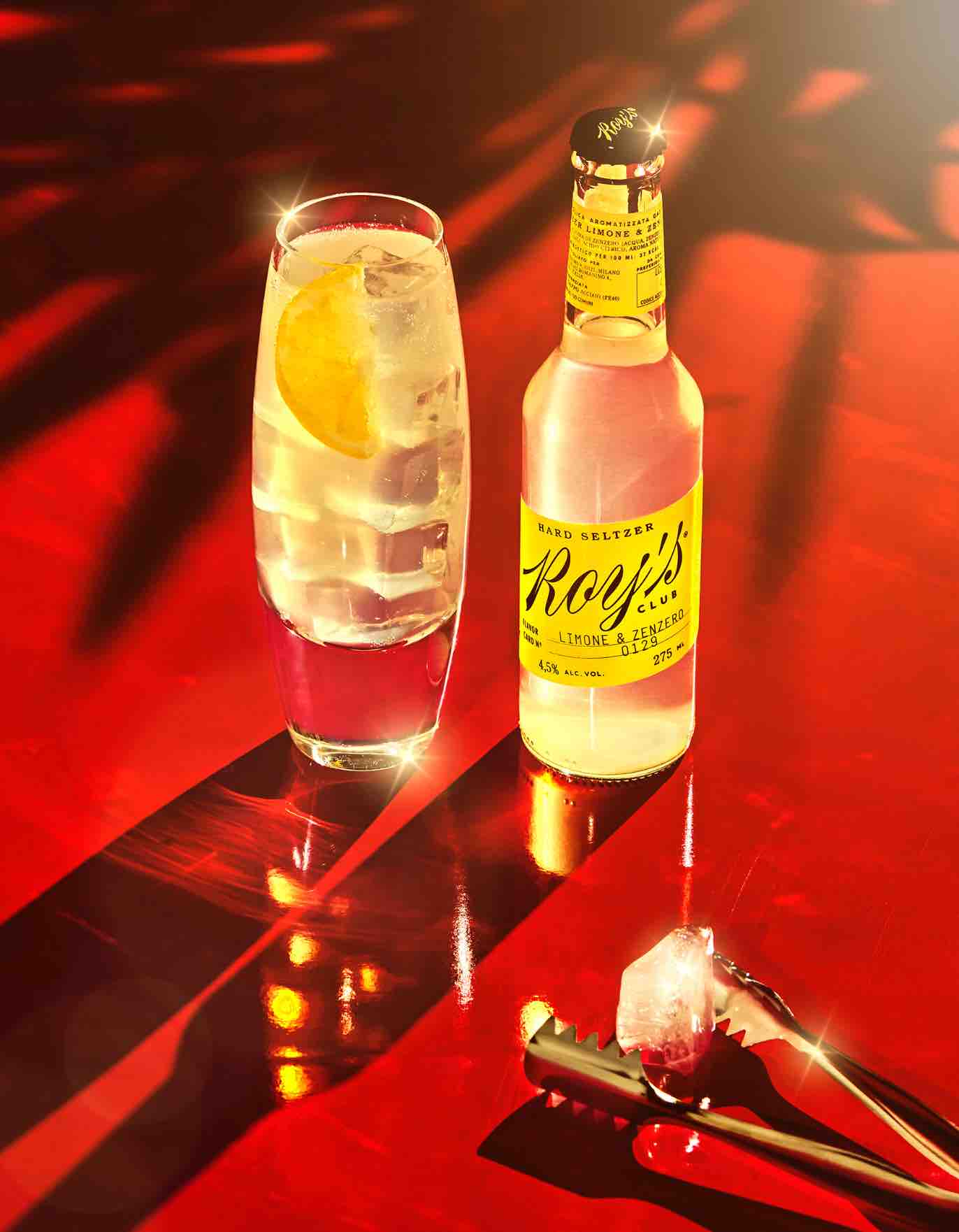
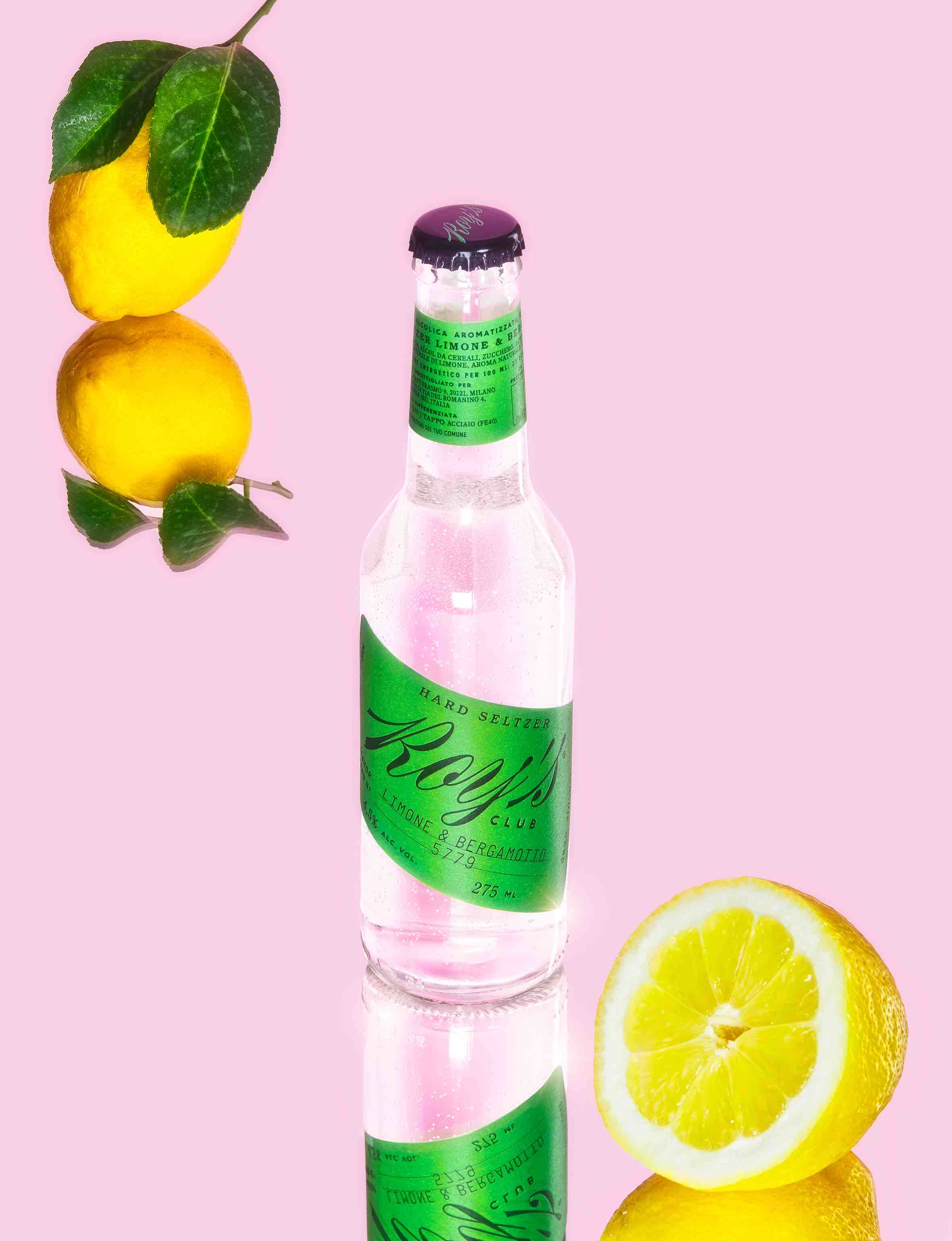
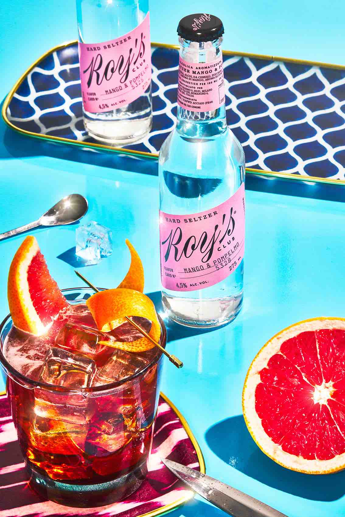
Roy's Club, a brand that came to life in 2022, is a novel and refreshing addition to the world of Italian beverages, specifically hard seltzer. At its core, Roy's Club aims to introduce Italy to the delightful realm of low-alcohol beverages, setting a trend and creating a new standard within the industry. As the purveyors of style, taste, and tradition, we were entrusted with the task of designing labels for a line of hard seltzers, each housed in a 275 ml glass bottle. The brand's vision is not just about crafting any hard seltzer; it's about redefining the experience and setting a new benchmark.
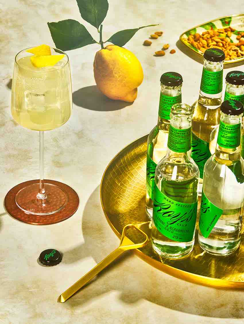
Our challenge was to encapsulate the essence of Italian elegance and create a design that's not just fresh but also deeply reflective of the Italian identity. To achieve this, we embraced the concept of a 'social club.' Each label was conceived as a symbolic membership card to Roy's Club, a club that encapsulates not only the present but also the rich history of Italian social life. Drawing inspiration from vintage business cards and iconic imagery of legendary Italian clubs from the past, we embarked on a journey to pay homage to tradition and set new trends.
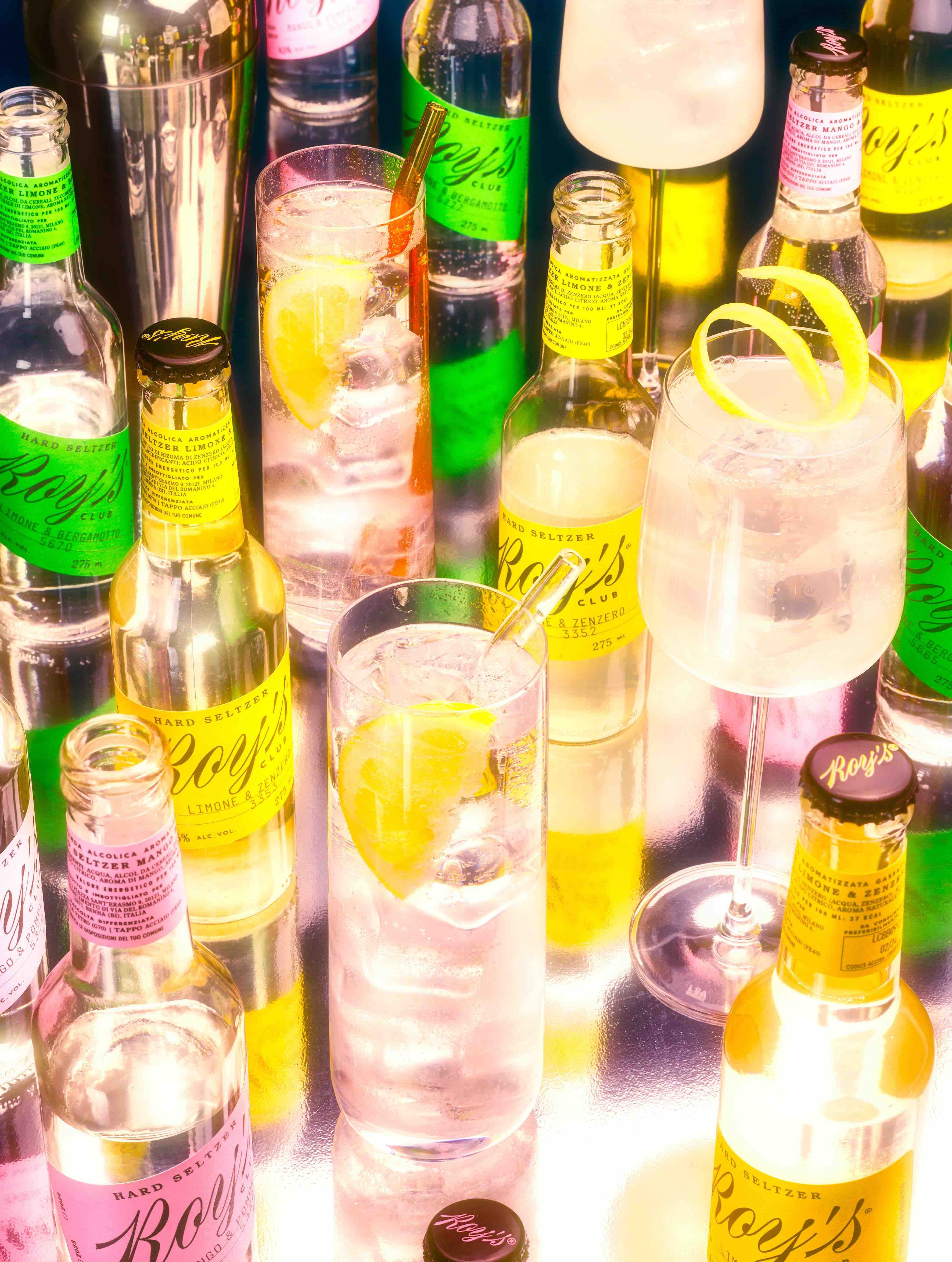
What makes Roy's Club truly exceptional is the personalized touch. Each bottle is not just a part of a lineup; it's a unique piece of art. Individual numbering was introduced to underline this distinctiveness, ensuring that every bottle tells a story of its own. The centerpiece of our design is an elegantly whimsical custom script typeface, complemented by secondary serif and sans-serif fonts. The creative interplay of these fonts adds an element of playfulness to the design, especially noticeable on the bottle neck, where we wanted to create a visual impact.
We sought to create a design that not only reflects the premium quality of the product but also invites consumers to step into a world that marries tradition and modernity. Roy's Club is more than just a beverage; it's an invitation to savor the pleasures of a bygone era in a modern and elegant form. With this design, we hope to convey the brand's commitment to quality, style, and a memorable Italian experience that transcends time and leaves an indelible mark on the world of hard seltzer.
Credit
Name:Auge Design
Status:Agency
Location:Firenze, Italy
Project Status:published
Project Type:Packaging
Project Industry:Food/Beverage
Project Market Region:Europe
Project Deliverables:Packaging Design
Keywords:WBDS, Agency, Design, Awards, 2023/24
Additional Credits:
Executive Creative DirectorDavide Mosconi
Associate Creative DirectorAndrea Mastroluca
DesignerAlessandro Sasso
PhotographerMaurizio Di Iorio
More by Auge Design