

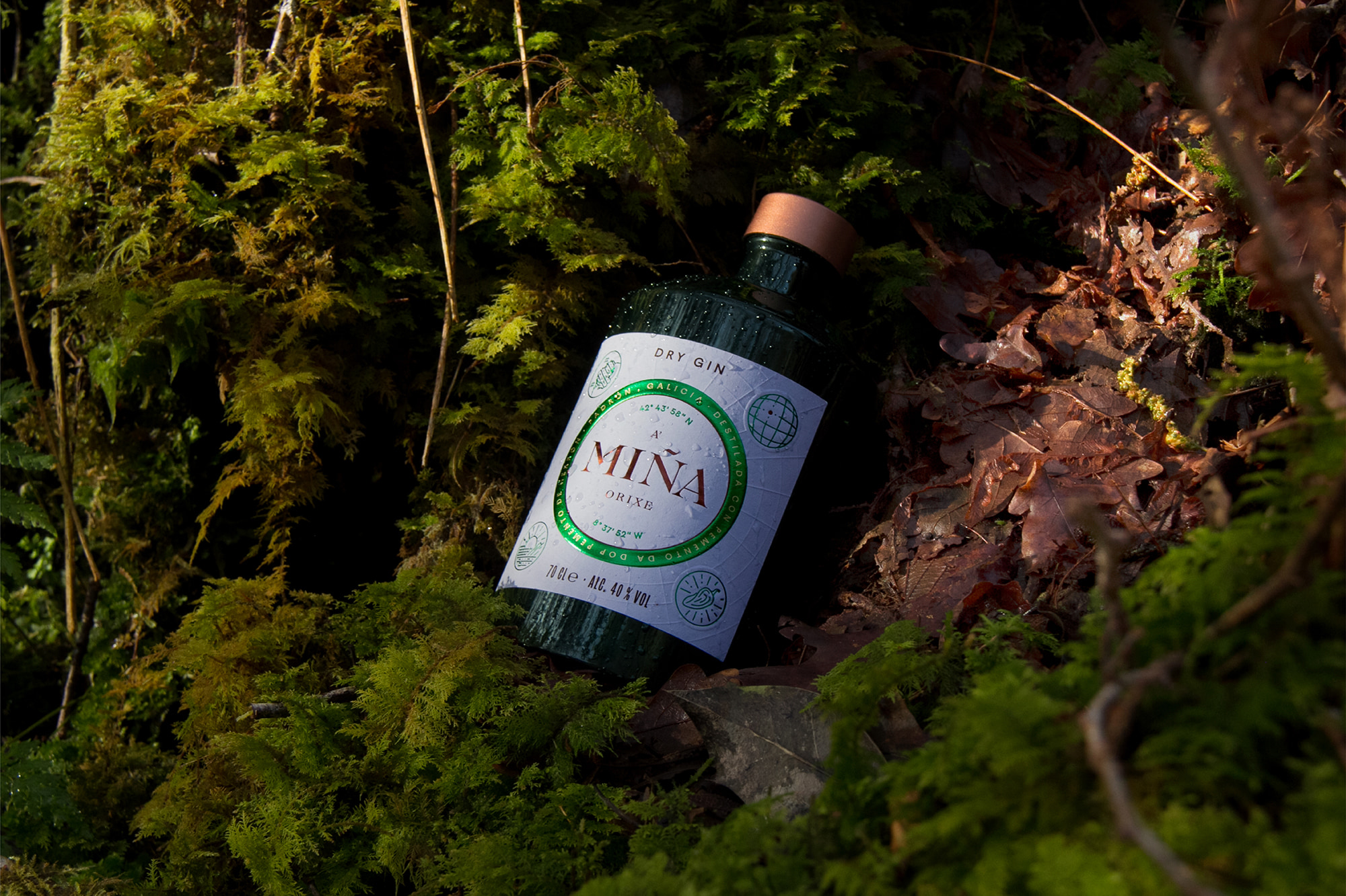
A’Miña: From Galicia to the World
Galicia is known for its geography, its orography, its sinuous forms, and its diverse contrasts. It is a land full of paths that wind their way through branches and forks throughout Europe. An origin that expands to the rest of the world.
As it is known for its geography, we were inspired by the layout, expansion and symbolism of maps: from the local, to the international.
From them many origins are born, and many destinations emerge. They are the guide for travelers, walkers and pilgrims to territories all over the world.
Of Galician origins, this gin was born to reach much more distant destinations.
A'Miña, a possessive, with an ending so especially Galician, which takes hold of the origin, exalts its provenance and transmits rootedness in an evocative way.
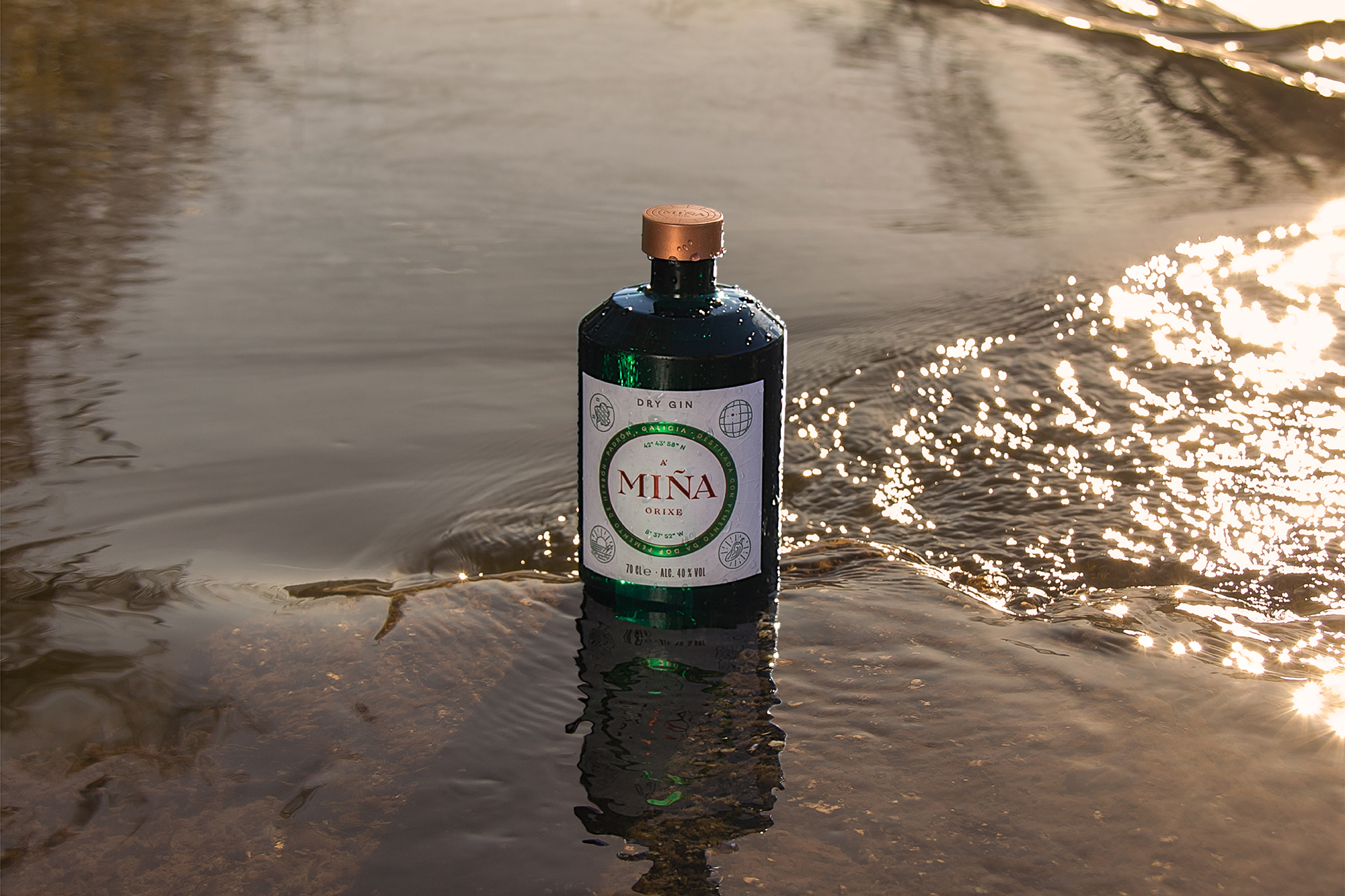
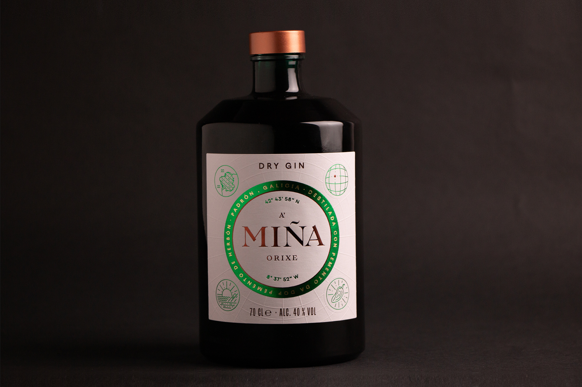
The proposed bottle is the Chiara de Vetroelite. Its cylindrical shape reminds us of the milestones of the Roman roads present in Galicia. The chiseled shoulder and short neck give it a strong personality and a contemporary style.
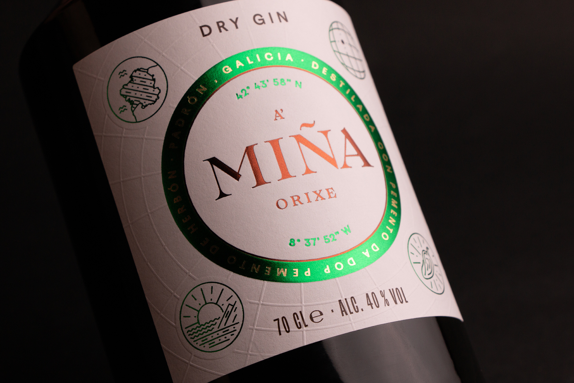
Linked to the main botanical, the color green is present in different parts of the packaging, giving it freshness and boldness. The green glass of the bottle becomes the key element of the design, reinforced by some stamping details on the label.
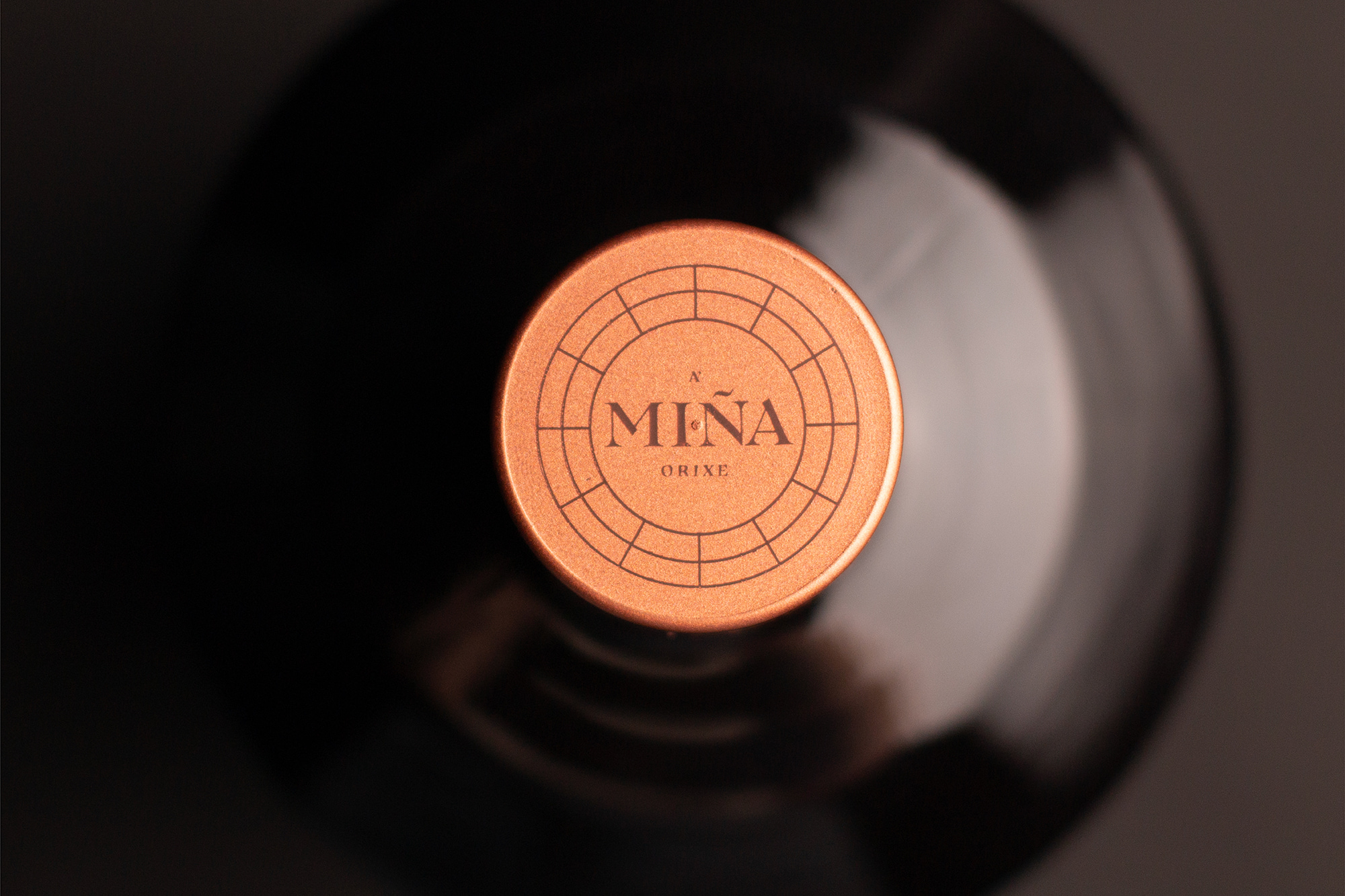
The label has different finishes that give the design quality and avant-garde. The meridians and parallels, in embossing, are the immersive grid where the different graphic elements have been arranged, as if it were a map of coordinates, placing the logo in the center in copper finish, inside a green circle. The four corner elements reinforce the idea of Origen.
Credit
Status:Creative
Location:barcelona, Spain
Project Status:published
Project Type:Packaging
Project Industry:Food/Beverage
Project Market Region:Europe
Project Deliverables:Packaging Design, Product Design
Keywords:WBDS, Agency, Design, Awards, 2023/23
Additional Credits:
Design AgencyMorillas Brand Design
More by Morillas Branding Agency