
-Packaging-Design-Creation-by-Kind-Image-1.jpg)

Bareksten Lyset og Mørket (Light and Darkness) Packaging Design Creation by Kind
The world's best gin - premium packaging
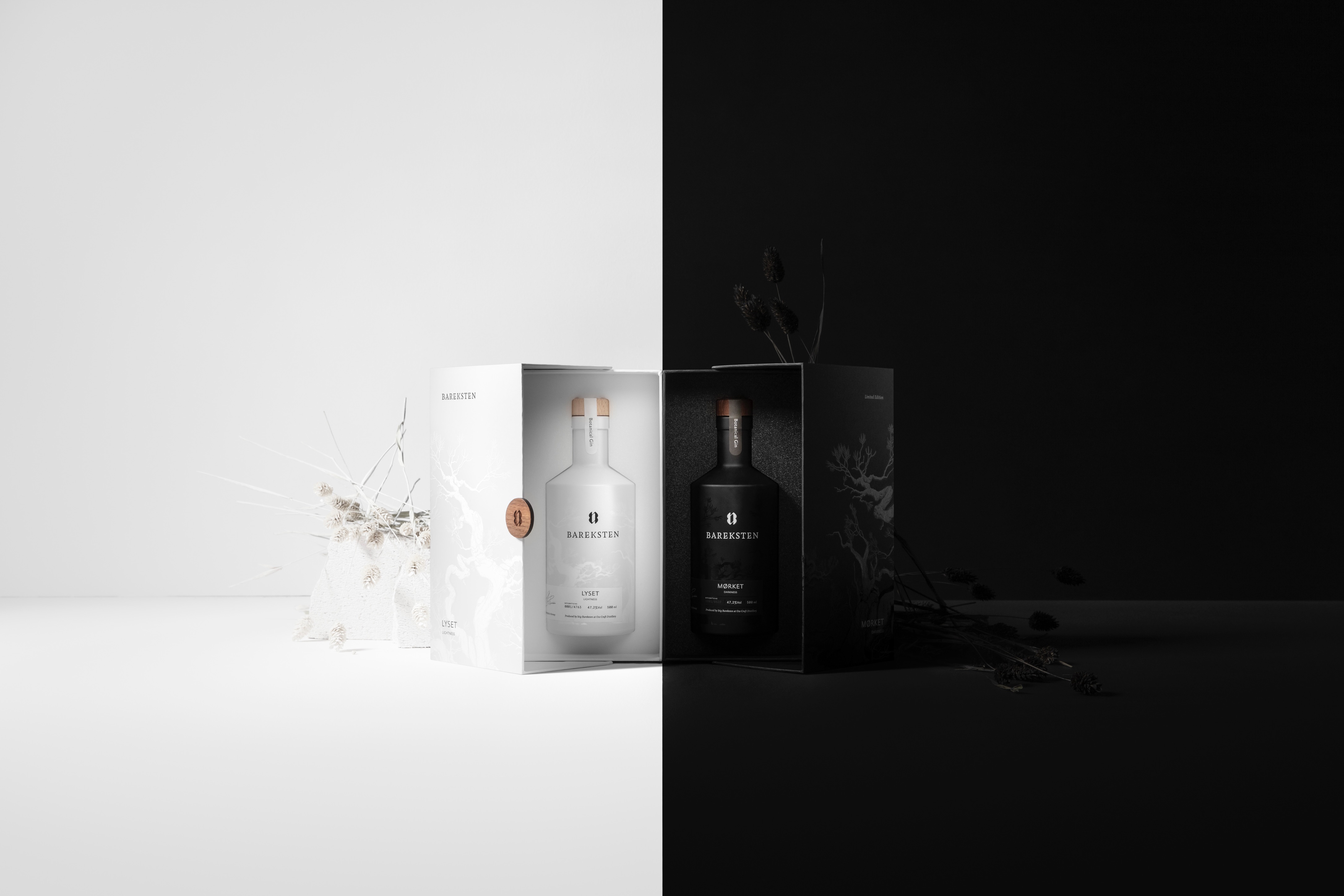
The award-winning Stig Bareksten is a highly-distinguished master-distiller and co-founder of Oss Craft Distillery, situated in Bergen. Kind, which is behind the Bareksten brand and his signature line, has developed the design and communication concept for a new Limited Edition series, Lyset and Mørket (Light and Darkness). Lyset and Mørket is Norwegian for Light and Darkness. Coherence and contrast are an essential part of this annual series. Mørket has a deep taste of herbs and spices. The spirit was distilled on the brightest day of the year and marks the transition from the light to the darkness. Lyset on the other side has a light and fresh taste and was created on the darkest day of the calendar year. This marks the transition towards lighter times.
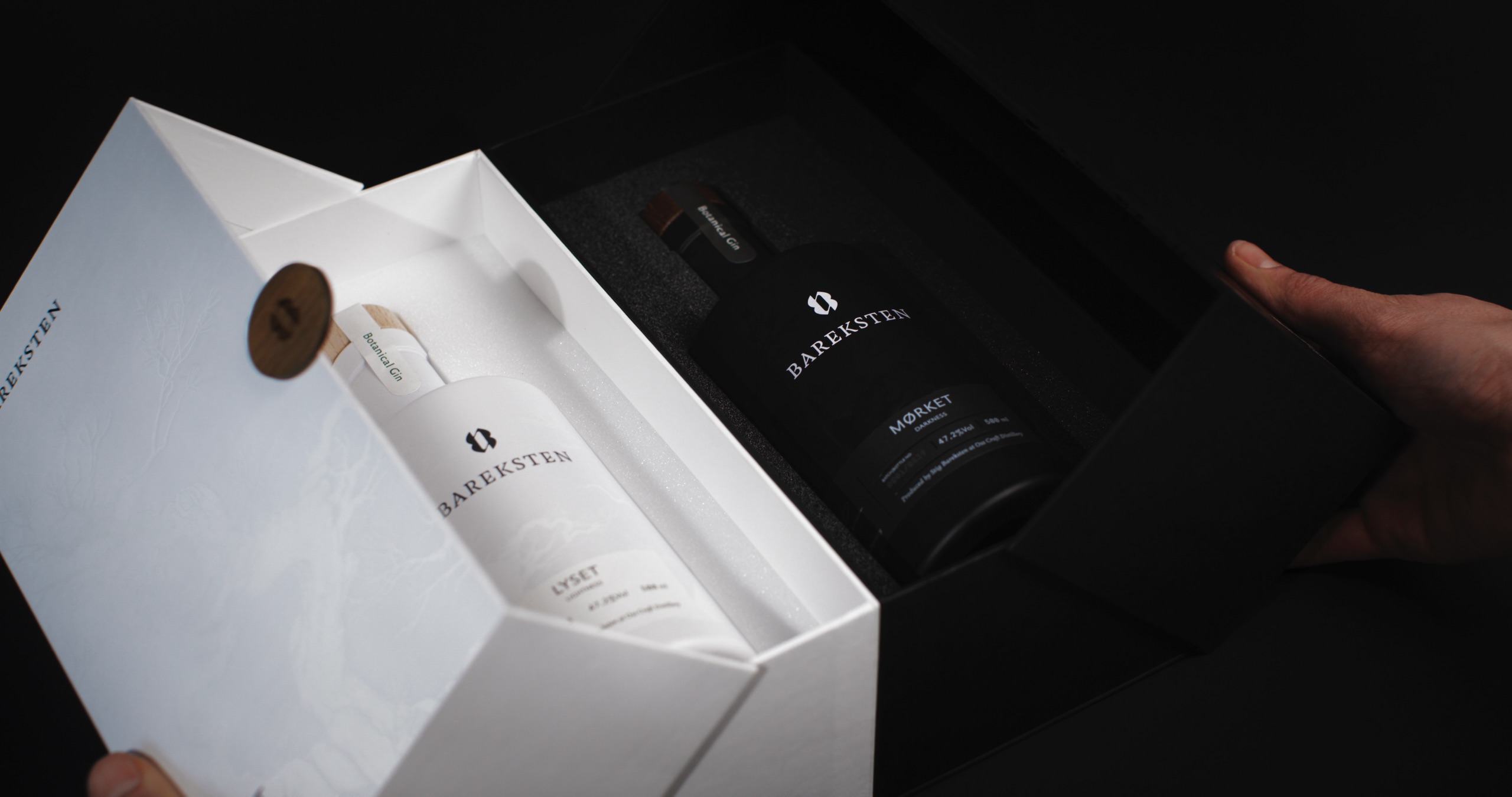
Kind wanted to create a design that could communicate the story behind the product, in a tactile and exclusive way. It was important that Lyset and Mørket were strong individually, and harmonious together. The bottles also had to be seen as a natural part of Bareksten’s product portfolio.
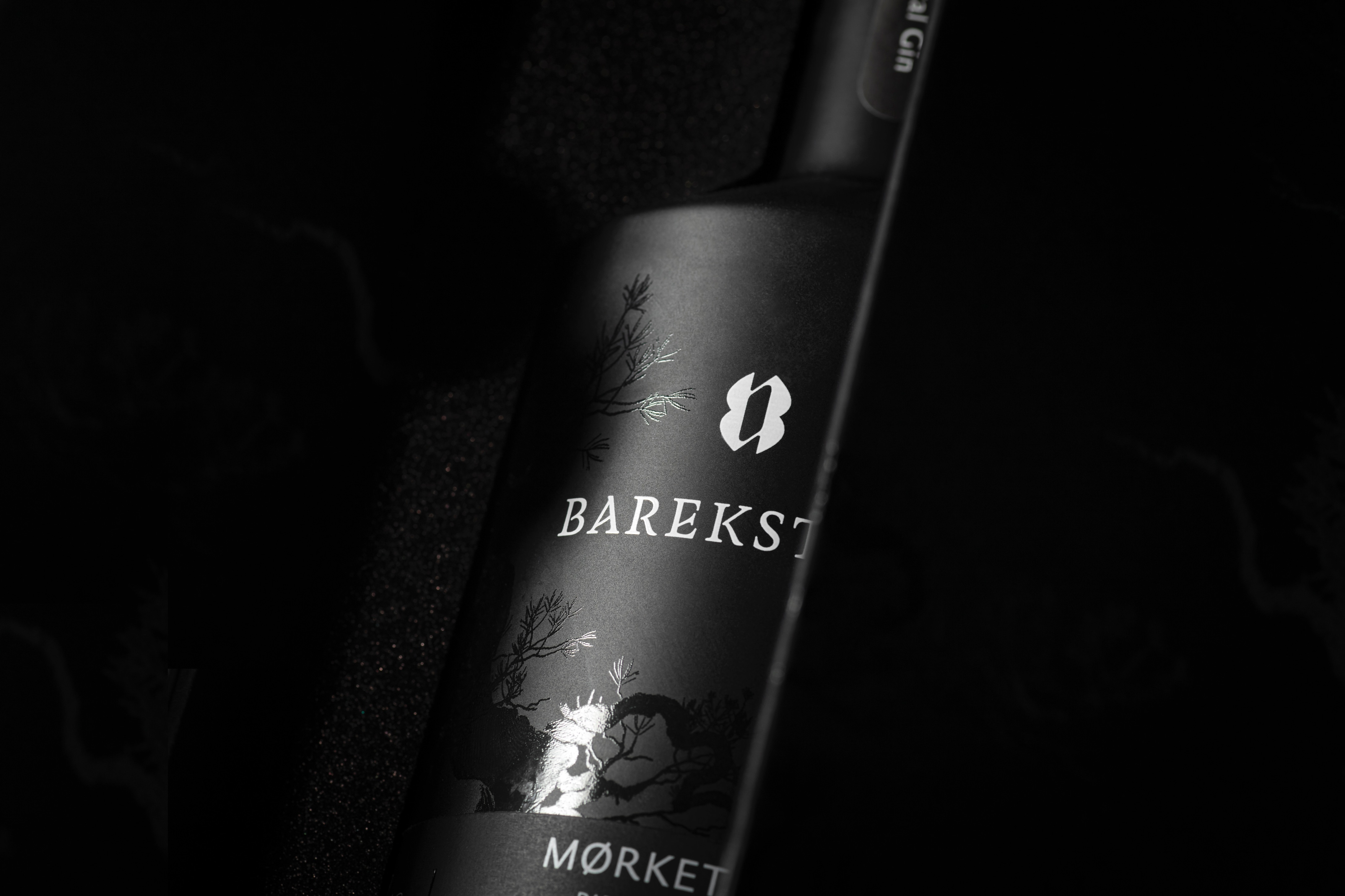
The contrast and symbiosis between ingredients, taste, light and darkness, is the main concept within the design. Mørket, with its matte, black bottle, represents the dramatic and mysterious side of the Norwegian flora and fauna. In high-contrast to this is Lyset, which portrays the gentle and harmonious spirit of nature.
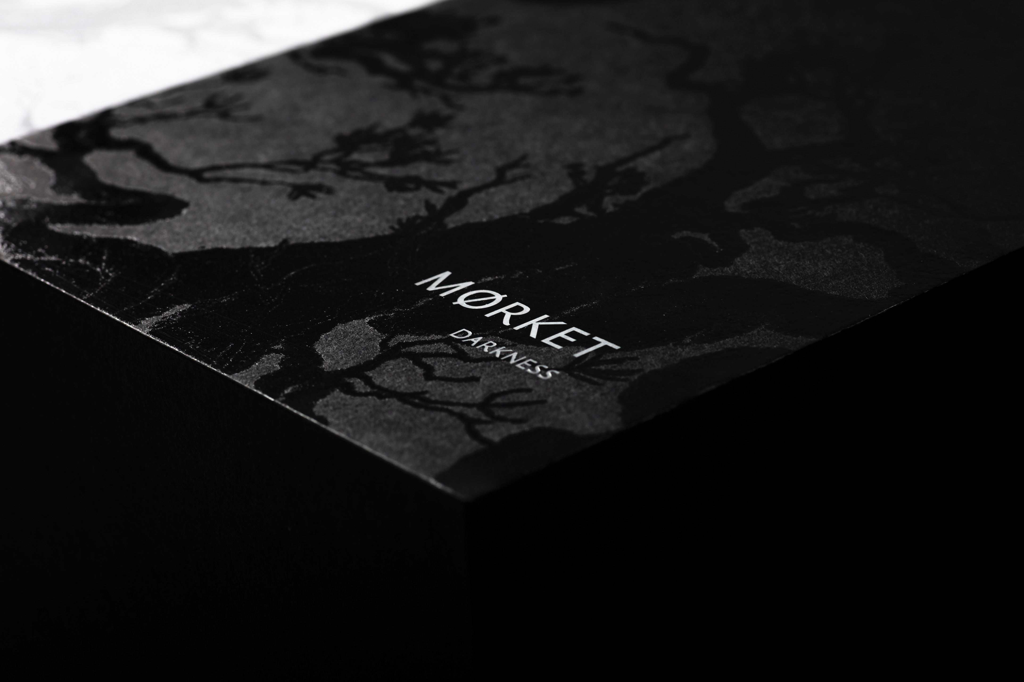
Both bottles are surrounded by a glossy illustration of an ancient Norwegian forest landscape. This illustration is a key element in all of Bareksten’s products and ties Lyset and Mørket together with the mainline. The glossy UV varnish on the illustration contrasts with the matte surfaces of the bottles, creating a refined and delicate exterior.
The harmony between the two is emphasized through mirroring design elements. The ambigram and logo are the centre of both bottles but in opposite colours. The labels sit discreetly on the bottom of the bottles and are inspired by old vials.
Lyset and Mørket are strong alone, but iconic together. The premium box is designed to unite the bottles, by using contrast. The glossy Uv varnished illustrations are repeated here on the matte, uncoated paper surface and emphasize the refined expression while reinforcing the concept.
-Packaging-Design-Creation-by-Kind-Image-2.jpg)
-Packaging-Design-Creation-by-Kind-Image-3.jpg)
-Packaging-Design-Creation-by-Kind-Image-4.jpg)
-Packaging-Design-Creation-by-Kind-Image-5.jpg)
Credit
Name:KIND
Status:Agency
Location:Bergen, Norway
Project Status:published
Project Type:Packaging
Project Industry:Food/Beverage
Project Market Region:Global
Project Deliverables:Packaging Design
Keywords:WBDS, Agency, Design, Awards, 2021/22
Additional Credits:
ClientStig Bareksten
Creative DirectorTom Emil Olsen
Design DirectorKnut Harald Longva
Senior DesignerAgnieszka Gawlik
Project ManagerAnn Kristin Michelsen
PhotographerChristoffer Meyer
PhotographerIsak Theodor Norum
DesignerEmil Olsen
DesignerJohannes Blomgren
More by KIND