

Wine Packaging Labeling for Knee Deep in Margaret River by Harcus Design
knee-deep: adj. submerged to the knees (in water or something liquid); intensely preoccupied with, or by a given topic or emotion.
The founders, the Child’s family, broke ground back in 2000 establishing what was to become an iconic Margaret River winery. The brand name of ‘Knee Deep in Margaret River’ was a tongue-in-cheek acknowledgement of jumping in ‘boots and all’ during a testing time in the wine industry with the grape glut of the late nineties. Times have changed and so too have the reins.
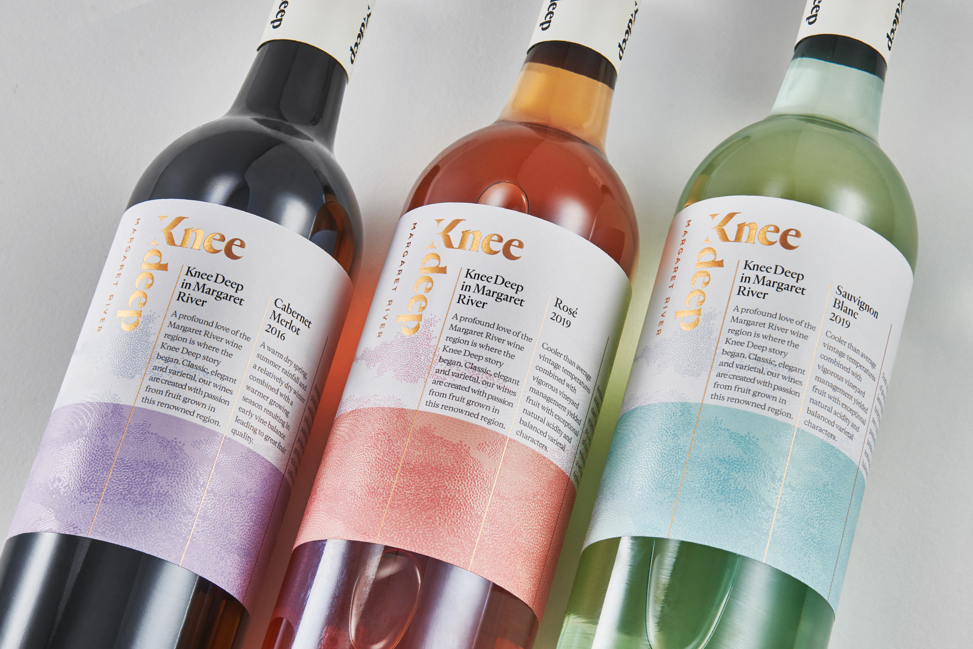
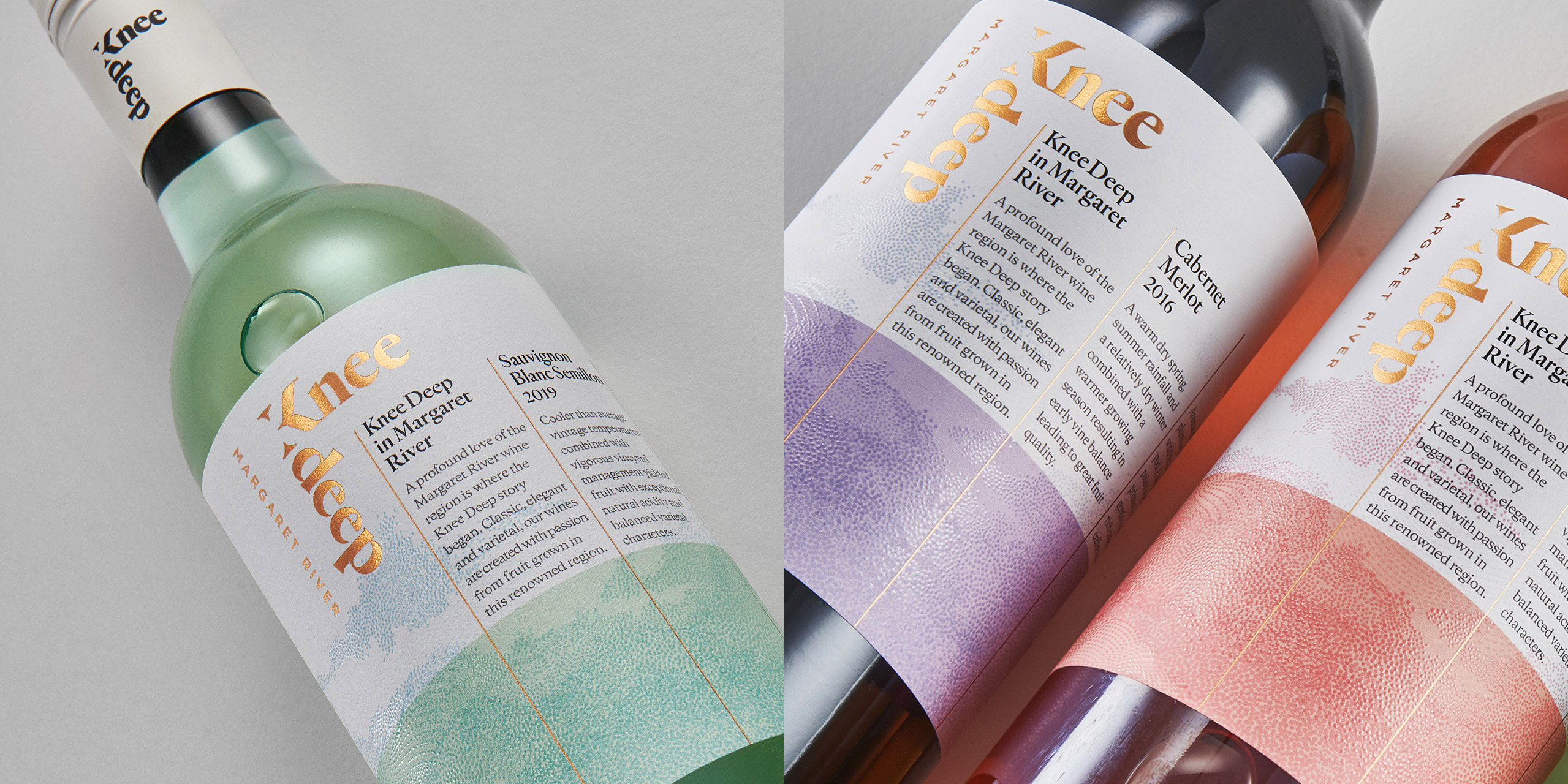
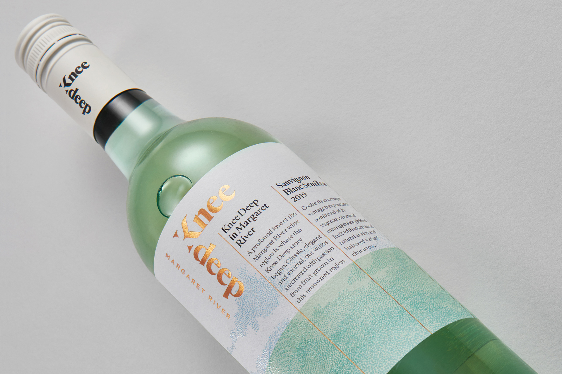
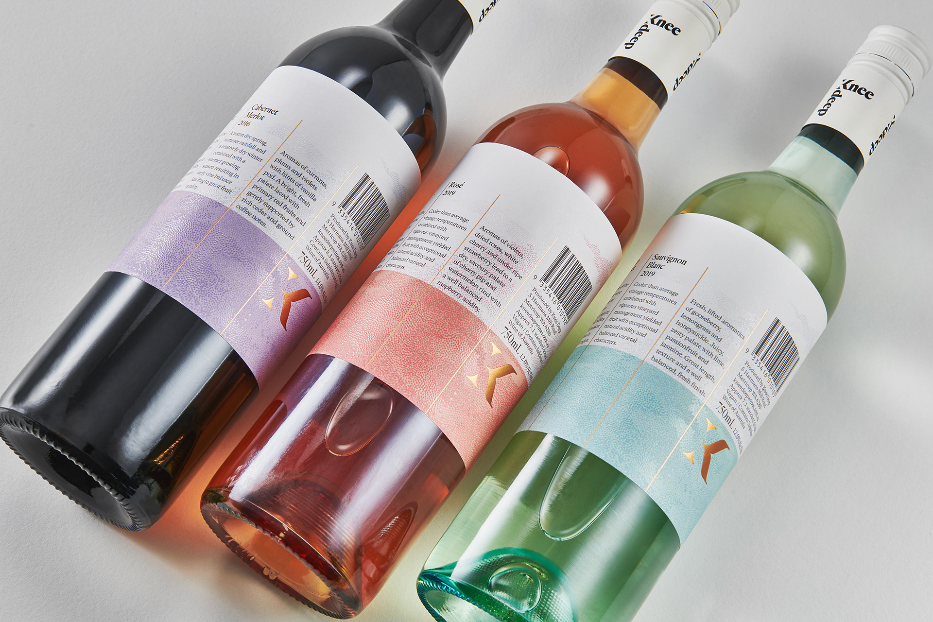
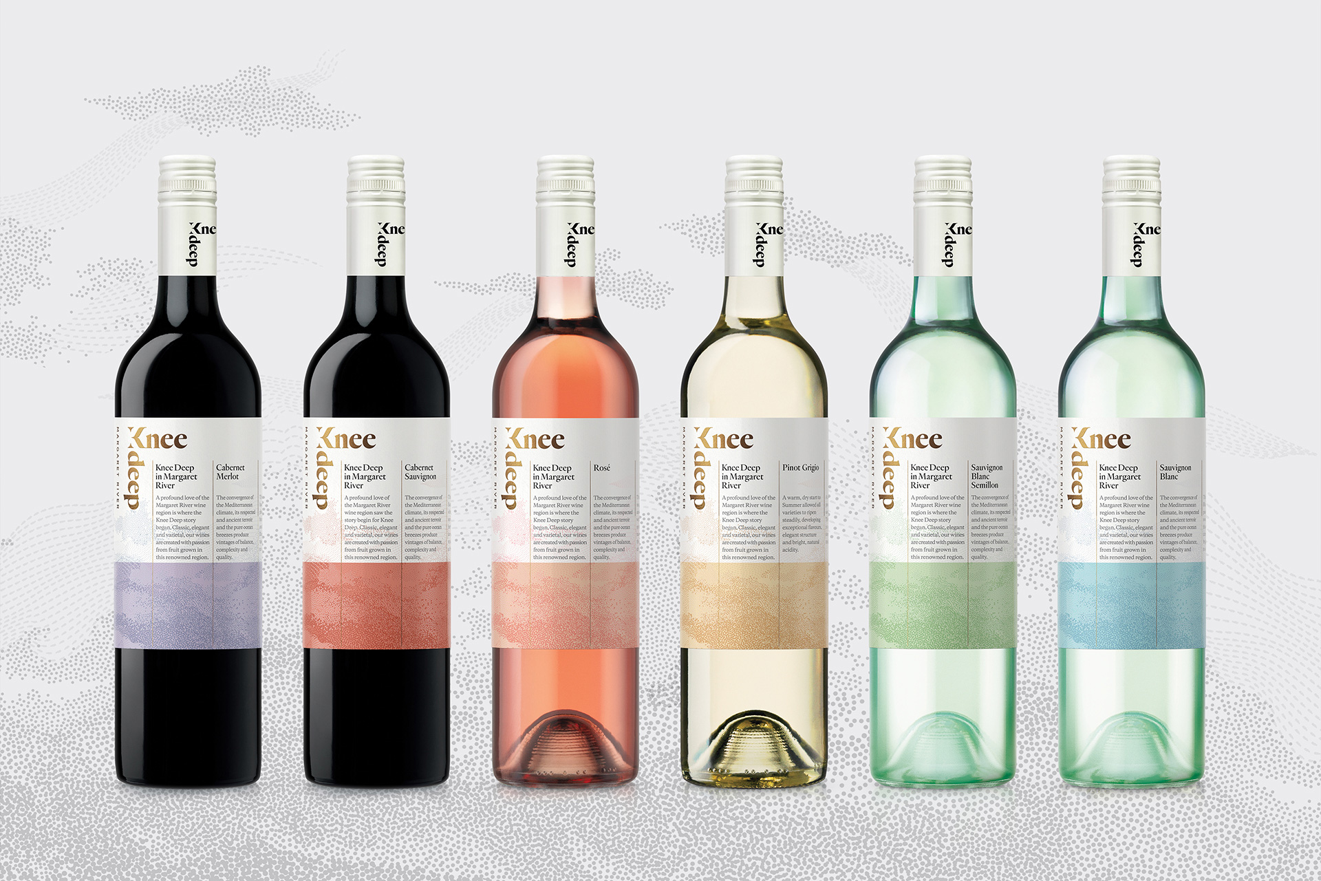
The brand rejuvenation was instigated by the new owners, Matt Holden and Clair Chatel-Holden. With its descriptive brand name, we designed an immersive storyline approach to this wine series. The editorial-like text columns form a longitude grid which wraps around the label; while the latitudinal ‘band’ of colour signifies both the sense of immersion and the above-and-below watery influences of coast and climate in this maritime region. Within this grid structure, the story continues with individual vineyard growing conditions, the tasting notes and mandatories flowing around to the back of the labels.
The knee deep logotype also becomes a device to express this depth of involvement.
It can be read in multiple orientations playing on the ambigram nature of the word ‘deep’. The shorthand icon of the K, used on the cap tops and the label backs, we nicknamed ‘the bended knee’. The colour palette across the series evokes the fresh and breezy atmosphere and the tactile high-build effects on the illustration engages the senses of ‘where the river meets the ocean and the winds and clouds create the waves and shift the sands’...
Latitude -33° 36' 54.43" S Longitude 115° 06' 20.20" E
Credit
Name:Harcus Design
Status:Creative
Location:Sydney, Australia
Project Status:published
Project Type:Packaging
Project Industry:Food/Beverage
Project Market Region:Oceania
Project Deliverables:Brand Design, Brand Identity, Brand Mark, Brand Naming, Brand Rejuvenation, Label Design, Packaging Design, Photography
Keywords:Harcusdesign, Harcus, Knee Deep, Knee Deep Wine, Wine Label, Label Design, Australian Wine, Australian Design, Packaging Design
Additional Credits:
Creative Director & DesignerAnnette Harcus
PhotographerStephen Clarke
More by Harcus Design