

HRA Hana Packaging Design
When Hana became one of the UK’s first over-the-counter oral contraceptive pills to be approved for use in July 2021, it was heralded as a landmark win for accessibility in women’s health. In the six decades since the launch of the first contraceptive pill, women’s sexual empowerment has been completely transformed. Yet, throughout that period, femcare packaging has remained blandly discrete, usually pink and accompanied by cold, clinical, difficult-to-read instructions.
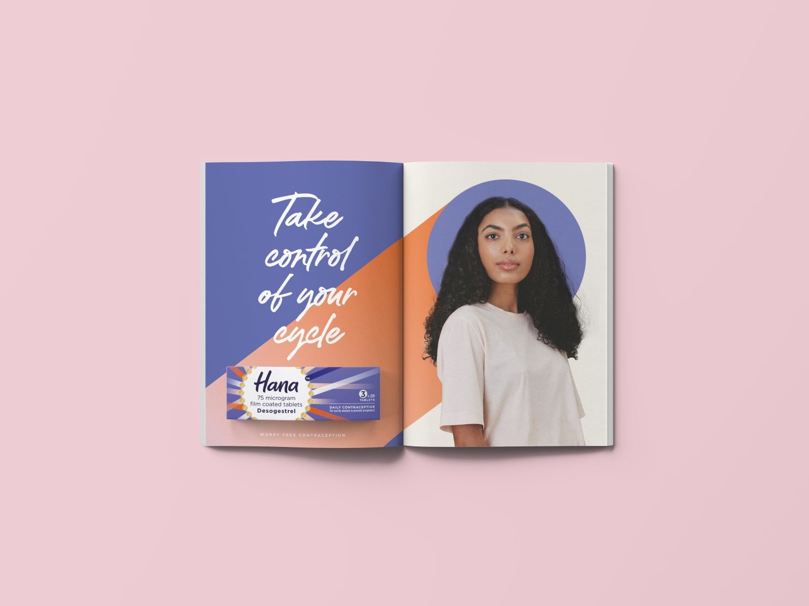
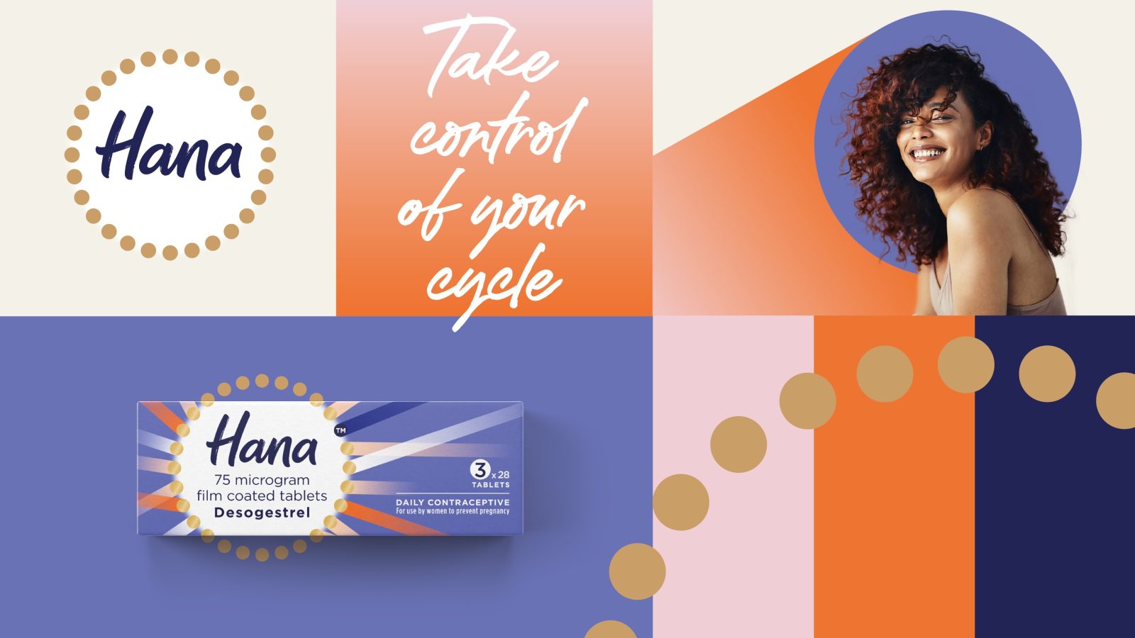
The launch of Hana was an opportunity to turn this on its head and create a healthcare brand that truly represented the revolutionary nature of the product. Hana was born with the big ambition to be the first regular contraception available to buy in a pharmacy, without prescription, and in doing so to positively empower women through broadening their access to effective, regular contraception.
We felt the traditional femcare branding clashed with most women’s healthcare experiences today, which usually start with an online fact-finding mission or on an app, rather than with a trip to the pharmacy. There is a new wave of consumer-friendly products which are providing bold, accessible information, busting taboos and putting women firmly in the driving seat of their own healthcare journeys. Inspired by these emerging tools that empower women, we wanted to create a desirable consumer brand for Hana that could still inform and assure efficacy.
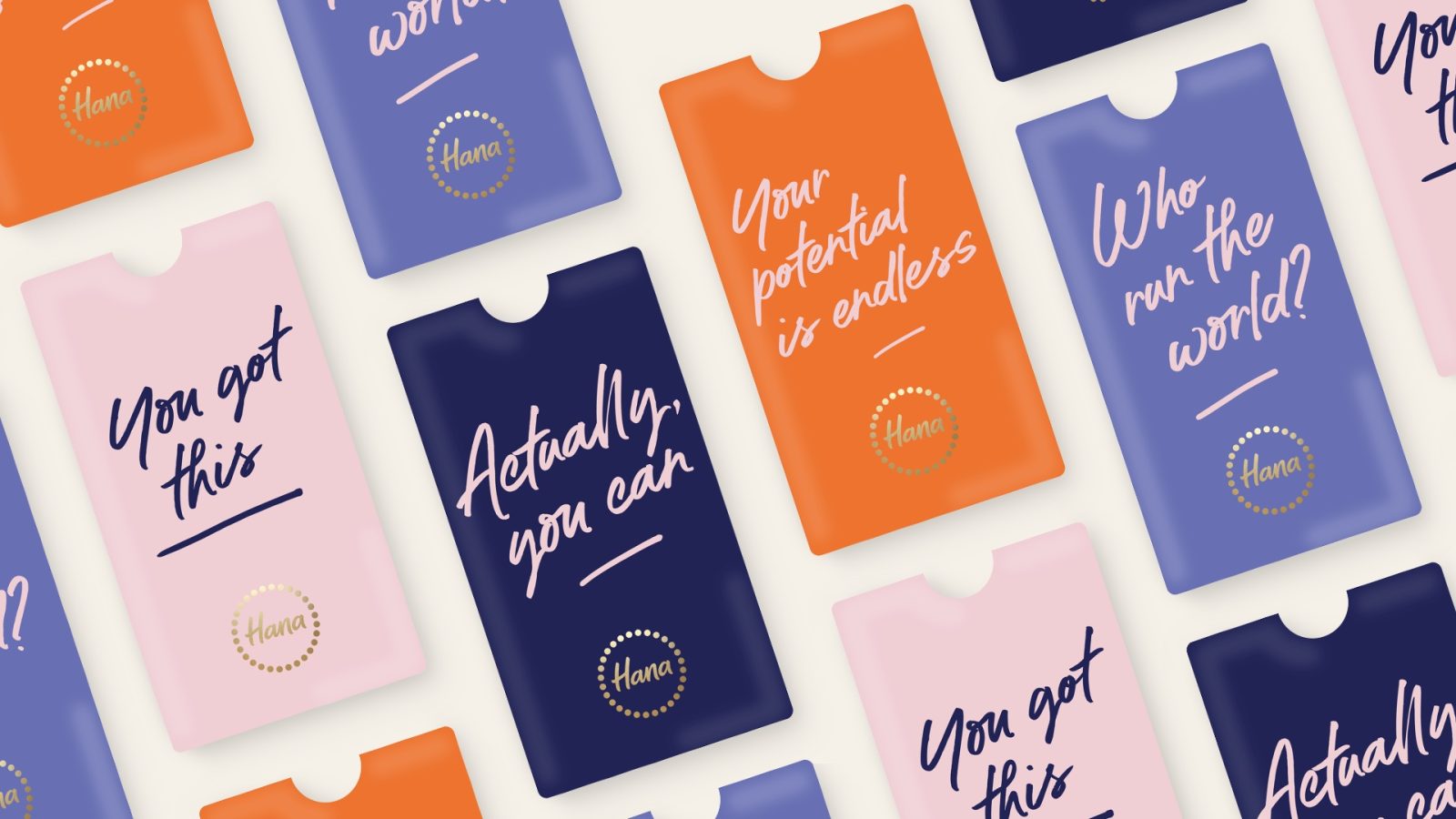
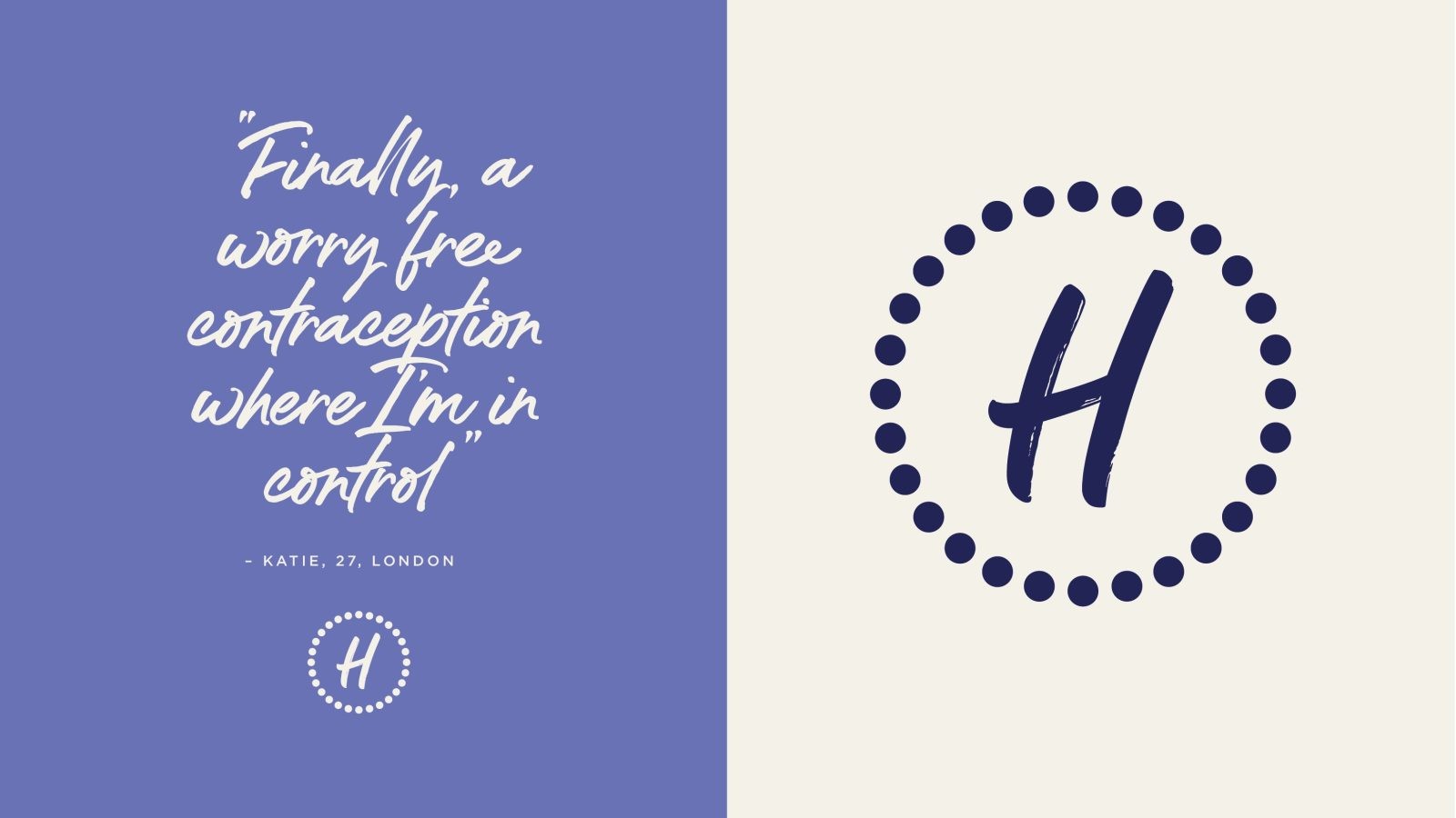
We felt that personifying the brand by giving it a female name, rather than something medical or latin, helps place Hana’s consumers at the centre of their healthcare experience. Keeping things warm and personal, we commissioned a lettering artist to create a hand-drawn ‘Hana’ signature, which is the brand’s trademark logo.
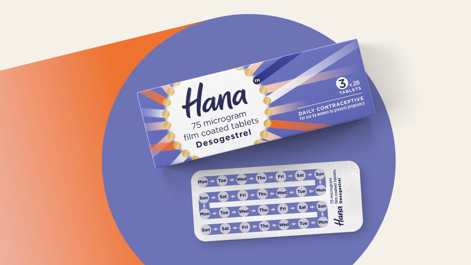
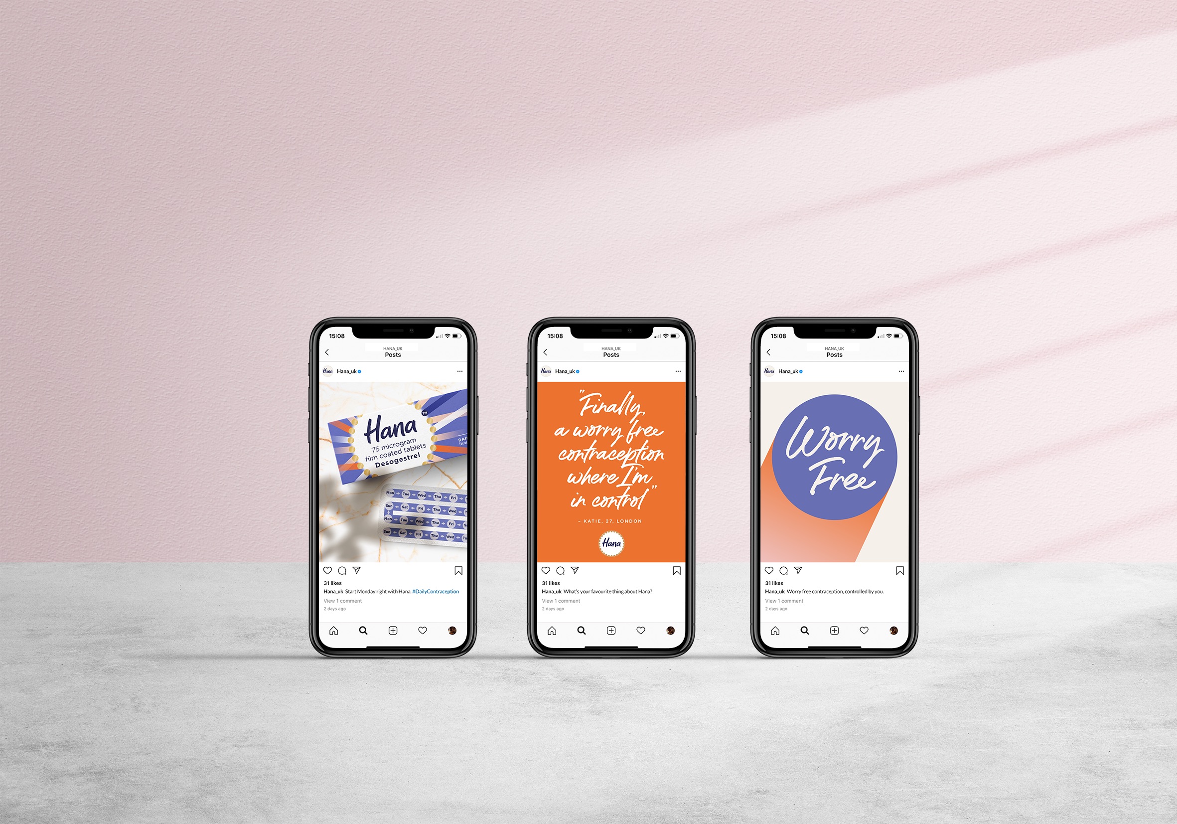
In terms of packaging, we used a modern colour palette and utilised Instagram-friendly photography, which not only flouts convention but also helps the brand stand out throughout its journey - from digital campaigns to pharmacy shelves. This packaging design was the leading touchpoint in designing a wider visual identity that would help build Hana as a brand in a newly competitive environment.
Surrounding the logo, for instance, there’s a yellow circle made from 28 mini pills, one for each day of the month, which signifies traditional contraception messaging of safety, through a constant cycle and consistent protection. And while gold foil wrapper positions Hana apart from the clinical, restrained semiotics of similar contraceptive brands, it still contains a ‘Same Time, Every Day’ reminder and ‘days of the week’ blisters for consumers to organise usage and to signal the importance of timing.
The memorable name, unique brand mark, and vibrant visuals drive the eye-catching difference at shelf that will help ensure that consumers always ask the Pharmacist for Hana. This positions Hana apart from the clinical, restrained semiotics of similar contraceptive brands or a prescription product. Instead, it sits comfortably in the OTC space, like your best friend, or a big sister, rather than an authority figure in a white coat.
Hana launched in the summer of 2021, but our packaging design was working hard for us before the launch. It was the primary way we could demonstrate our intent with both regulators and retailers in advance of any launch. It allowed us to put forward our case to make this pioneering switch, to demonstrate our commitment to consumers and to start to bring our retail partners on board.
A recent research study that featured feedback from 320 women in the UK between 18-49 showed that the Hana packaging design tested significantly higher on uniqueness and eye catchiness than established women’s fem care brands behind the counter.
The packaging design also helped us agree to express our story and helped build agreements with key pharmacy partners to ensure widespread distribution at launch. We were able to form exclusive agreements with key partners such as UK Pharmacy chain Boots - where Hana will be the only brand visible over the counter in their pharmacies. It allowed us to provide them with distinctive brand assets in the form of point-of-sale materials to get ready for launch, laying the foundations for the category-disrupting, high impact visuals you now see in stores.
And we hope that it also sends out a rallying cry across the femcare journey - whether it’s healthcare products for period pains or the menopause - to create brands that empower and challenge the taboos all too often associated with women’s health. The brand identity that Hana heroes on pack tells a story of female empowerment and a confidence that starts from within, and the launch of products like Hana heralds a landmark win for accessibility in women’s health.
Credit
Name:Elmwood
Status:Agency
Location:London, United Kingdom
Project Status:published
Project Type:Packaging
Project Industry:Health Care
Project Market Region:Not specified
Project Deliverables:Not specified
Keywords:WBDS, Agency, Design, Awards, 2022/23
Additional Credits:
Creative DirectorPaul Ponting
Design DirectorRob Dyer
Account DirectorCharley Pickering
Head of Provocation & StrategyDeborah Stafford-Watson
Senior DesignerStacy Agius
Motion GraphicsOli Minchin
More by Elmwood