

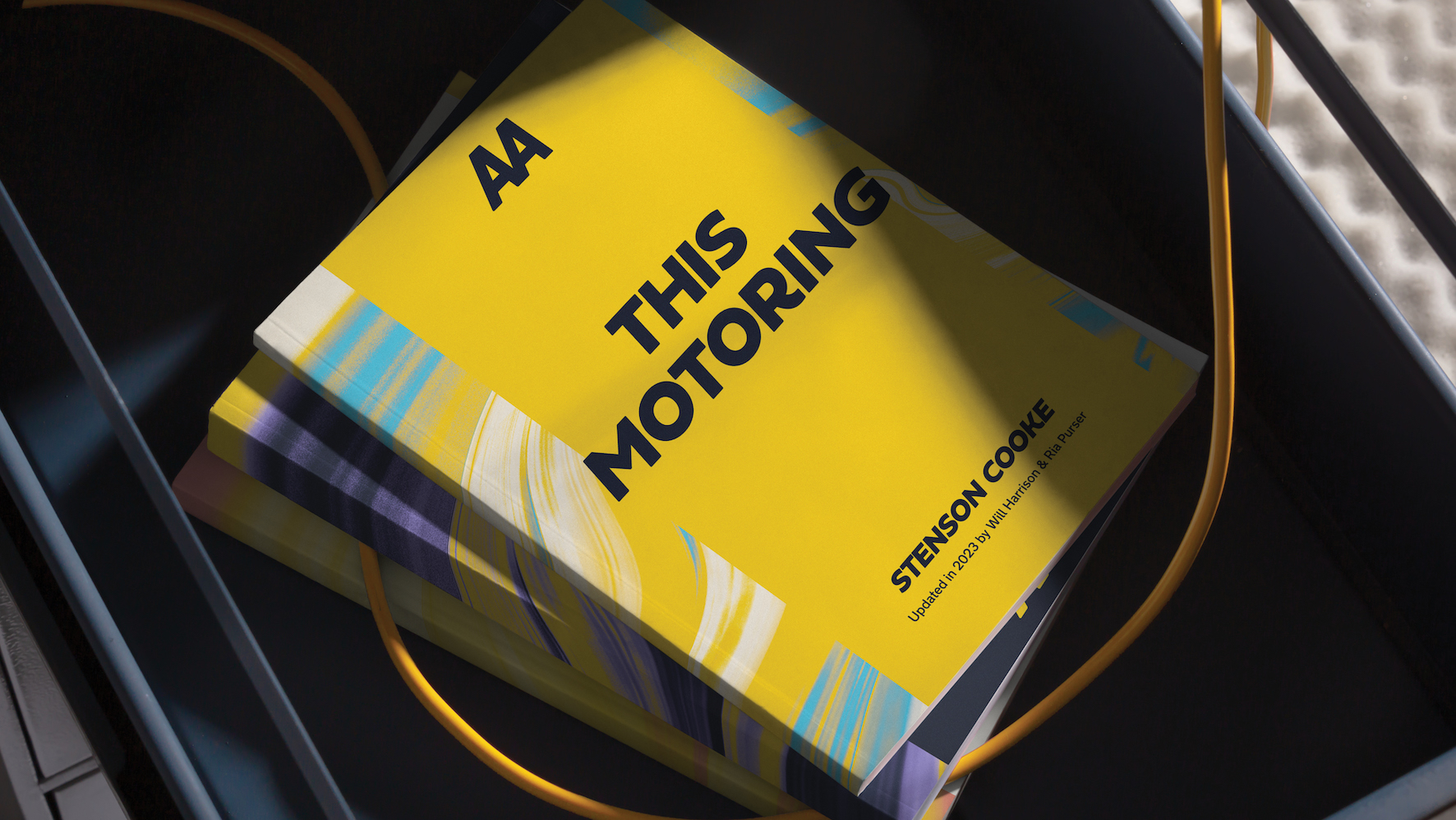
Elmwood Creates New-Era Brand Identity for The AA
In June 1905, four driving enthusiasts banded together in London to form The AA. Almost 100 years later, the organisation they founded has become synonymous with motoring – a true piece of British heritage. But behind its dependable legacy, it has also been a great innovator, from pioneering roadside pumps, to piloting the first connected cars. The next 10 years will see more change in the driving world than we’ve seen in the last 50. A rapidly evolving age of innovation where new ownership models, tech models and a huge uptake in EV ownership are transforming the industry as we know it. Now more than ever, people need a champion and a guide, someone who has got their back no matter the road ahead. Our help was enlisted to develop a new-era brand identity for The AA, future-proofing its brand and expanding its focus beyond roadside assistance to include the entirety of the driving life cycle.
A new driving world required a new kind of confidence. But there was a sense that the brand itself had lost some of its confidence. The AA is at once a heritage brand holding a category leading position, and a progressive innovator leading the charge into a brave new driving world of electric vehicles and driverless cars. We needed to move it from something every dad had in the boot to something the next generation of drivers would want to have as their co-driver, no matter the journey - dialling into the timeless sense of trust and solidity but with a bit more contemporary swagger.
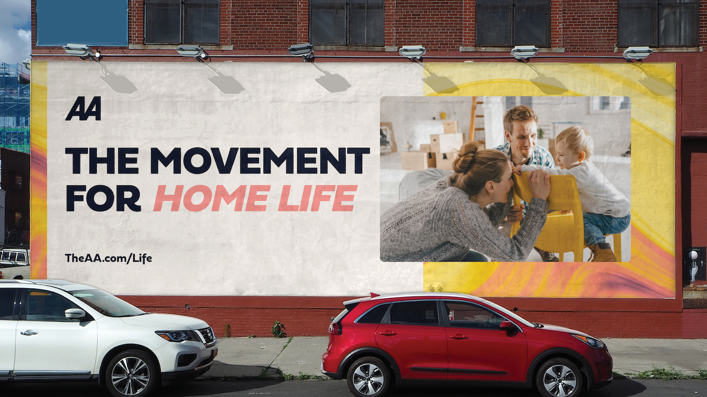
Whilst well known for its support of drivers through products like roadside assistance breakdown cover, The AA has been expanding a wider portfolio of products designed to meet consumers needs across every part of their driving life, from insurance to finance. We recognised an opportunity to position the brand as an active leader in a changing market, built around the idea of "Always Moving" to capture The AA's inherent spirit of life in movement and forward momentum.
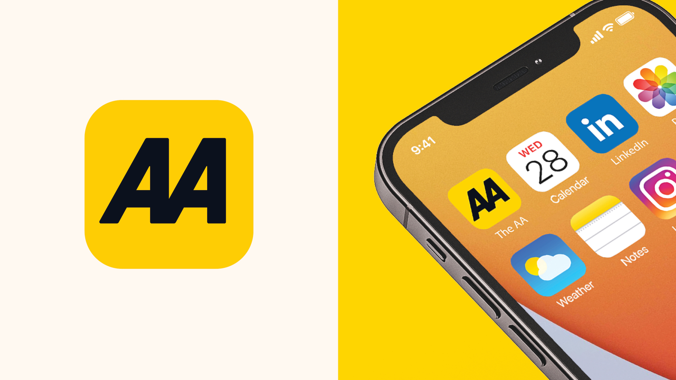
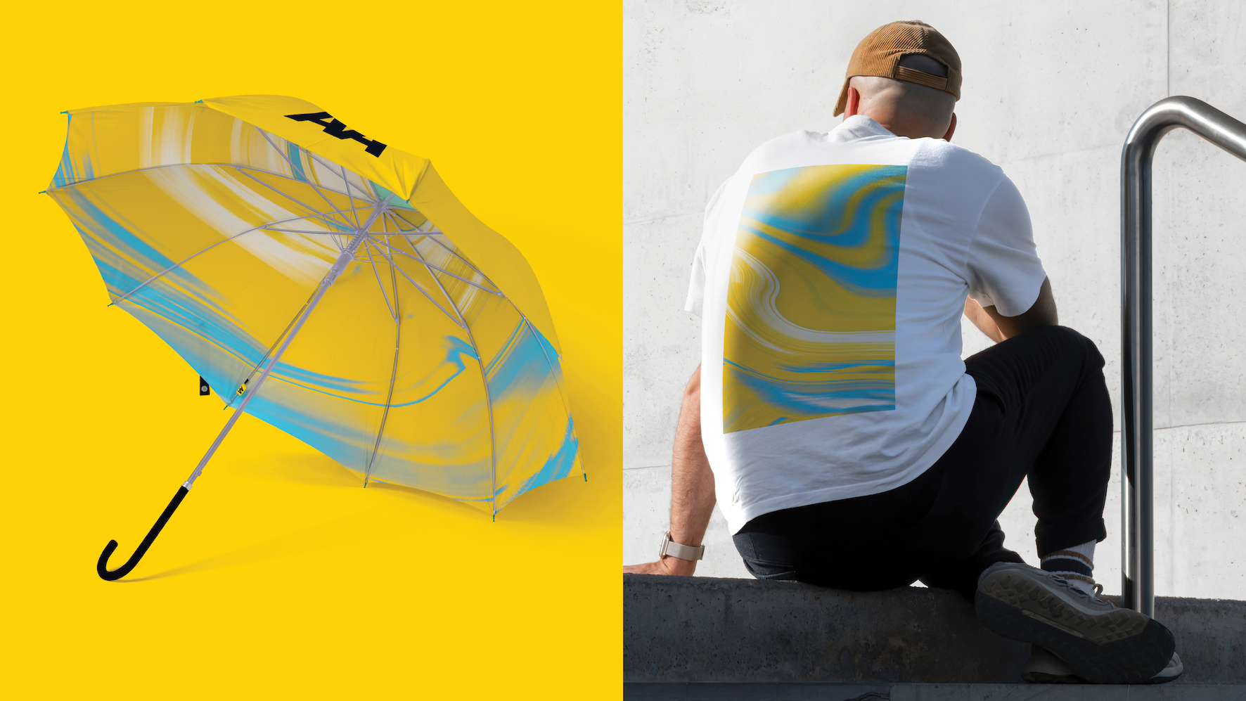
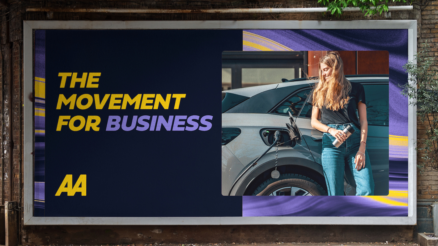
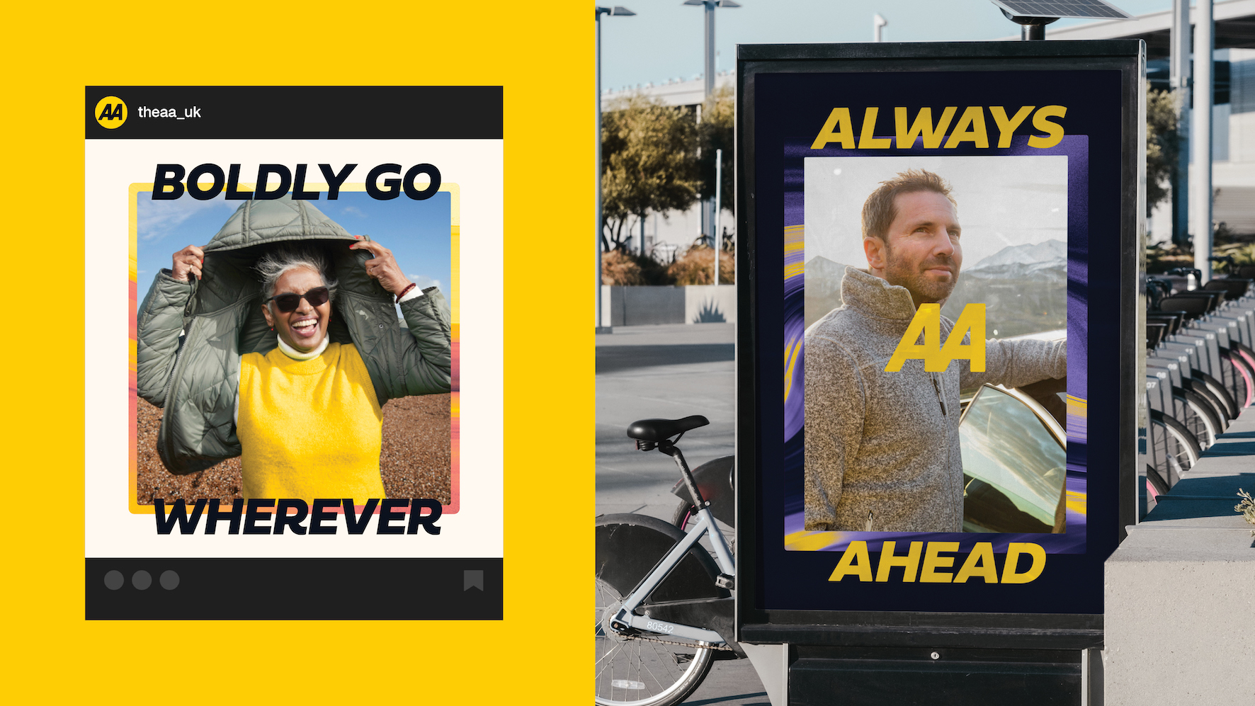
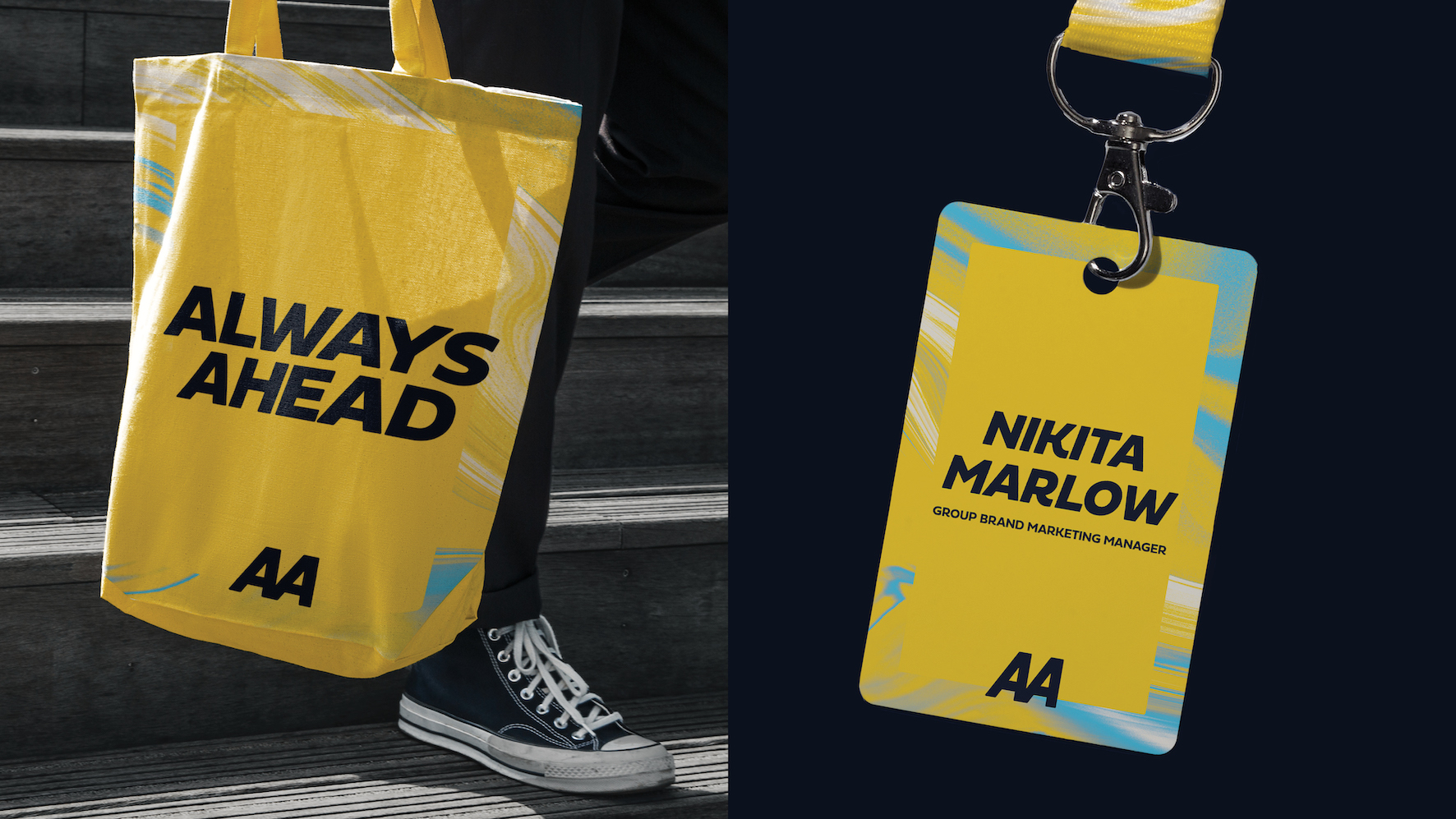
The iconic logo mark has been refined to make it digital-first and inject a sense of motion and movement with the brand's new purpose. A refined and storied set of assets modernise the brand and help it engage a broader audience and age profile. From our colour palette born out of the perfect driving day, to our journey pattern, we tell a consistent story about helping our colleagues, customers, and members to be 'Always Ahead'. The visual assets are amplified by a refreshed TOV, packed with 'always ahead yellow energy' which lets us write with a little more bite. The result is a brand team which is proud to get behind and a business with a renewed sense of confidence for the future.
Credit
Name:Elmwood
Status:Agency
Location:Elmwood, United Kingdom
Project Status:published
Project Type:Identity
Project Industry:Transport
Project Market Region:Europe
Project Deliverables:Brand Identity, Brand Redesign
Keywords:Brand Identity, Identity Refresh, Brand Platform
Additional Credits:
Senior Account DirectorPaul Waters
Design DirectorPaz Martinez Capuz
Creative DirectorKyle Whybrow
Senior Visual Experience DesignerRyan Brown
Senior Account ManagerGrace Marsh
Senior DesignerMatt Churchill
Middleweight DesignerMihaela Georgieva
Head of AnimationOli Minchin
Strategy & Provocation DirectorEsther Hastings
More by Elmwood
Similar projects