

CF Napa Works Its Magic for Spellbound
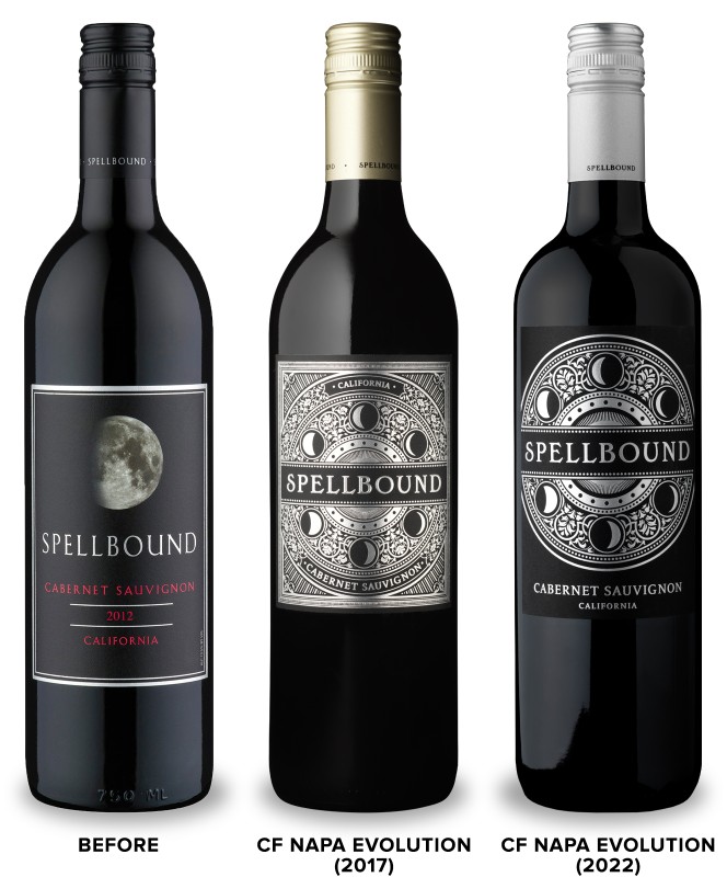
When Folio Fine Wine Partners was looking to create the next packaging evolution for their Spellbound wine brand, they returned to CF Napa Brand Design, the designer of the existing packaging. The label was eye-catching and made the brand name pop, but the varietal name wasn’t as apparent as it could be. Poor lighting in the retail environment also hindered the readability of the gold foil on cream motif used for the white wines. The design needed to be tweaked to maintain the beloved look of the label while allowing the consumer to distinguish the wine style at a glance.
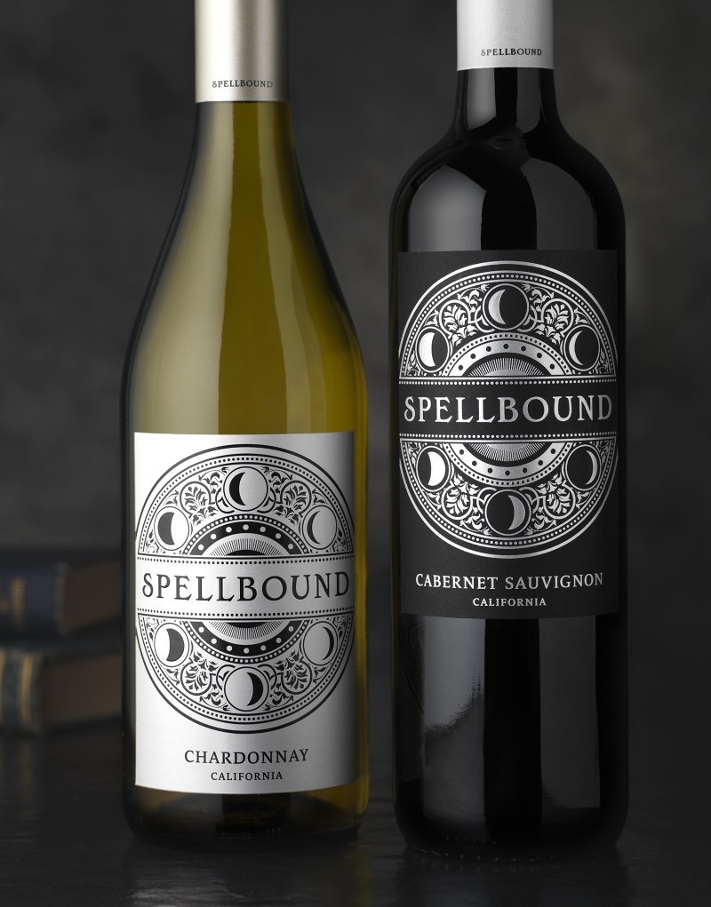
CF Napa Brand Design simplified the lunar phase graphic and pulled the varietal and AVA out of the illustration – allowing the wine info to stand alone and be easily identifiable. The graphic was stamped in silver foil on black paper for the red wines and for the white wines, the graphic was printed black on metallic silver paper. To further aid in differentiation between wines, CF Napa Brand Design developed a color-coding system for the top dot of the screwcaps – silver for Cabernet & Chardonnay, blue for Merlot, purple for Petite Sirah, and red for Pinot Noir. The fine-tuning of the label and the capsules created a package that allows customers to pinpoint the wine varietal they desire while maintaining the brand’s signature mystical appeal.
From Spellbound, “Everyone knows the warm sun nurtures plants, bringing grapevines to full maturity. But it’s the moon, ruler of the tides, whose gravitational force helps pull water up from the soil during the cool nights that has influenced farmers since ancient times. Our food-friendly wines are true to their roots, expressing ripe varietal character and spellbinding flavors.”
Credit
Name:CF Napa Brand Design
Status:Agency
Location:Napa, United States, United States
Project Status:published
Project Type:Packaging
Project Industry:Food/Beverage
Project Market Region:North America
Project Deliverables:Art, Art Direction, Brand Architecture, Brand Design, Brand Identity, Brand Mark, Brand Redesign, Brand Refinement, Brand Rejuvenation, Brand Strategy, Branding, Creative Direction, Design, Graphic Design, Icon Design, Identity System, Illustration, Label Design, Logo Design, Packaging Design, Product Architecture, Product Design, Rebranding
Keywords:Spellbound, Wine, Packaging, Design
Additional Credits:
Design AgencyCF Napa Brand Design
More by CF Napa Brand Design