

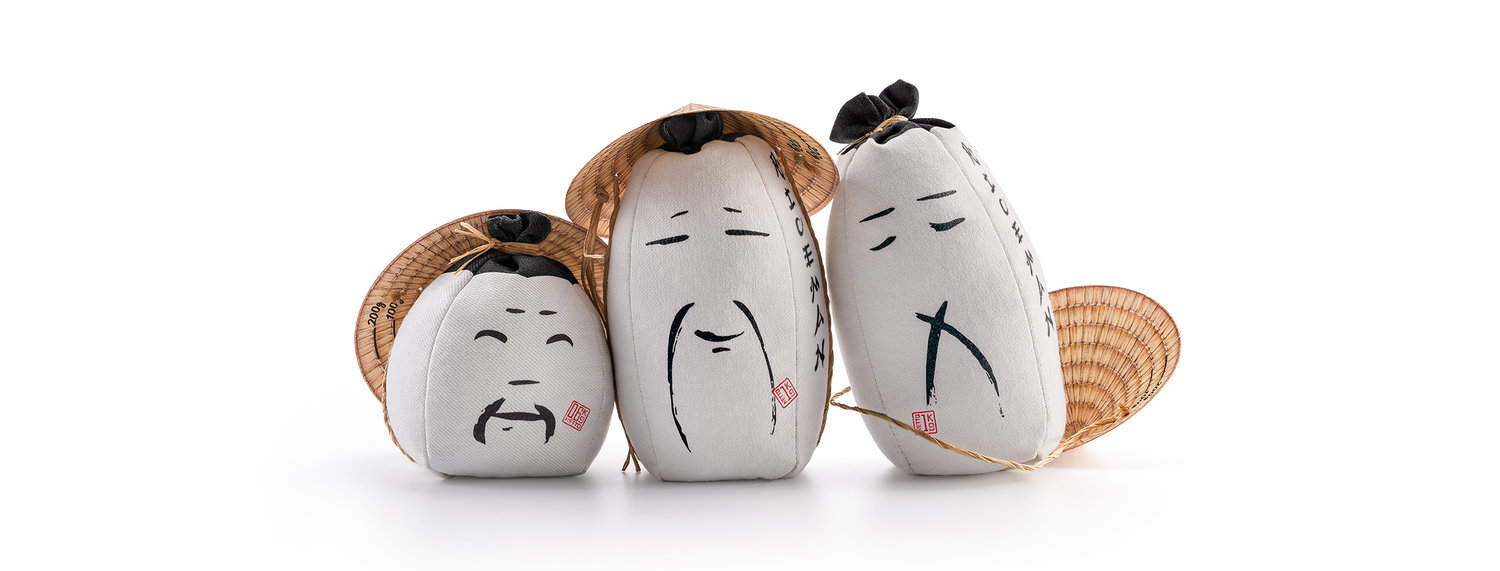
Riceman Packaging Design Pays Tribute to the Rice Farmers Endeavours
Backbone Branding - RICEMAN
The Challenge
As one of the most ancient cereal grains and one of the highest consumed ingredients around the world, Rice has been a staple component in our diets for centuries! Given that we are very much used to having this ingredient in our daily life, we tend to forget that the process in which this grain goes through until it gets on our plates is an interesting and specifically intricate one.
So when a small distributor has contacted us to create a design for two types of rice, whose main clients are health food stores, our goal was to evoke the interesting and inspiring process of rice growing by paying tribute to the anonymous humans in charge of the hard work in the rice fields.
The Solution
So our packaging needed to convey an emotional, human message but be functional at the same time.
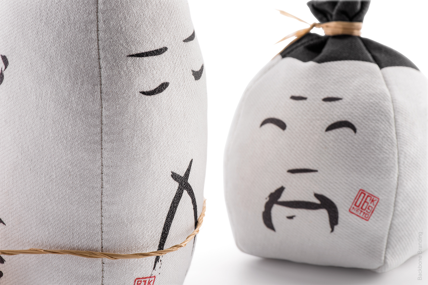
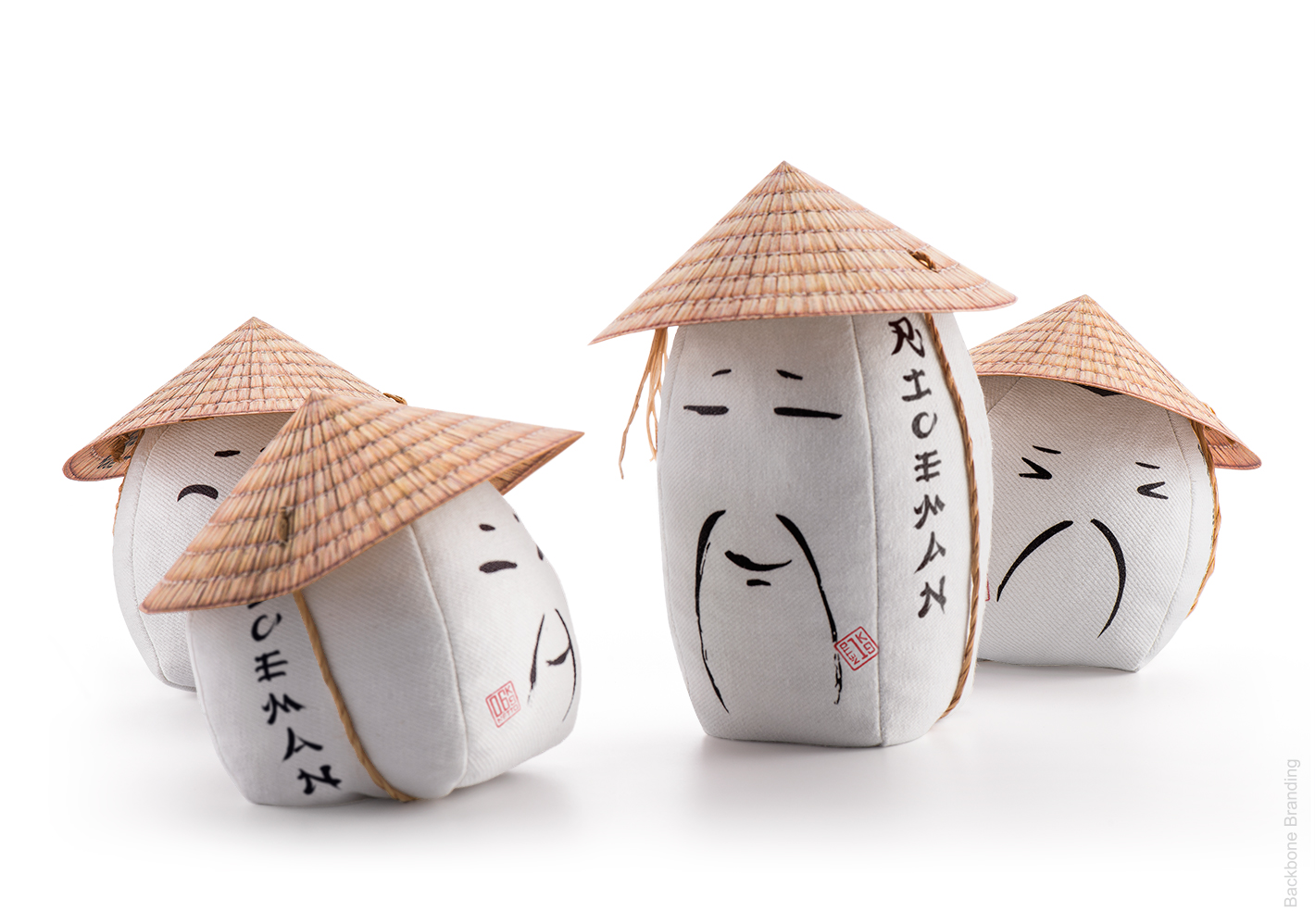
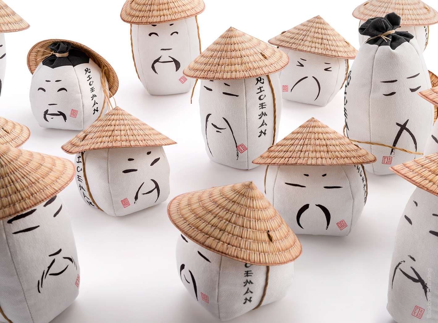
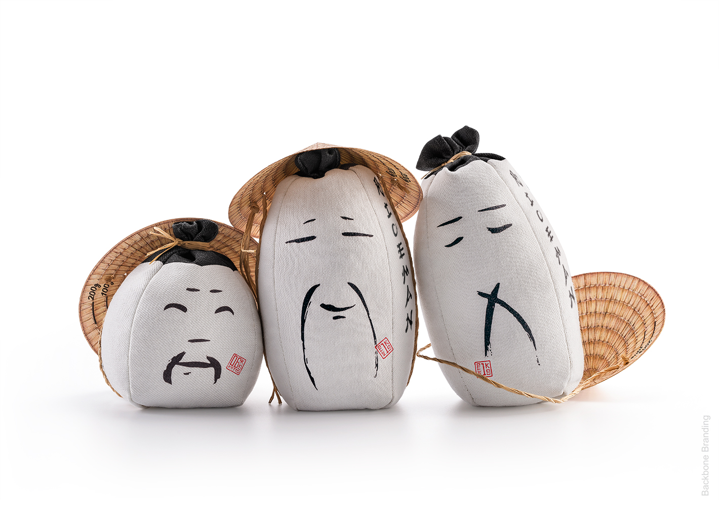
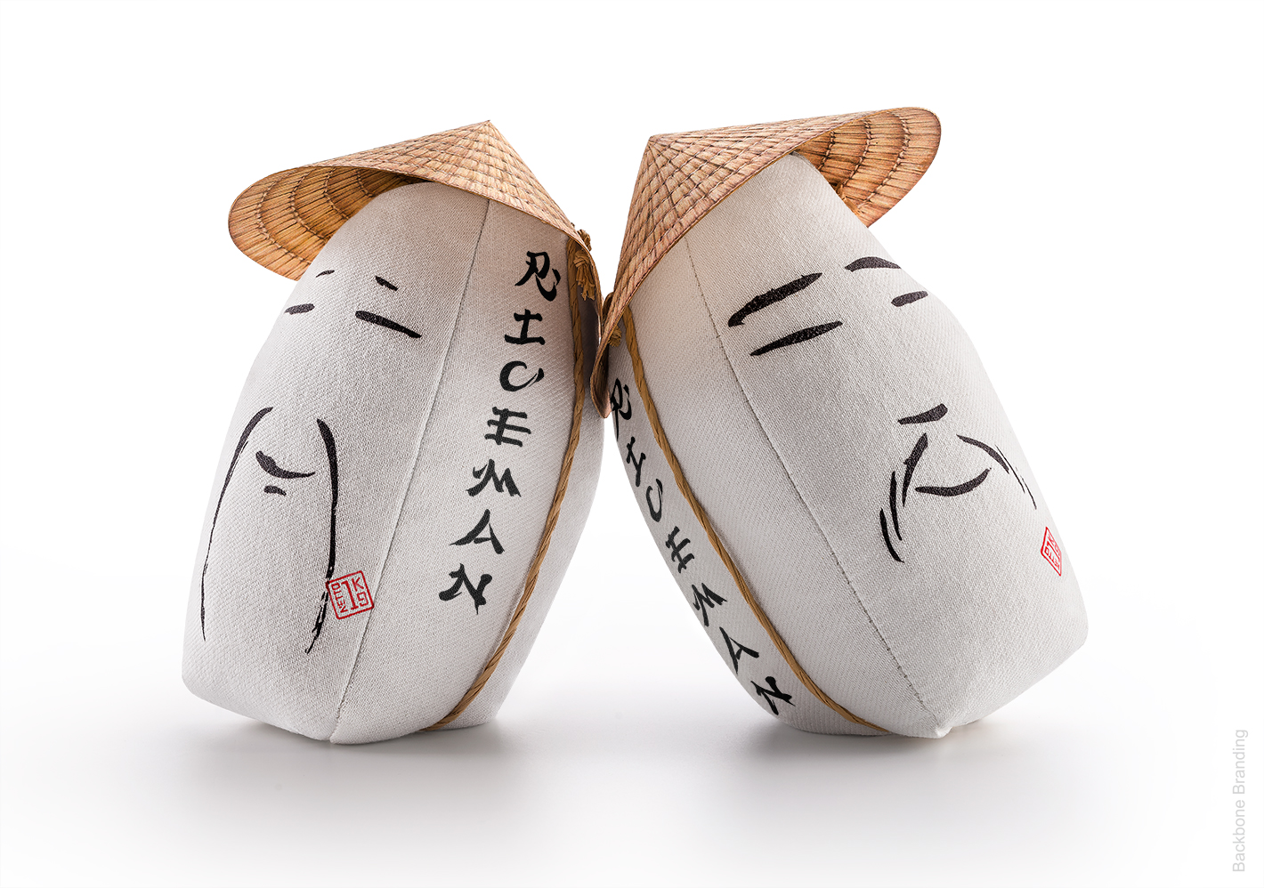
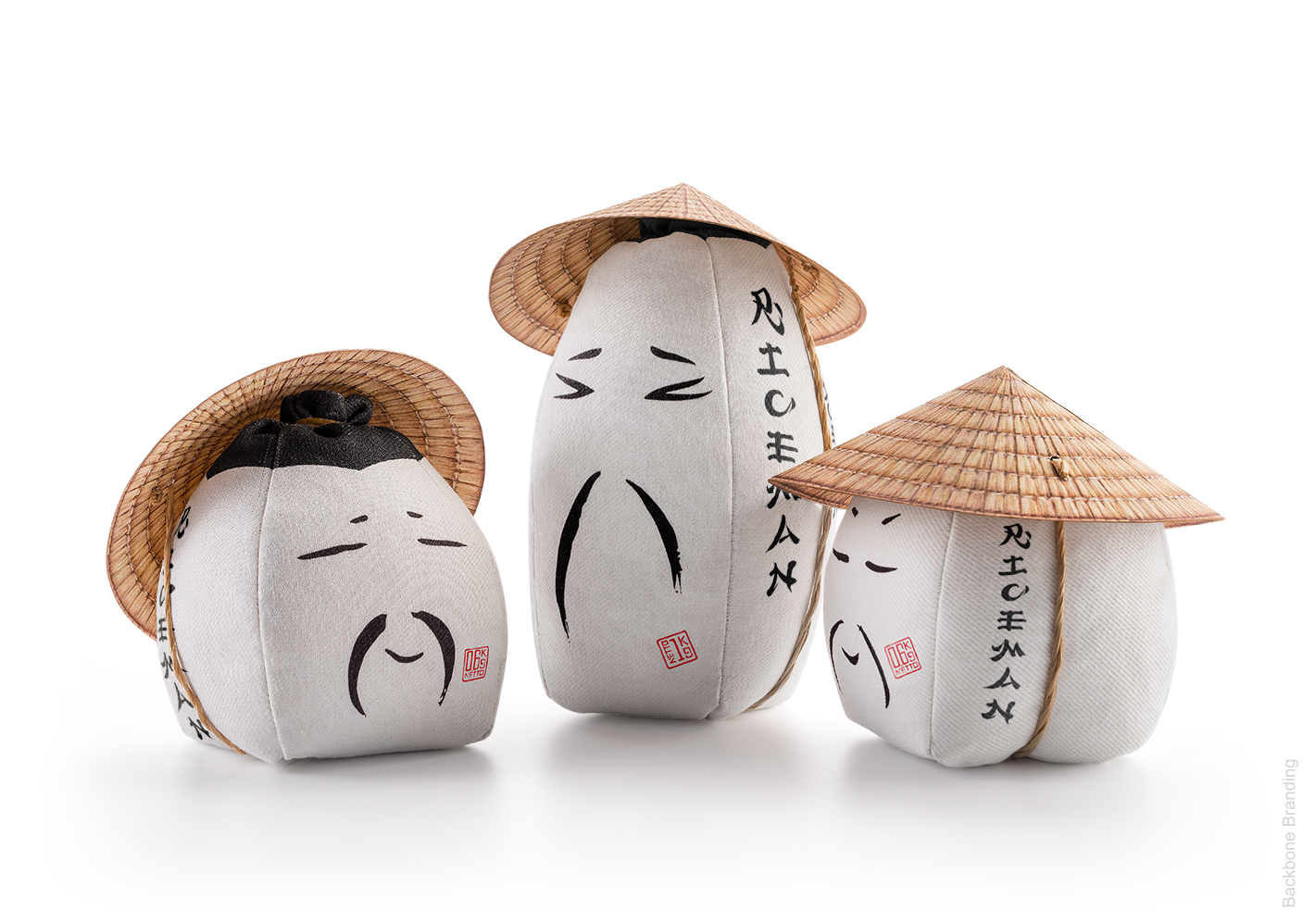
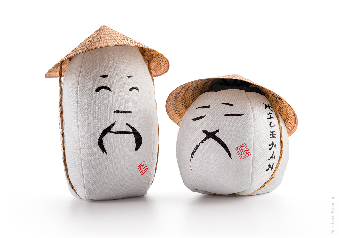
Visually, the design on the container should be uncomplicated and minimal in order to perfectly represent this simple and familiar grain, and at the same time remind us of the human labor in the rice harvesting process. So the goal was to use the bare minimum and only necessary amount of black graphic lines in order to capture, in the most minimal way possible, the facial expressions of the rice farmers. Portraying the diverse emotional states a person goes through, the graphics go from self-confidence and pride, to satisfaction, empathy and tiredness. From the merchandise perspective, when displayed next to one another on a shelf, the products would be covering the wide spectrum of human feelings, as if those farmers were having an expressive conversational scene with one another.
The End Product
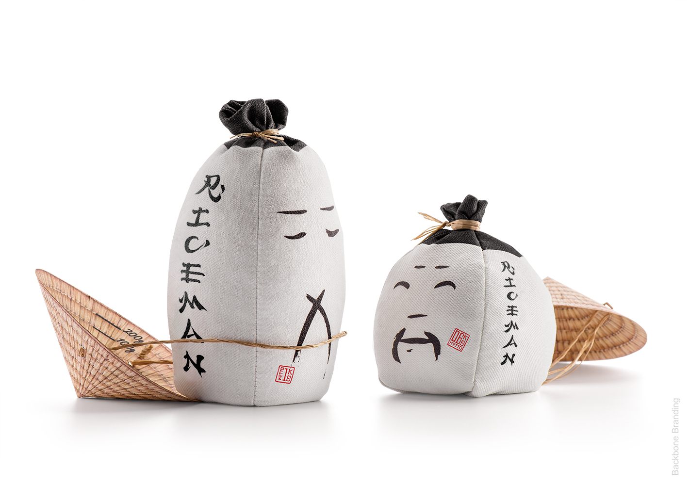
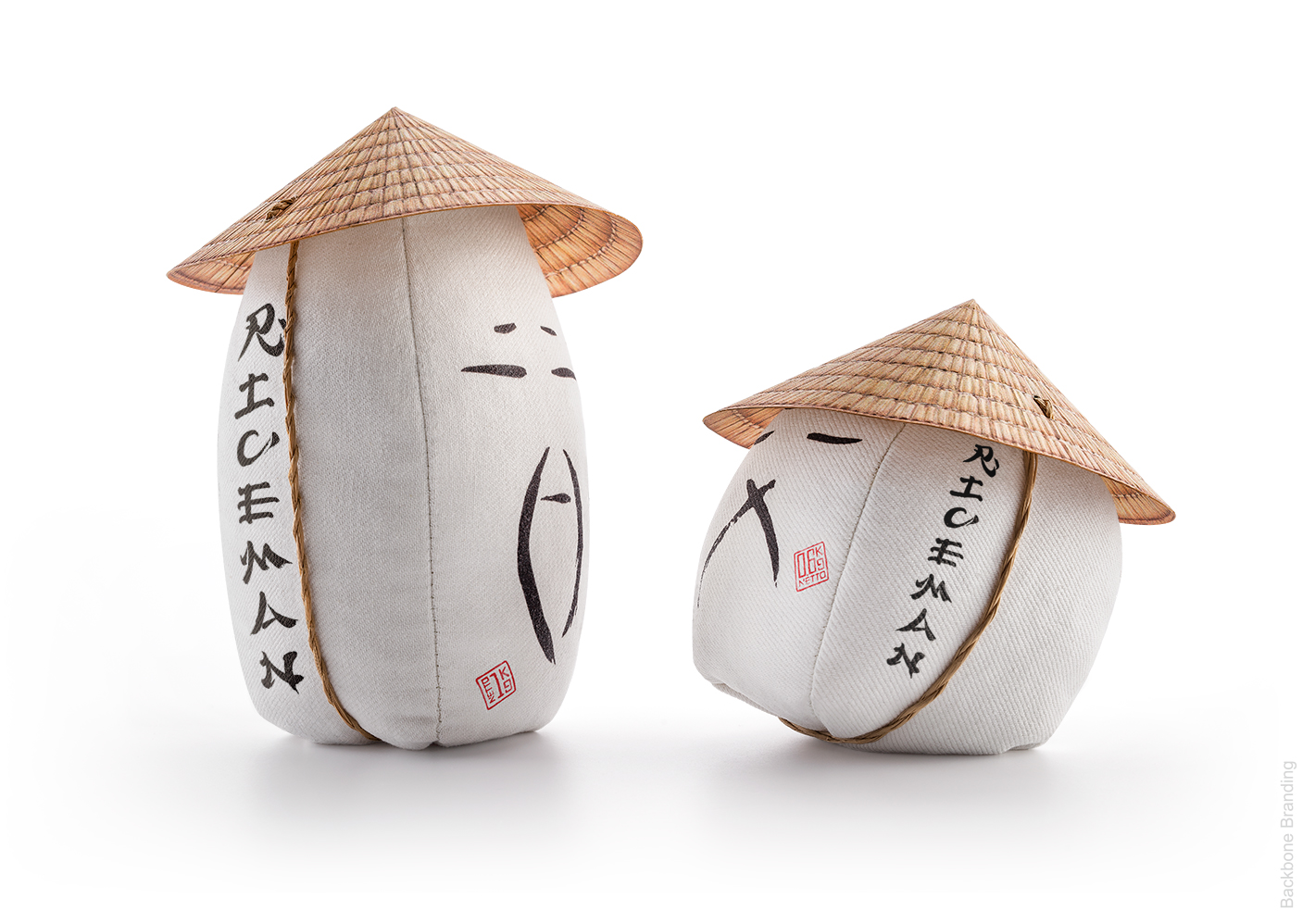
Regarding the functional aspect, we opted for 2 different sizes of bag, which simply indicate the type of rice it contains: the small bag for short-grain and the tall one for the long-grain.
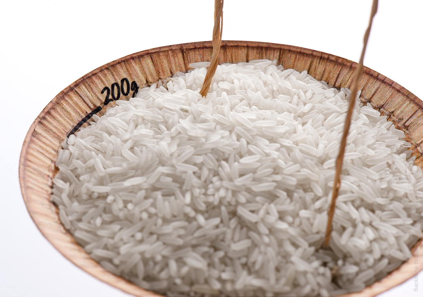
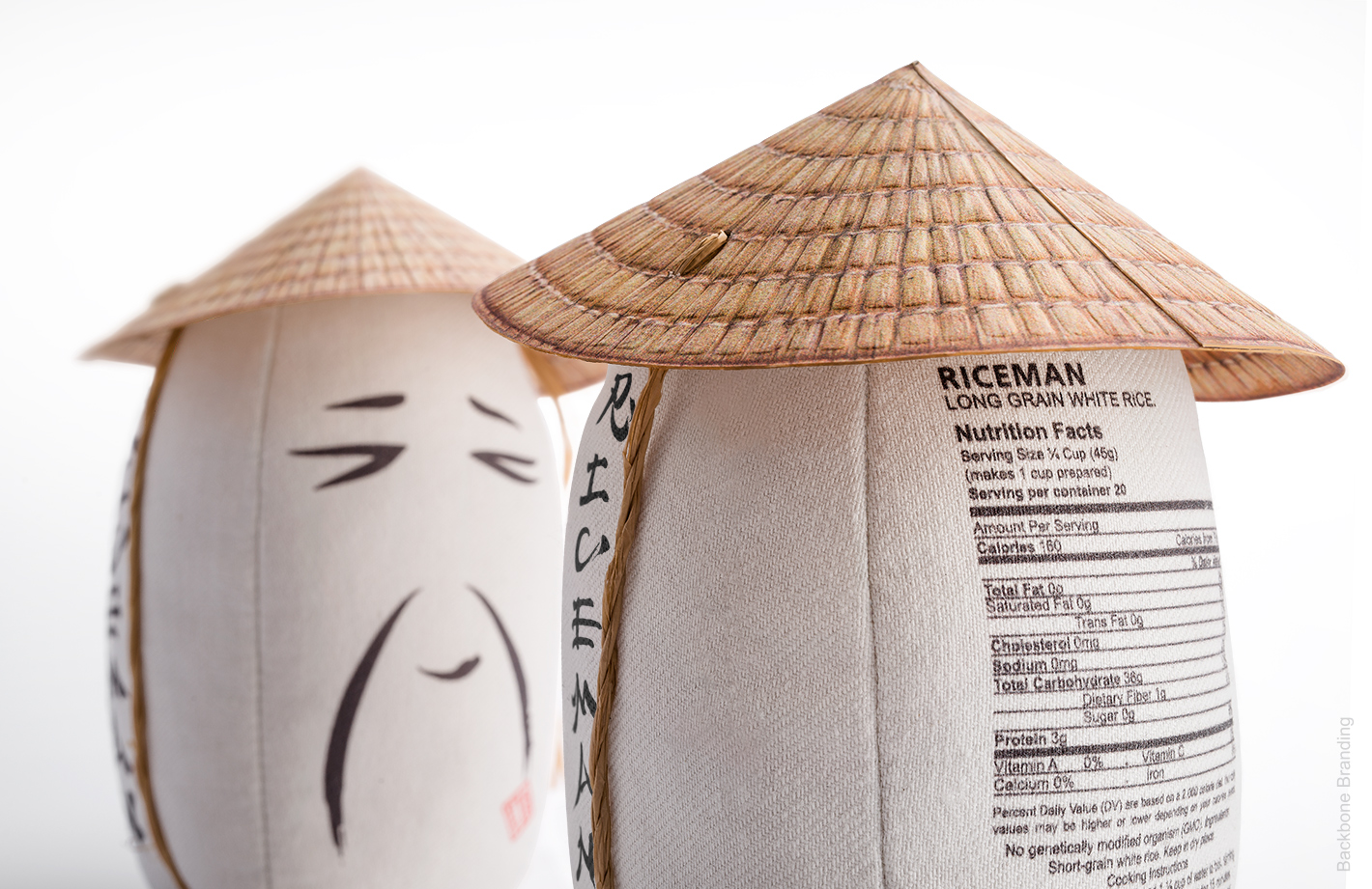
As for the material, we went for the sustainable option with the use of a high density sackcloth fabric to contain the rice, and a carton lid in the form of the Asian farmer’s traditional conic hat. To make things easy for the consumer, on the inner side of the cone hat are marked rice cup measurements.
Continuing with our tribute to the human involvement behind the rice product, we have chosen the name RICEMAN as a way to immortalize his identity on our brand. As for the graphics and visual writing style, we selected an Asian calligraphy for our logotype to emphasis the regional origin of this grain.
Credit
Name:Backbone Branding
Status:Creative
Location:Not specified, Armenia
Project Status:published
Project Type:Packaging
Project Industry:Not specified
Project Market Region:Europe
Project Deliverables:Not specified
Keywords:Not specified
More by Backbone Branding