

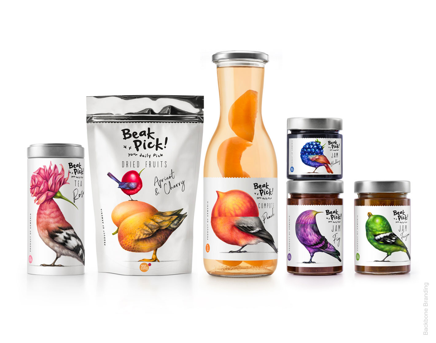
Packaging and Label Design for a Line of Armenian Jams, Preserves, Compotes and Tea
Backbone Branding - Beak Pick !
The Challenge
These days we are becoming increasingly aware of our health, therefore exchanging our old diets with more nutritious options and overall healthier eating habits. Recent studies show that is it highly recommended to eat in small quantities throughout the day rather than burdening our digestive system with large meals. However, we live in a country where jam is popular and a consumer’s favorite. Therefore, our aim is to continue enjoying this delicious but highly sugary food rather than cutting it off from our daily diets, while consuming it in a more cautious way.
So, the idea for this new line of jam was to construct a brand identity that conveys this specific message: ”jam is a treat to be savored rather than a meal to be devoured.”
The Creative Concept
Nature is always a great source of fascination to us, we get inspired by studying the shape and anatomy of its components or even observing the behavior of its species.
While observing the way birds ate fruit in an orchard, we came to a conclusion that their behavior is representative to the way man should graze on food and enjoy it in small quantities. Their behavior was precise, taking in their daily dose of sweetness in tiny bits just enough to get a taste of the delightful flavors without overly indulging. This is the way man should consume jams. They are ‘’daily treats’’ to be savored slowly and leisurely while taking pleasure in the moment and the taste rather than to be devoured too quickly.
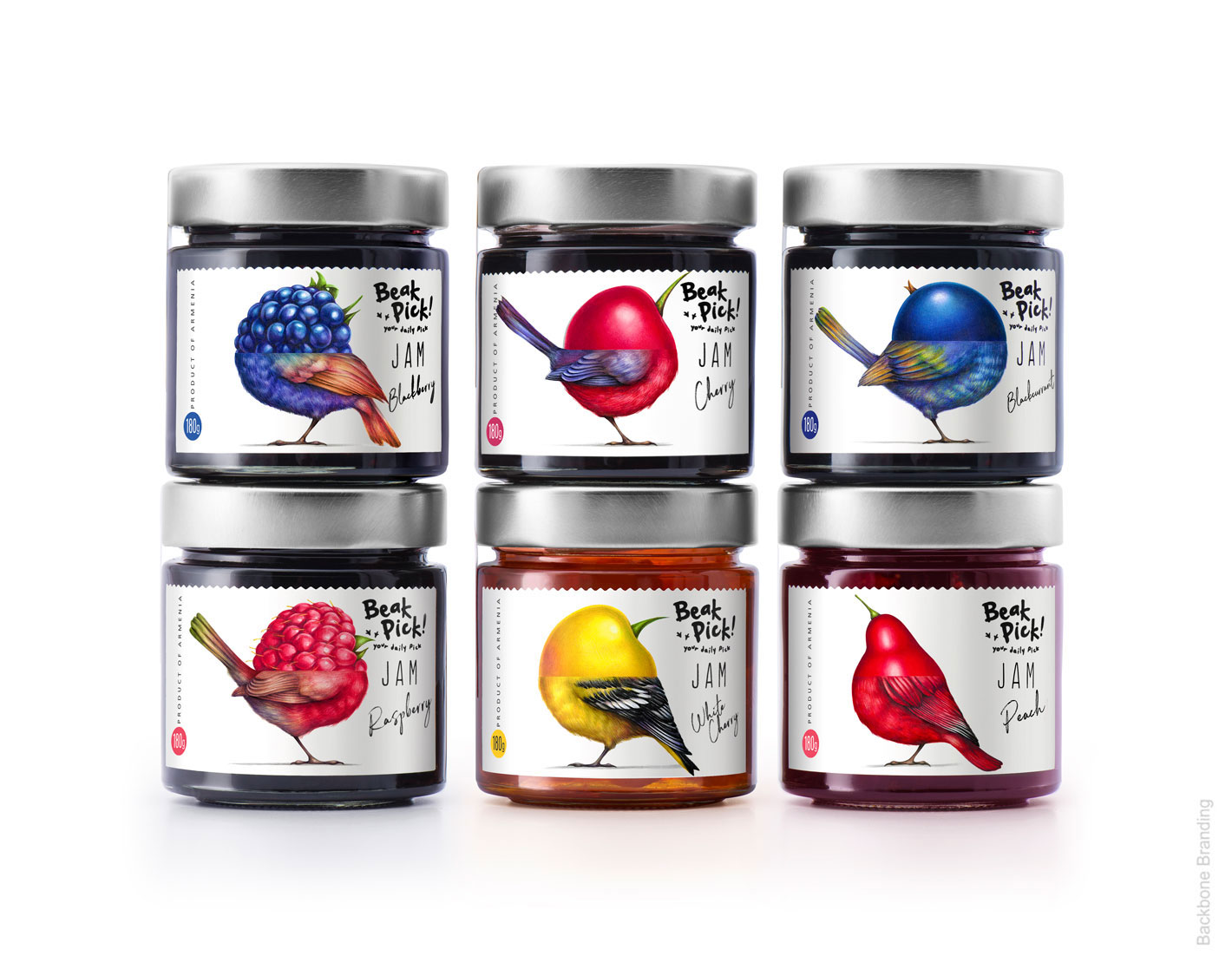
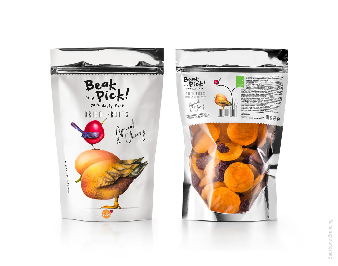
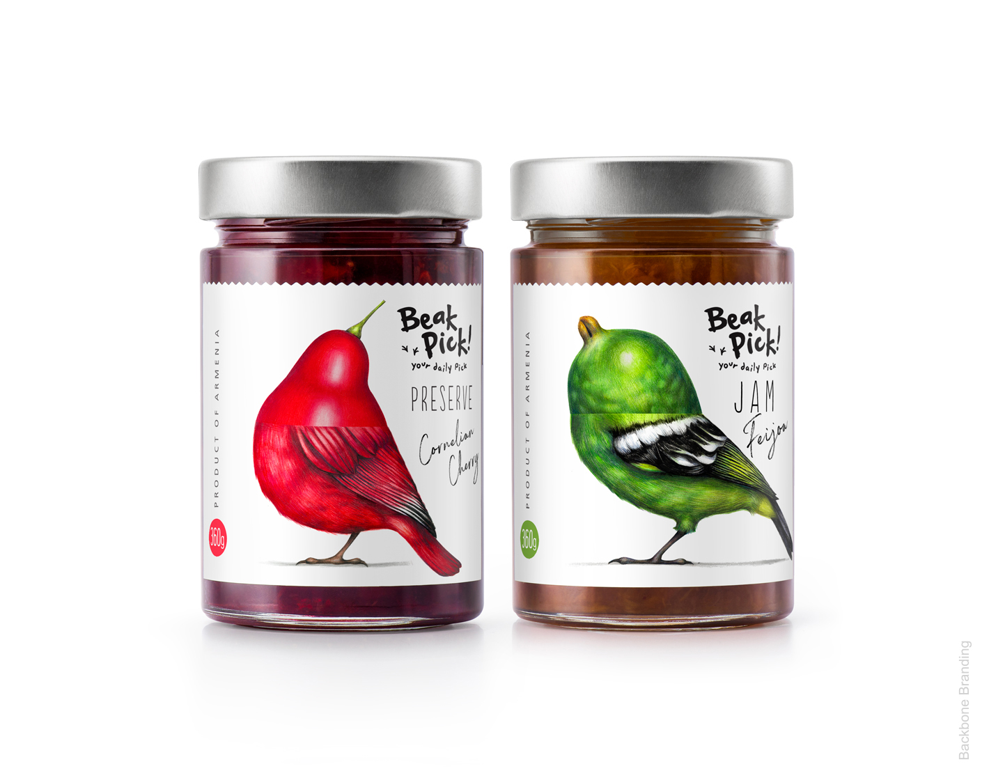
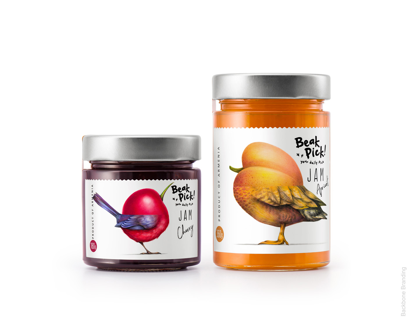
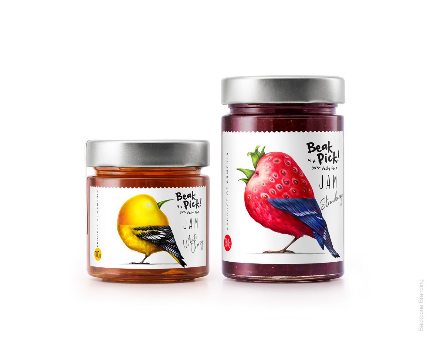
The beak is the part that the bird uses in order to pick up the piece of fruit and eat it. Furthermore, we noticed on a visual level, that the similarity between the aesthetics of the beak of a bird and the shape of some fruits is significant. Adding to this that fruit are the main components of jam, our product!
The Result
This is how the name ‘’beak pick !’’ was born.
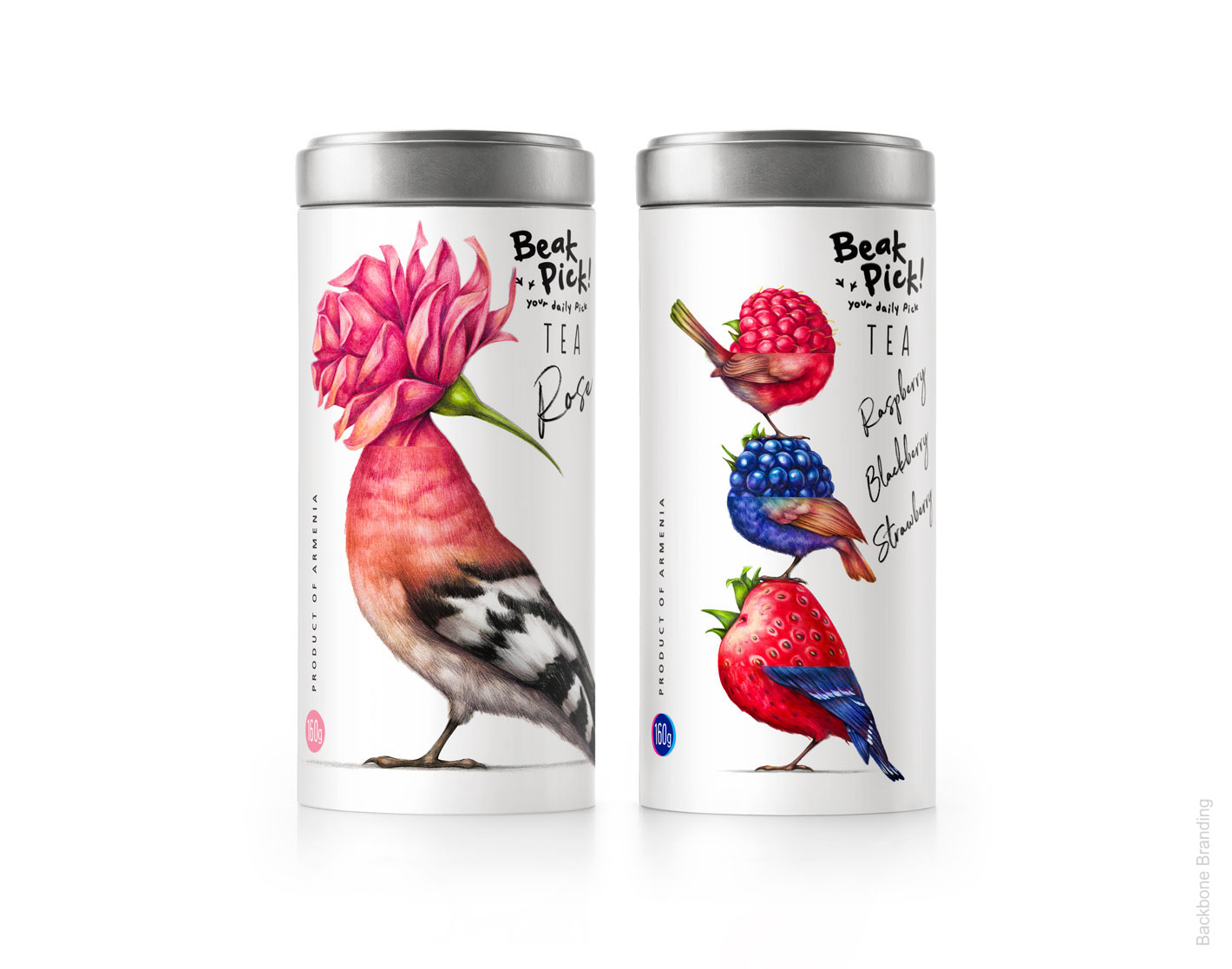
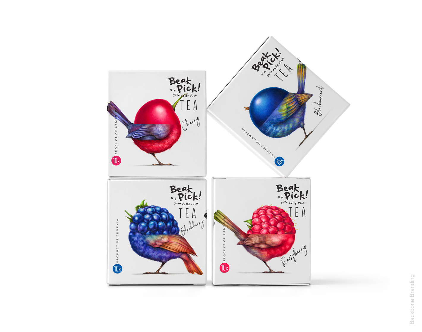
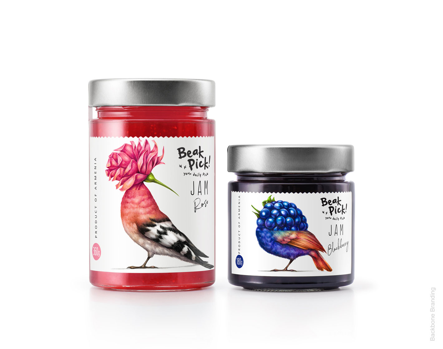
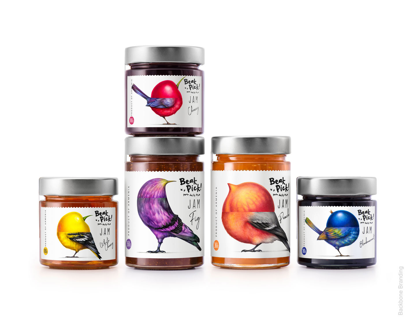
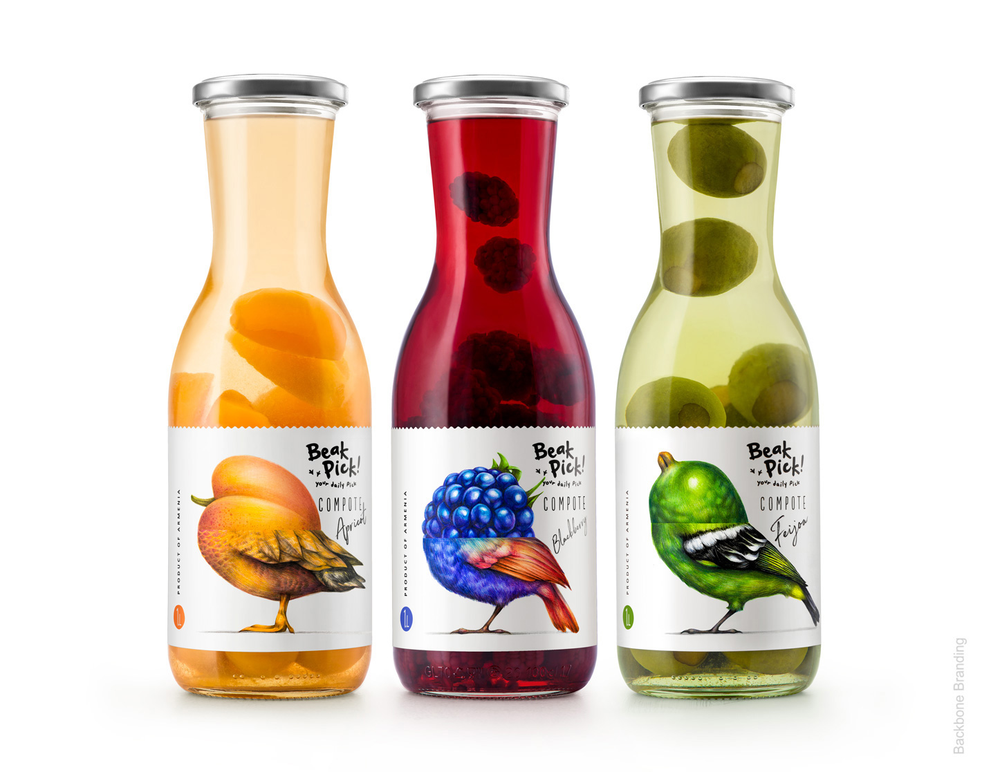
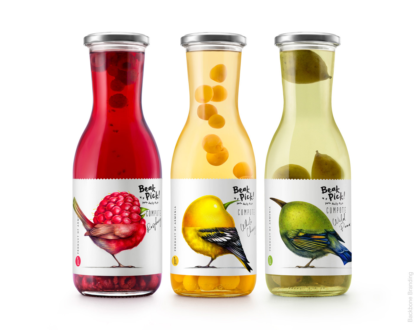
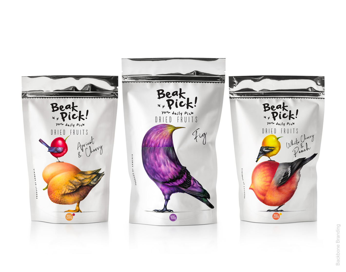
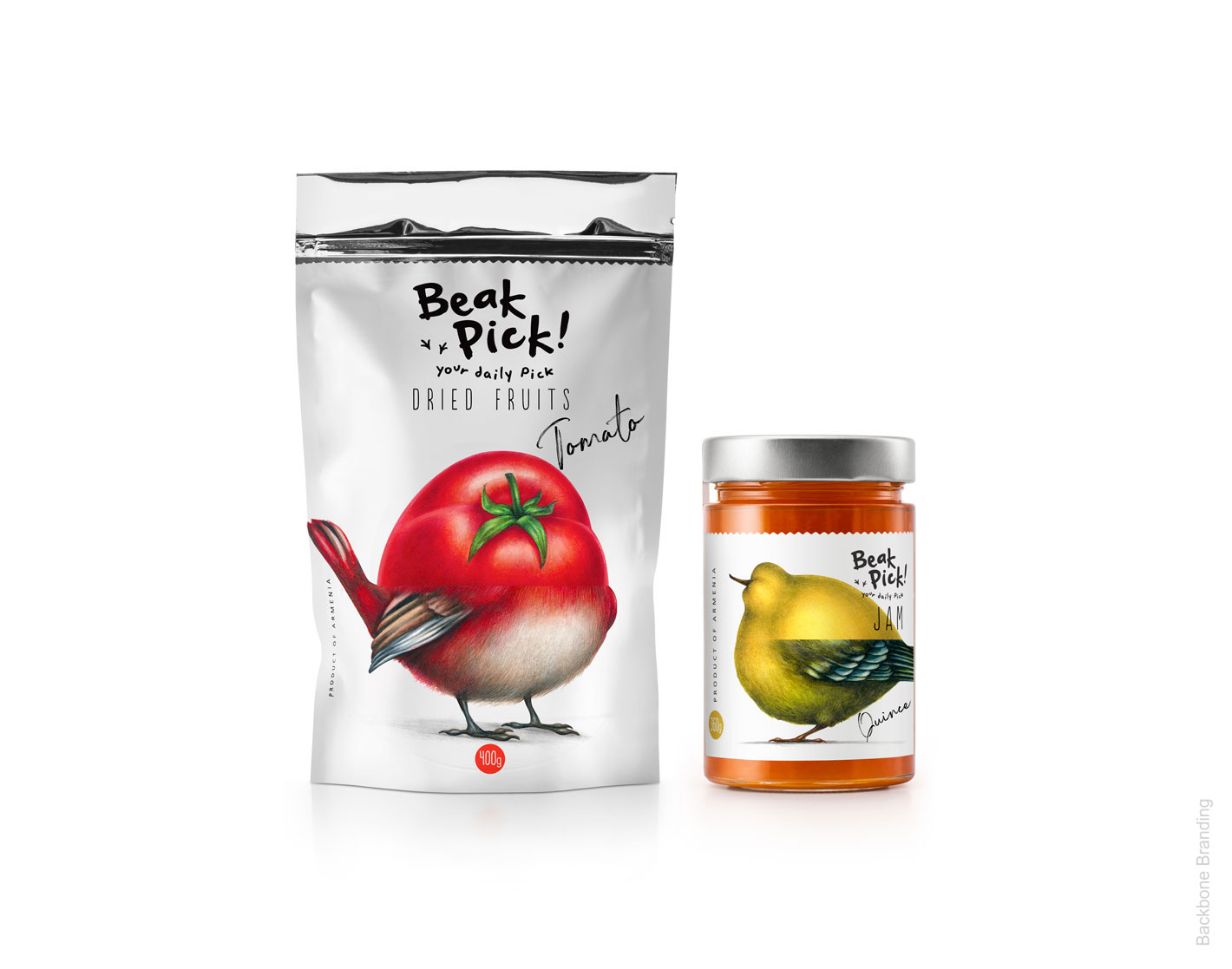
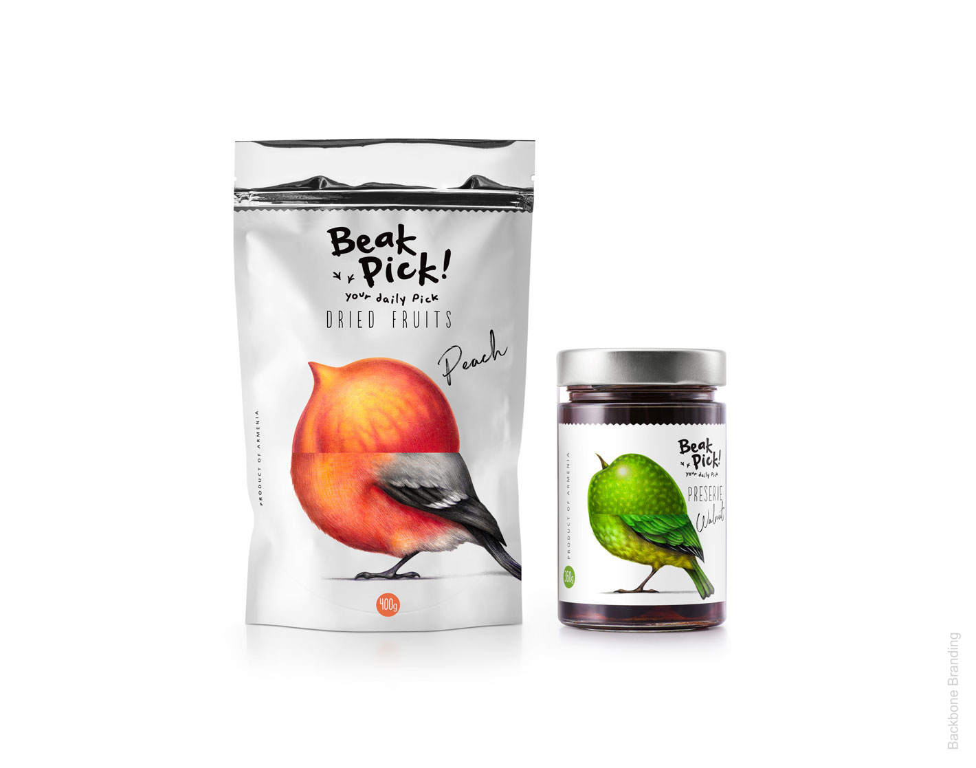
This was followed by a unique series of illustrations portraying the resemblance between the anatomy of a bird’s beak and the form of fruit by combining them into one entity. Going deeper with our bird theme, we were inspired by their frisky walking patterns for the playful writing style, then we added to the logo the scattered tracks of their feet. With its pure white background the product stands out from the lot and creates a contrast with the vibrant, colorful illustrations and black writing therefore having a strong impact on the looker.
Our message is clear and precise, consumers should savor '‘Beak Pick !'’ as their daily sweet treat. Visually, with birds and fruits illustrated on its label, the brand evokes a pro nature design, which perfectly mirrors the natural and non-artificial quality of the product. The “Beak Pick !” range includes jam and preserves, compotes, dried fruits and tea.


Credit
Name:Backbone Branding
Status:Creative
Location:Not specified, Armenia
Project Status:published
Project Type:Packaging
Project Industry:Not specified
Project Market Region:Europe
Project Deliverables:Not specified
Keywords:Not specified
More by Backbone Branding