

Flavour Perception Through Design
The challenge
Our loyal client approached us to brand a new product in the market – yogurt with fruit and berry topping. The challenge was to create a branding that would be similar to the brand identity of the parent brand and would transfer all the accumulated benefits associated with the parent brand to this new product.
The solution
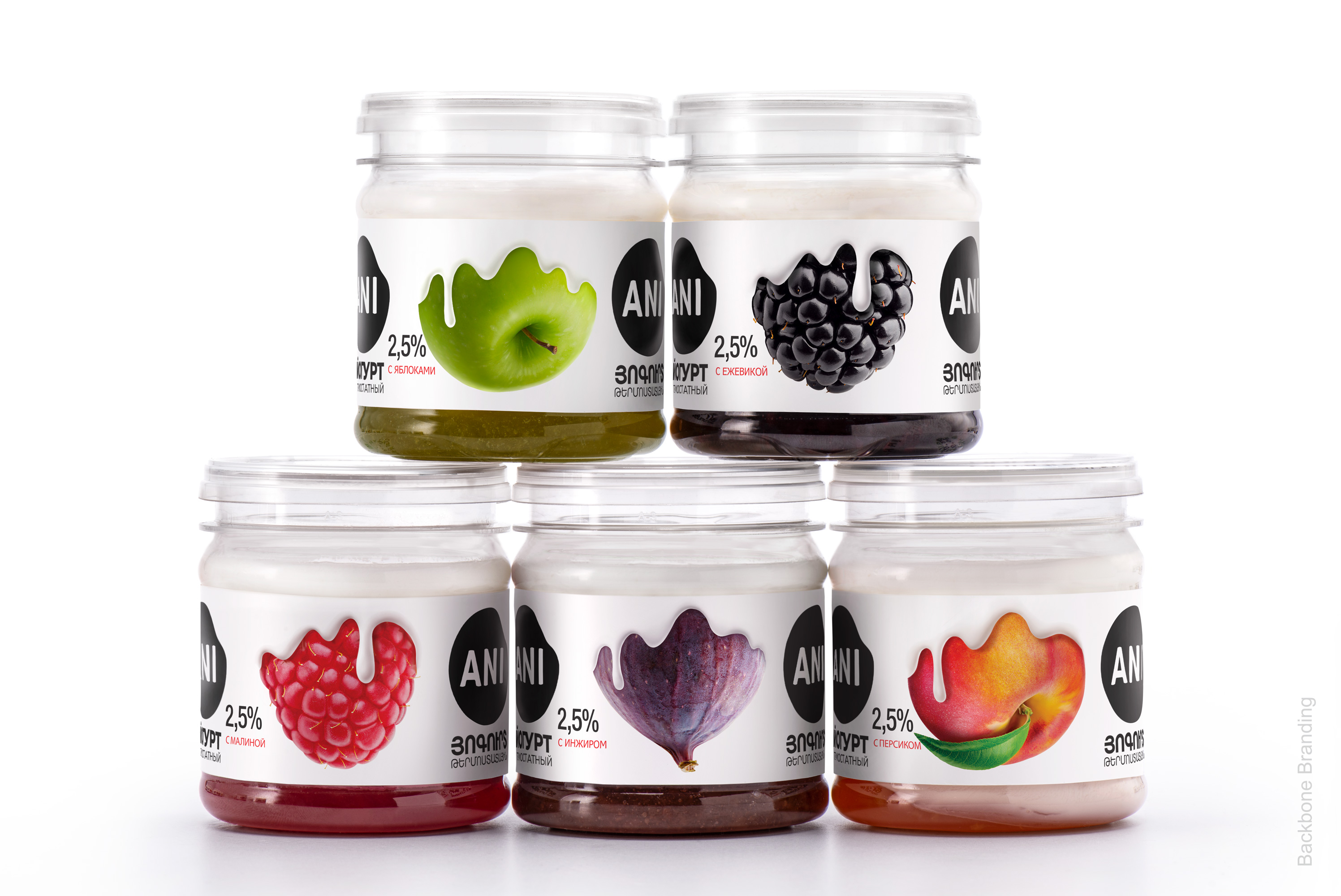
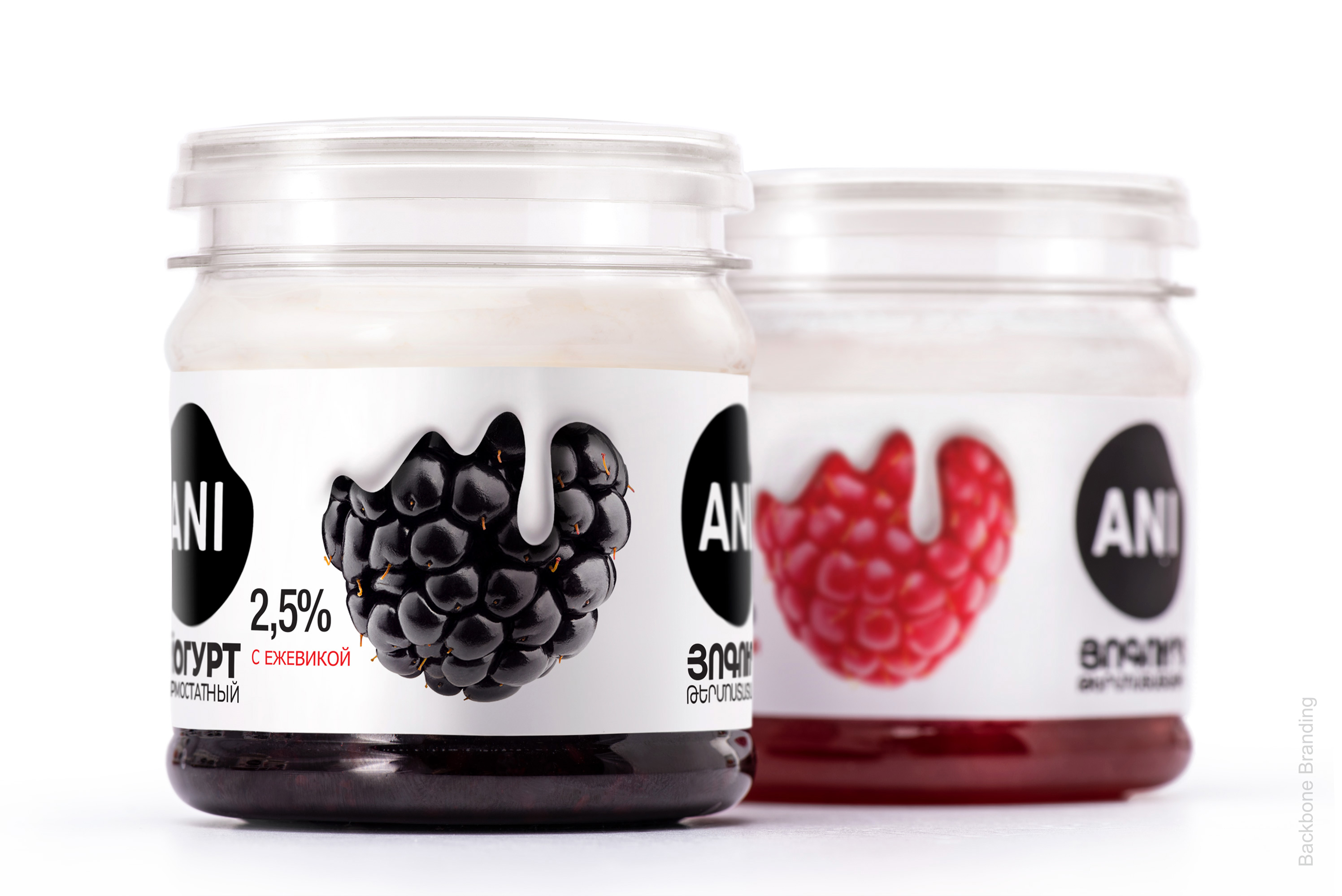
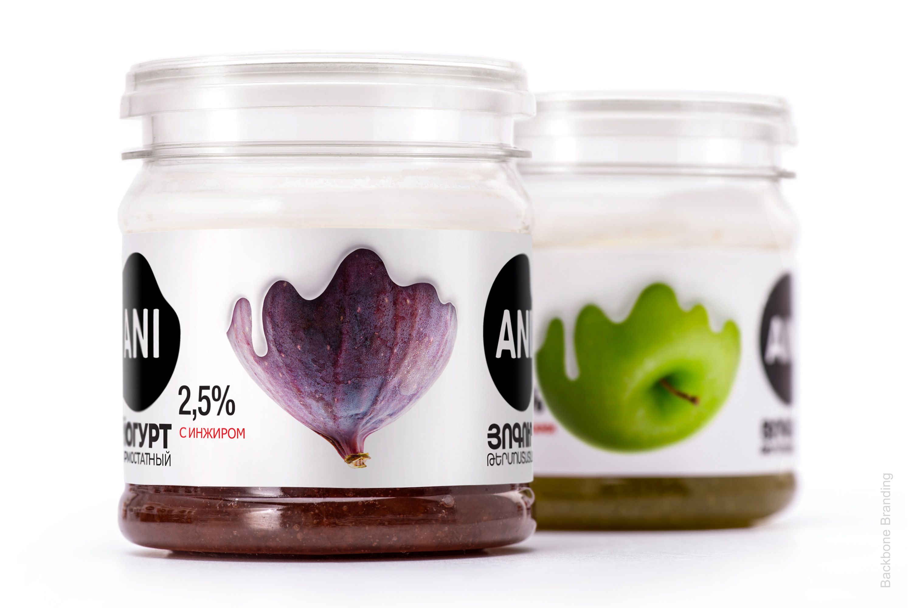
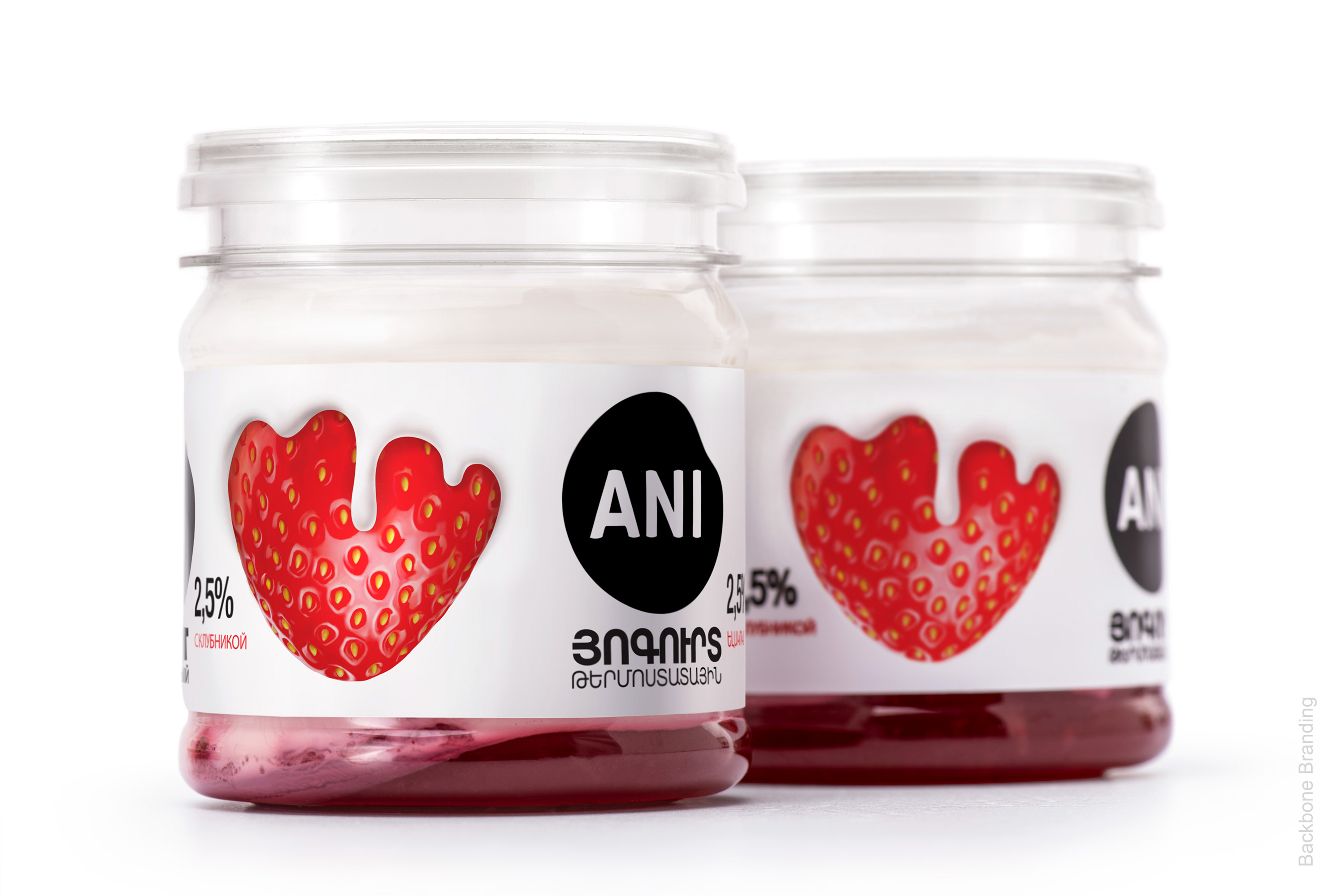
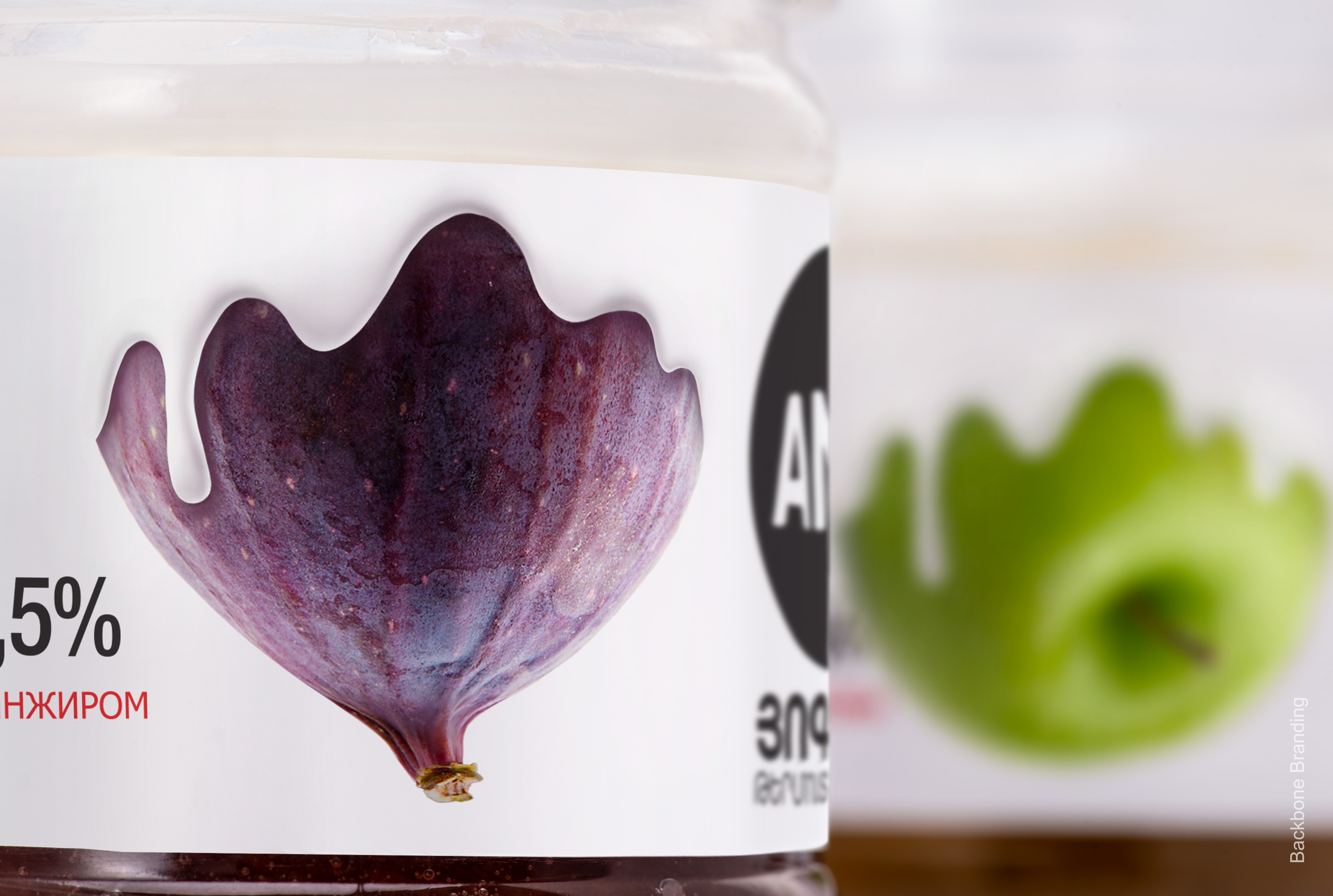
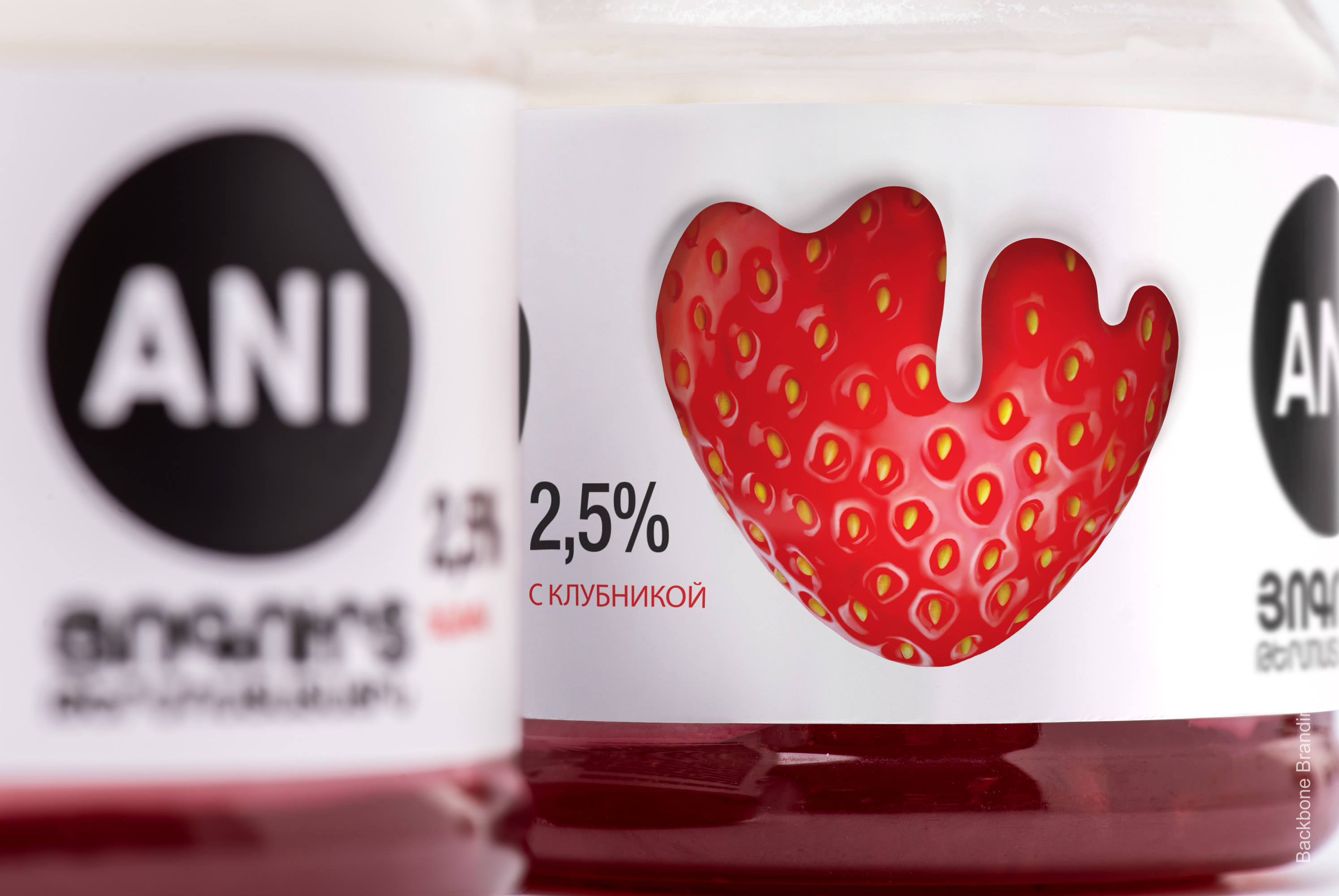
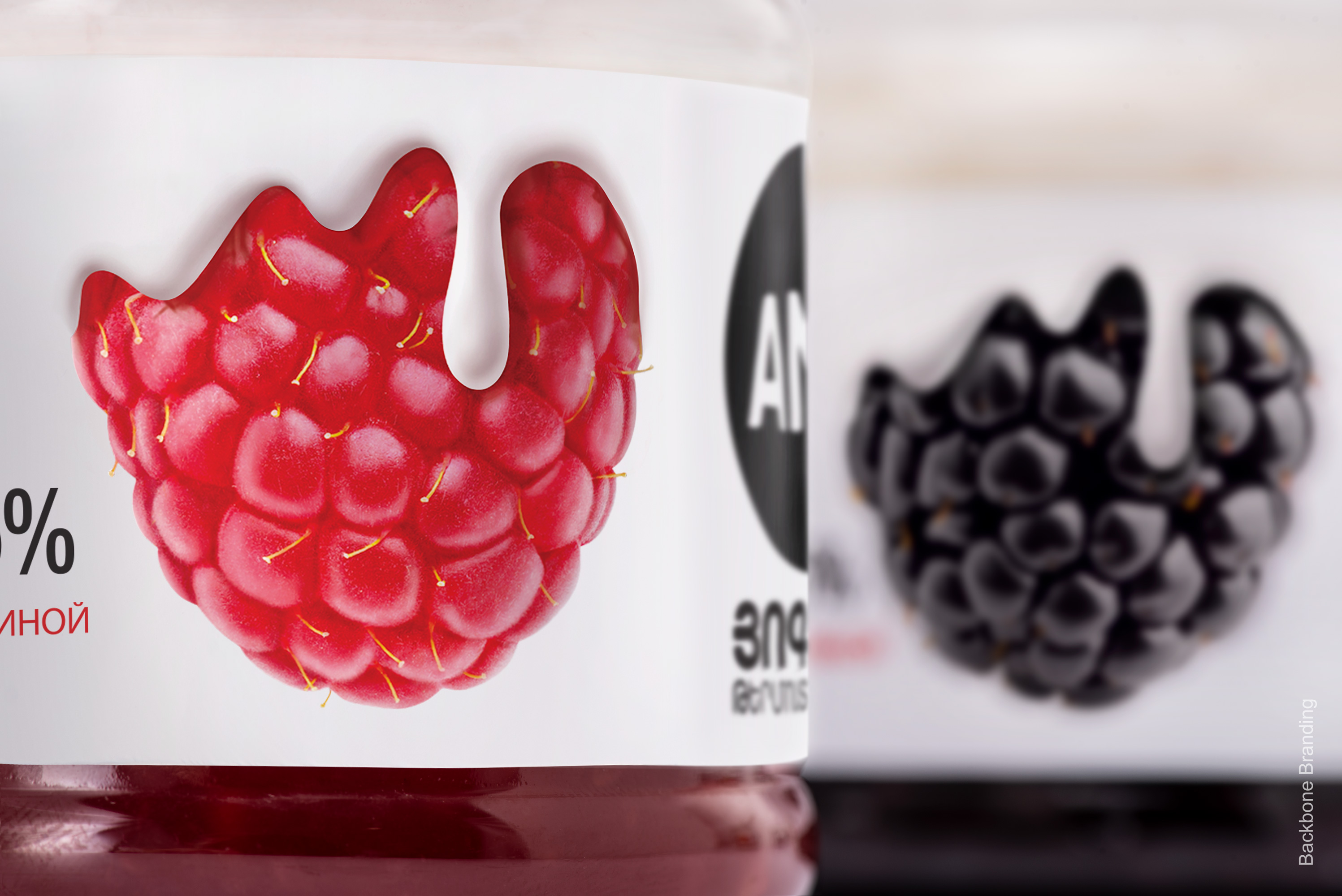
We have created a minimalistic design that would not be overloaded with text and images but rather be attractive and straightforward, and at the same time would pass the naturalness and deliciousness of the product. The content is precisely represented in the design: it gives the impression that yogurt devours the fruits in its white infinity, absorbs the healthy components and delicious taste of each fruit, and delivers a delightful experience of the tender taste. The fruit topping and natural yogurt are clearly visible from the transparent jars. The appealing fruit on the packaging showcases the lower layer, and the natural yogurt made from pure milk is on the upper layer.
The logo, which was redesigned by our company, is a simple black spot, which is a nod to the spot from the cow's body and emphasizes the cow, which produces natural milk from which the yogurt is made. It is shown on both sides of the packaging, making it visible from both sides of the shelf, having a more substantial impact on the consumer.
The result
As a result, we came up with a simple design that creates an emotional connection with customers and is immediately associated with the parent brand.
Credit
Name:Backbone Branding
Status:Creative
Location:Yerevan, Armenia
Project Status:published
Project Type:Packaging
Project Industry:Food/Beverage
Project Market Region:Europe
Project Deliverables:Brand Design, Brand Identity, Branding, Illustration, Packaging Design
Keywords:WBDS, Agency, Design, Awards, 2021/22
Additional Credits:
Creative DirectorStepan Azaryan
IllustratorElina Barseghyan
More by Backbone Branding