

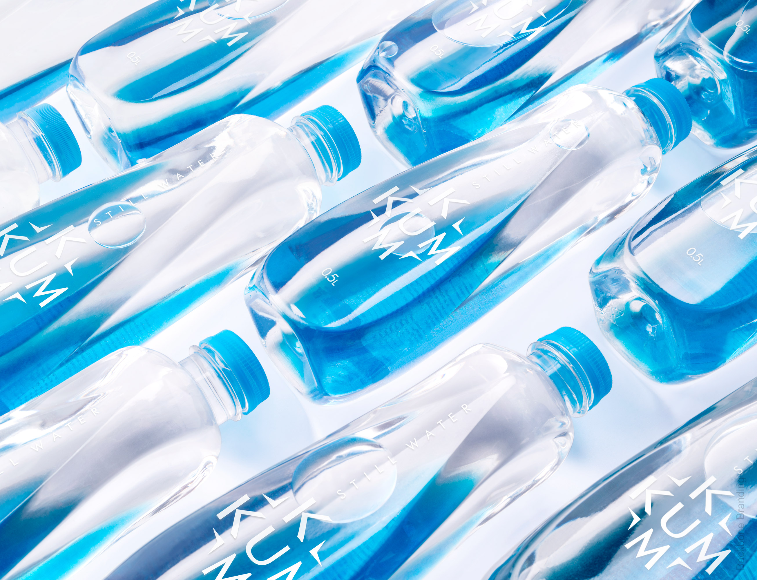
Backbone Branding Creates KUM-KUM: a Very Unique Water Bottle Design
The Challenge: Water is barely visible to the eye and has a transparent and extremely unique appearance. First and foremost, the name 'KUM-KUM'' of this new brand of water was already picked by the client. This naming reflects the idea that consuming water by little sips, which is expressed by “KUM-KUM” in Armenian, is the key to enjoying it. When we were approached to create the design for this brand , our goal was to showcase the characteristics of water and make them emerge through our design. Therefore, we have tried to solve this challenge by basing our approach on the minimal and transparent attributes of water.
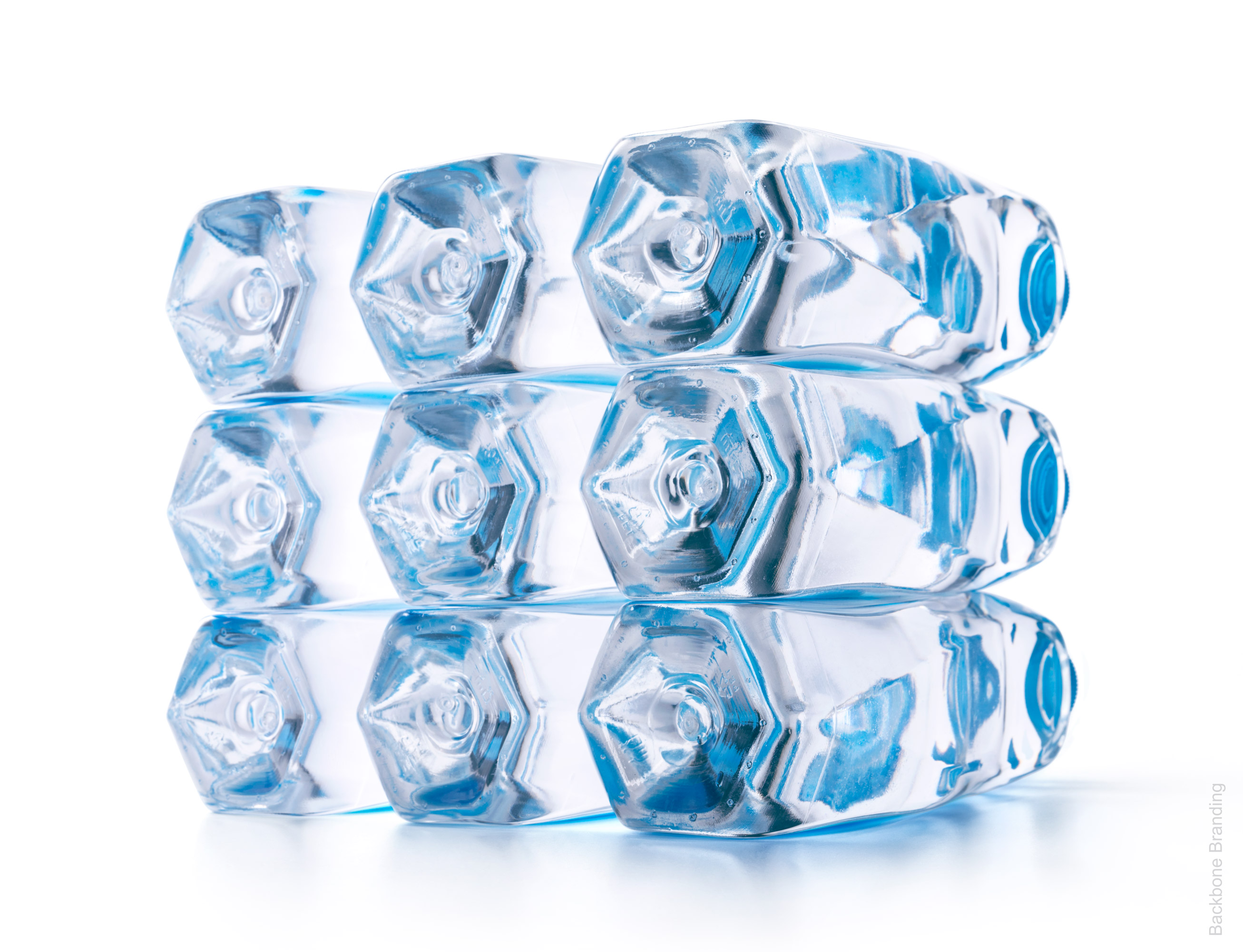
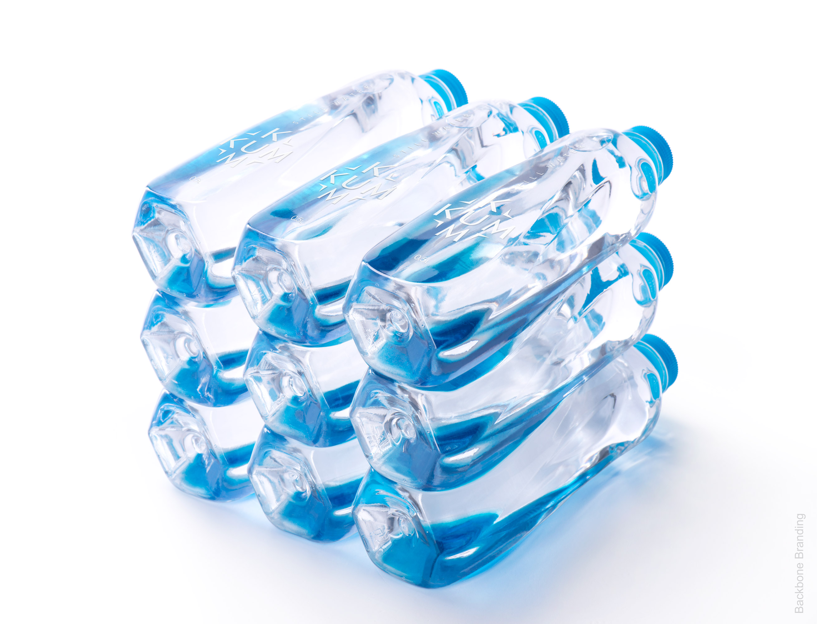
The Solution: We have observed the water in its dynamic state. Per consequence, the movement that it has made became the structure of our bottle. When the bottle is rotated, this specific structure gives the impression that the water is in its dynamic state.
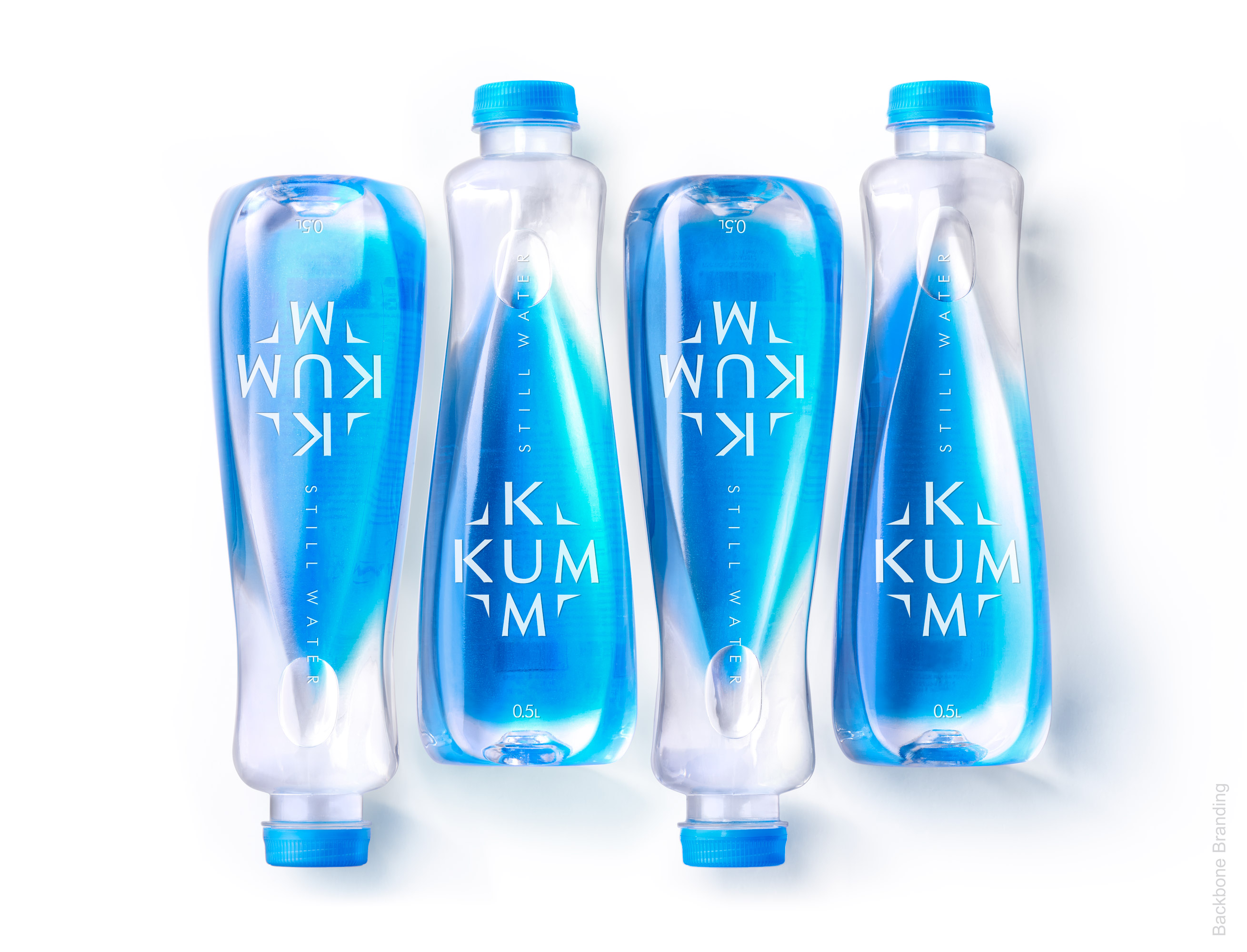
We have incorporated the droplet of water in the structure of the bottle.
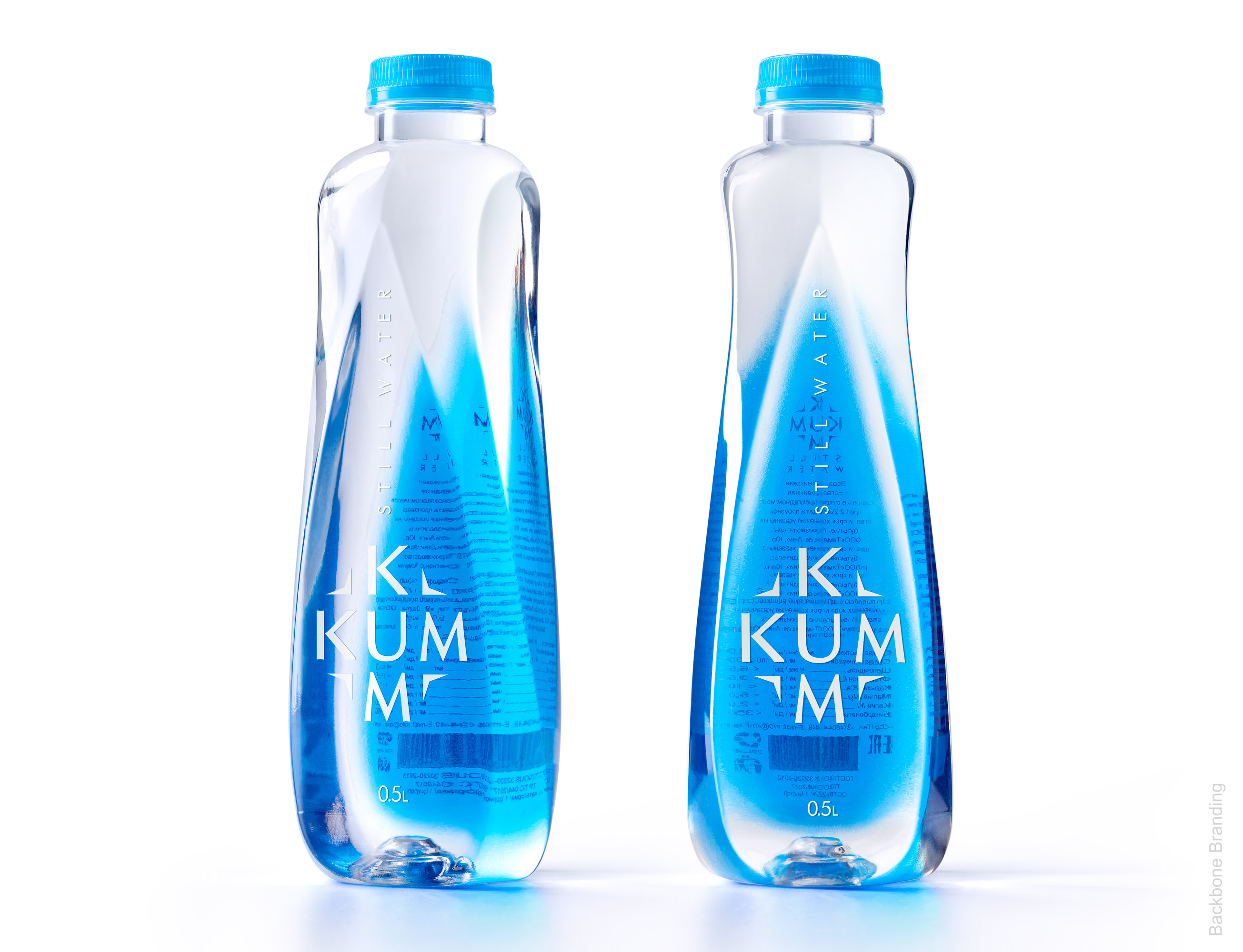
The Result: The bottle has symmetrical droplets on its four sides, two facing upward and two facing downward, which shape the form of water in its dynamic substantiation. Moreover, we have conducted many experiments to get with this plastic bottle a brand that is premium and that is not by any means inferior to glass bottles. The design is not only elegant and harmonious, but also comfortable and easy to hold.
As for the label and logo, we have created a combination of a label and a bottle full of water, which shows the transparency and plasticity of the water in its dynamics.
The blue tint of the back label blends harmoniously with the bottle and, thanks to the refraction of light through the water, makes the bottle visible, and the brand’s white logo on the transparent label becomes apparent due to the blue tinted back label.
The back label, the front label and the bottle structure are so harmonious that when you turn the bottle, the logo, thanks to the design solution, becomes sometimes visible and sometimes not, just like water itself.
If the front label was not white and transparent, the blue tint of the back label would not reflect the structure of the bottle, and if the name of the opposite logo was not “KUM-KUM”, it would not lead us to the idea that the bottle should have this structure. Each is a logical continuation of the other.
The phenomenality of the project lies in the fact that it’s difficult to figure out where the structure of the bottle has started and where it has ended. Due to the physical and optical illusions, the resulting outcome is that the label, the logo, the structure of the bottle, the transparency, the material, the selected colours, the reflections and the water, form all-together an inseparable unity.
[embed]https://www.youtube.com/watch?v=3ltHLSmxoPA[/embed]

Credit
Name:Backbone Branding
Status:Creative
Location:Not specified, Armenia
Project Status:published
Project Type:Packaging
Project Industry:Not specified
Project Market Region:Asia
Project Deliverables:Brand Identity, Branding, Packaging Design, Product Architecture, Structural Design
Keywords:WBDS, Agency, Design, Awards, 2020/21
More by Backbone Branding